A Beautiful Surprise Via FedEx

HIM_book_cover_painting_held_by_illustrator

A beautiful "painting" of upcoming book cover, held by illustrator.

I received an amazing surprise via FedEx yesterday. A package from Unicorn Castle Books. I’ve been working on a cover for a supernatural novel (a novel based on actual events, interestingly enough) HIM by Kerry D. King. And the surprise in the packing container was a giant “blow up” of the book cover.

Well, it wasn’t a total surprise.

The publisher had alerted me last week that it would be arriving. The surprise was that the detailed digital version of the cover I had created for the author’s spouse (who was going to surprise the author with a birthday present in the form of a large “painting” sized version of the cover) had translated so well into the poster-sized print. The detail was amazing and about floored me when I extracted it from it’s carefully padded shipping container.

Maggie our studio’s in-house muse immediately remarked, “The color is perfect for this room!” She was right, and she’s a stickler for having everything look as close to perfect as is humanly possible in the house (and also often gives excellent artistic suggestions during the creation of book covers). So this beautiful gift will soon be hanging on the wall alongside other of my treasured possessions.

As for the book, I’ll be reporting about the process of creating this book cover, as well as where you can buy the book when it goes into print.

In the meantime, a major “Thank You!” to the kind folks at Unicorn Castle Books who so generously sent this to me.

Now… Time to hang a new digital painting.

===================
Duncan Long was the cover artist for HIM, an upcoming novel from Unicorn Castle Books. You can find more examples of Long’s digital paintings at Duncan Long’s Artwork Portfolio.

Tags: , , , , ,

Comments Off on A Beautiful Surprise Via FedEx

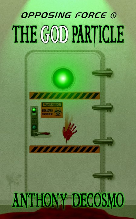
Opposing Force 1: The God Particle Now Available

Anthony DeCosmo Kindle Cover illustration by artist Duncan Long

Got word from author Anthony DeCosmo:

Just wanted to let you know that Opposing Force 1: The God Particle is now up and available on Amazon and Barnes & Noble for the Kindle and Nook. The cover work you did on this project was outstanding.

You can read more about the process we went through to obtain the final cover (above) at an earlier blog.

And you can read sample chapters from this thriller and/or buy a copy at Amazon.com.

=======================
Artist Duncan Long creates a variety of book covers for large presses as well as self-publishing authors. You can see more of his artwork in his Book Cover Artist Portfolio.

Tags: , , , , , , ,

Comments Off on Opposing Force 1: The God Particle Now Available

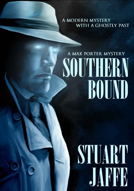
Stuart Jaffe’s Mystery Novel In Print

Book cover artwork by illustrator Duncan Long

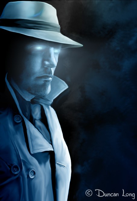
I got word today from Stuart Jaffe that his mystery novel Southern Bound is now available for purchase. You can read more about how we created the book cover illustration for this title at my previous blog: Cover Artwork for Stuart Jaffe’s New Mystery Novel.

Offering hours of good reading, the book is a part of the Max Porter mystery series which blends a ghost story with the traditional hard-nosed gumshoe trying to solve a crime.

It was supposed to be a new beginning – good job, good pay, and a lovely home in North Carolina. But when Max Porter discovers his office is haunted by the ghost of a 1940s detective, he is thrust neck-deep into a world of old mysteries and dangerous enemies.

You can read three sample chapters for free or buy a copy of Southern Bound here at Amazon.com.

Stuart Jaffe book cover illustration for his mystery novel

Final cover illustration for Stuart Jaffe's mystery novel


===========================
Book illustrator Duncan Long has created a over a thousand illustrations for publications including a number of mysteries. You can see more of his book illustrations in his online portfolio.

Tags: , , , , , ,

Comments Off on Stuart Jaffe’s Mystery Novel In Print

27 Wondrous Book Cover Designs and Layouts

Relentless book cover dust jacket artwork

Yes, another biased look at some of my book cover designs. And, again, I’ve laid them out on their own page so they can appear at larger sizes on the page without a need to click through to each one. You can explore them here: book cover layouts and designs.

Each cover design works (I think) because it captures the genre or overall feel of the book as well as attracting the eyes of potential customers so they’ll pick up the book or click on a link to find out more about it.

And that’s all the cover really needs to do.

The purpose of a book cover is not so much to tell the whole story but rather capture the attention of a potential buyer. As such, it might not be a cover that most people find attractive or even of interest; rather it must target not the general population but potential readers. That’s an important distinction that many book cover designers as well as their clients fail to remember. The cover promises a good read; the book delivers on that promise.

For this reason the illustration (or lack thereof), the color of the book cover, and the typeface used on the front, back, and spine are all of critical importance. Get one wrong and it can translate into a lot of lost sales.

And so… Without further ado…. 27 Wondrous Book Cover Designs and Layouts

======================
Duncan Long is a graphic artist who often does the layouts for book covers as well as creating the illustrations for them. You can see more examples of his book cover design in Duncan Long’s Portfolio.

Tags: , , , , ,

Comments (2)

Terrorists, Nukes, and Other Art Nightmares

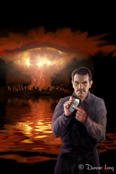
Nuclear Jihad: Unsold book cover illustration by artist Duncan Long

Nuclear Jihad: Unsold book cover illustration by artist Duncan Long

Over the last few months, I’ve been creating more “terrorist” covers and recently terrorists with nuclear devices. Arguably this is the ultimate nightmare of our age, only exceeded in the destructive potential of an all-out nuclear exchange or our planet being struck by a large asteroid. I suppose part of the fiction writer’s job is confront the reader with ideas he might otherwise never entertain.

Certainly this is the case with novels about nuclear weapons in the hands of madmen — like the one above who’s just remotely detonated a nuclear bomb with a coded signal from his cell phone.

The four (plus one from an older age) shown in this blog are all potential book cover illustrations. Each is all built around rejected elements from previous book projects I was working on. After finishing the projects, I went back to the sketches and felt some of them might become book illustrations in their own right. So I’ve fleshed a few of them out to create complete pictures.

That said, these are also “on the auction block,” ready to grace the cover of anyone needing to attract — and perhaps terrify — readers.

While we generally think of most terrorists as the men, it seems that women offer the potential — at least in fiction — to be equally cold-blooded. Hence a couple of female terrorists, both calmly insensitive to the damage they’ve done.

Playing With Matches: Book Artwork by Illustrator Duncan Long

"Playing With Matches:" Book Artwork by Illustrator Duncan Long

Nuclear Night book cover illustration by artist Duncan Long

"Nuclear Night" by book cover artist Duncan Long

And, yes, there is a twisted face in the nuclear blast of the picture above.

Of course end of civilization or even end-of-the-world tales are nothing new. Every culture has its myths of the end of everything, from the Mayan reorganization at the end of the “calender year” to Wagner’s Der Ring des Nibelungen from the old Nordic myth of the final cataclysmic end of Götterdämmerung. That preamble out of the way, here’s a left-handed salute to those ancient terrorism whether Druid chant or sorcerer’s spell.

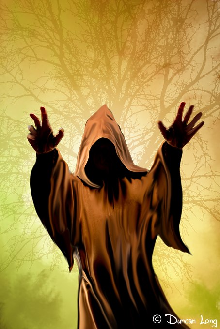
The Last Druid Apocalypse - Book Cover artwork

"The Last Druid Apocalypse" by book cover artist Duncan Long

While a culture’s nightmare may be a nuclear device in the hands of terrorists or an out-of-control witch in older times, the more common weapon “with your name on it” has proved throughout history to be the conventional, whether blade, bullet, or bomb.

Today that tool of the trade for many a real-life terrorist is the suicide vest. So this final painting offers a bit of reality for the viewer, with a nod toward that most dangerous of fanaticisms (regardless of its name) which calls evil “good,” and bad “evil,” while promising good rewards its bad works.

Arfan and the 40 Virgins book cover artwork

"Arfan and the 40 Virgins" by book illustrator Duncan Long

==========================
Illustrator Duncan Long creates a variety of book cover artwork, from peaceful scenes to nuclear holocaust. You can see more of his book illustrations in his Book Art Portfolio.

Tags: , , , , , , , , ,

Comments (1)

Houston, We Have Liftoff.

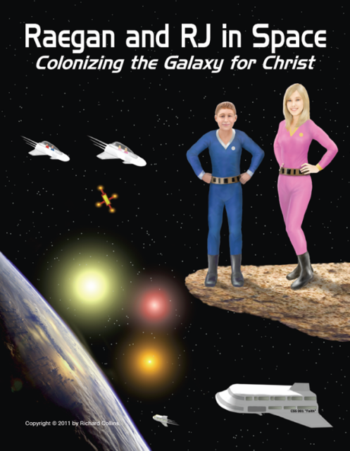
Official Raegan and RJ in Space Poster

I got word today that the science fiction graphic novel trilogy of “Raegan and RJ in Space” is now in print and available for purchase. Written and illustrated by retired Army officer Richard Collins, these books are aimed at intermediate and YA readers. They’re also unique in that they present a Christian message as well.

Here’s the blurb from the publisher’s website:.

Raegan and RJ in Space tells the story of the first Christians to leave Earth to colonize other star systems. The trilogy was written to give Christian kids a fun and interesting story to read with a happy ending. The story revolves around Raegan, a 13 year old girl, and RJ, an 11 year old boy, and their life on the colony ship CSS Faith.

Book 1, Christmas at Alpha Centauri, is set in the year 2025, and tells the story of Raegan and RJ and 5 Christian families travelling to the Alpha Centauri Star System to colonize it for Jesus. Book 2, Journey to Barnard’s Star, is set in the year 2027, and tells the story of Raegan and RJ and 5 Christian families traveling to the Barnard’s Star System to establish their second colony. Finally in book 3, Homecoming, the year is 2029, and tells the story of Raegan and RJ and the families returning to Earth for a heroes’ welcome.

While the author handled most of the illustrations for the book himself (including very detailed plans of the spaceship and its inner compartments and systems), I was charged with creating covers for each of the titles along with a large poster of the space ships and characters.

The trick to these projects was consistently capturing the likeness of the two kids who appeared on each cover — but at different ages as the story progressed. Once the first characters were locked in, the real work began with book two and three, making them age so they looked older but were still recognizable. Fortunately the author/publisher was also an artist who could offer good suggestions when I painted myself into a corner a time or two.

You learn more about these YA science fiction adventures at the Raegan and RJ in Space web site.

===========================

Duncan Long is a book illustrator who creates artwork for a variety of genres including science fiction. You can see more of his artwork in Duncan Long’s Art Portfolio.

Comments (1)

Crazed Illustrator Crows Over 3 Book Covers

Crazed Illustrator Displaying His Three Book Cover Illustrations

I recently received a box which, after determining that it wasn’t ticking (yes, I have crossed a few art directors in my time), I discovered contained all three mammoth volumes of Lawrence P. White’s Spirit of Empire trilogy. And, yes, the author had kindly signed each one. And it goes without saying that I’m pretty proud of the cover artwork I created for these three books.

It was a shock to see how massive the books actually are. Had it not been for years of weight lifting and ham fingers, I likely could never have held them for the photo above. While I’d realized they were big when doing the layout for the covers — the spines were WIDE — only when holding them did their huge number of pages sink in.

Epics.

And each was beautifully printed and the interior well laid out. Yes, these are real treasures. And they’ll deliver a whole lot of good reading.

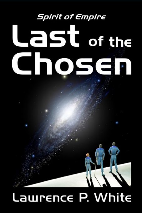
Book Cover Illustration for book one in the trilogy

Last of the Chosen -- first book in the trilogy.

Knights of the Chosen book cover illustration.

Knights of the Chosen -- 2nd book of White's trilogy.

Book cover for Voice of the Chosen -artwork by illustrator Duncan Long

Cover for Voice of the Chosen

Both the print as well as Kindle versions of these three books are available from Amazon.com. If you want to read some epic science fiction, check out these three titles:: Last of the Chosen, Knights of the Chosen, and Voice of the Chosen.

Getting copies of books from clients is always a joy for a book illustrator. And these were no exception to that rule.

Thank you, Lawrence P. White!

Tags: , , , , , , ,

Comments (5)

Illustrating a Fictional Biography of Carl Jung

Final book cover artwork for Steinberg Carl Jung Book

Many artists and writers are big fans of Carl Jung, in large part because he’s the champion of the hidden dark recesses of the human mind — places where many creative people find themselves in when working on plots, sketches, or other ideas. I’m one of those artists.

So when I had a chance to work on the cover illustration and layout for Suzanne Steinberg’s fictional novel about Carl Jung, I jumped at the opportunity.

Here’s how the publisher describes the novel:

This fictional biography A World Within a World goes deep into the unconscious mind of Carl Jung, one of the founding fathers of psychology. The book doesn’t just graze the fields of Carl Jung’s development but also touches upon the many people who were an inseparable part of the emotional tapestry of a life few understood behind the heavy curtain.

Two essentials for the book were an accurate portrayal of Jung — not too hard since there are lots of reference photos of him — and the creation of a graphic connection to the “world within a world” concept of the book’s title. Additionally the author wanted a light or ray coming from Jung’s head and requested that, if possible, I portray him sitting in an office.

That all sounded easy enough.

It proved tougher than one might have thought going into the work.

First of all, the cover would be used as an ebook as well as print version, so the central character couldn’t be reduced too much as might have been possible with print only. So immediately we were left with an upper body/head shot, plus hints of office furniture.

Here’s an early stab at the idea:

Early Cover illutration for Suzanne Steinberg Carl Jung book

Early Cover illutration for Suzanne Steinberg's Carl Jung Novel

As can be seen, the “world within a world” didn’t work too well. I had thought hollow earths, split down the middle, would be perfect. In fact, the dark blue of the top of the atmosphere and the darker blue of the planet caused an illusion of two metal rings surround Jung. Yikes.

So the solution seemed to be to let him be in his own world inside the Earth and make more of the planet show, perhaps a bit like a chick inside a broken egg.

Here’s the second attempt to make sense of the idea:

Suzanne Steinberg book cover illustration

The second attempt at the book cover illustration.

This proved more effective — but the colors weren’t what the author wanted to see. Also, the author suggested a book under his hands and a cup of tea to one side of the desk (both of which proved great suggestions).

So I shifted the colors from purple to blue, reworked the color of Jung’s sweater to match the planet better (using the original color of his sweater to create a leather elbow patch if you look closely), and then moved the beam coming from his head so it projected off to the right, thereby allowing for all white lettering to show up. The final touch was a little steam rising from the tea cup.
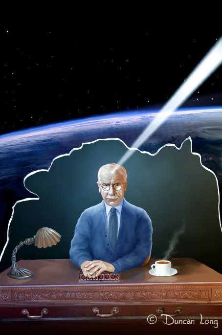
Illustrator Duncan Long's final artwork for World Within a World

The final artwork for the novel.

For the lettering, nothing seemed to be quite right (perhaps the irony of the electronic age is having thousands of typefaces to choose from, and not having one that quite works). After trying a variety of types, I finally decided to break the gold rule of layout and use more than just a single typeface for the title and author’s name.

Instead, I employed one type for the title, a second italic type for “within a,” and a third for the author’s name and kicker line. This worked (at least for my eye and that of the publisher) in part because there are so few duplicated letters in the title and author’s name — a rather unusual occurrence that made breaking the layout rules practical.

Finally, to mirror the “world within a world” idea, I added some stars in the center of the Os in the title.

Final book cover artwork for Steinberg Carl Jung Book

Of course mixing three different typefaces on the cover bothered the flying monkeys here at the Duncan Long Studio no end, as (like most hairy primates) they’re sticklers for obeying the rules. However, after plying them with fruit-flavored candy and reruns of The Mary Tyler Moore Show, they begrudgingly agreed to go along with the idea.

You can purchase Suzanne Steinberg’s A World Within a World at Smashwords.

=============================================
See more of Duncan Long’s book cover designs at: Duncan Long’s Art Portfolio

Tags: , , , , , , ,

Comments (1)

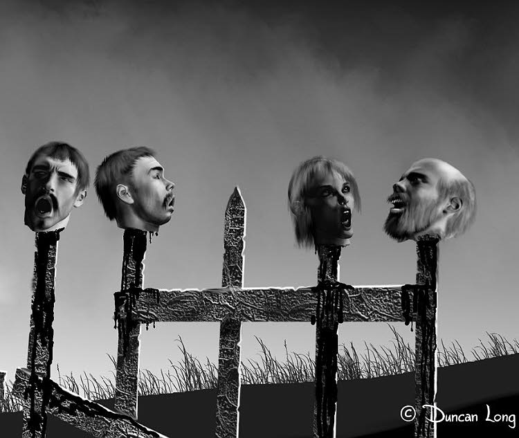
23 Horrifying Horror Book Cover Illustrations

Horror book cover artwork by illustrator Duncan Long

This is another installment of my picks of my own favorite artwork from various categories. This time it’s horror artwork (hopefully not to be confused with “horrid” art).

Some of these horror illustrations have actually appeared on book or magazine covers. One (the serpent Satan shaking his fist at Heaven) even appeared on the cover of a religious magazine. But most have not yet gone into print (and so the cover rights are available for purchase — hint, hint). Published or not, they’re my choices of what I consider to be my best artwork in the horror category.

Since some of the artwork needs to be viewed at a larger size than is practical with WordPress layouts, I’ve packaged the entire collection on its own page here: 23 Horrifying Horror Book Cover Illustrations by Duncan Long

I’m not sure “enjoy” is the proper admonition with horror pictures (unless you’re very, very warped). Perhaps the promise that some illustrations may scare your socks off? Or make blood squirt from your eyes? Well, perhaps not given that some disenchanted clown will bring a lawsuit.

So just go see the danged pictures, all right?

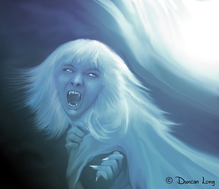
Artwork from Werewolves of New Idria graphic novel

For those who want to see some excellent horror artwork by other horror illustrators, here are my top picks:

Paul Mudie
Edward Gorey
Alan Clark
And a huge gallery of horror (and SF) book cover artwork

================
When not trying to scare the socks off viewers, illustrator Duncan Long works in his home studio with a battle ax always near by. Sometimes during breaks from his artwork, he stands in the back yard screaming at the invisible flying monkeys overhead.

Tags: , ,

Comments (2)

“These days Long prefers creating artwork to writing…”

Agendas - Illustration by Duncan Long

Agendas - Illustration by Duncan Long

I woke up this morning to discover that my interview with ArtPromotivate.com is now featured in its “Artist Spotlight.” Thank you, Graham Matthews, wherever you are!

Each project is unique and often a surprise. One day I may be painting a ghostly mansion, the next a deep space scene, and then a beautiful woman… on it goes. There’s no predicting what the next illustration that a client needs might be.

You can read the interview here.

The Royal Guard - an  Illustration by Duncan Long

The Royal Guard - an Illustration by Duncan Long

Tags: , , , ,

Comments (4)