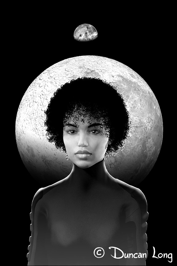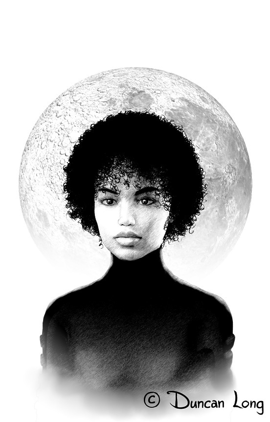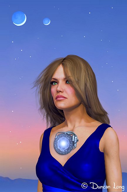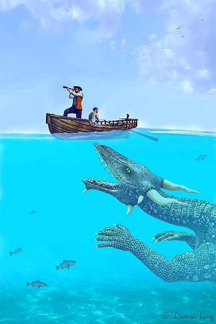
Sometimes an artist is called upon to create a monster, demon, fairys, gnome, troll or alien beast. And that’s always a challenge because the public has been “educated” by movies and artwork to expect a certain “look” from many of these creatures; meanwhile the client hiring the artist to create a picture for a book or magazine cover wants something new and original. So there’s a fine line between what is expected, and what is innovative.
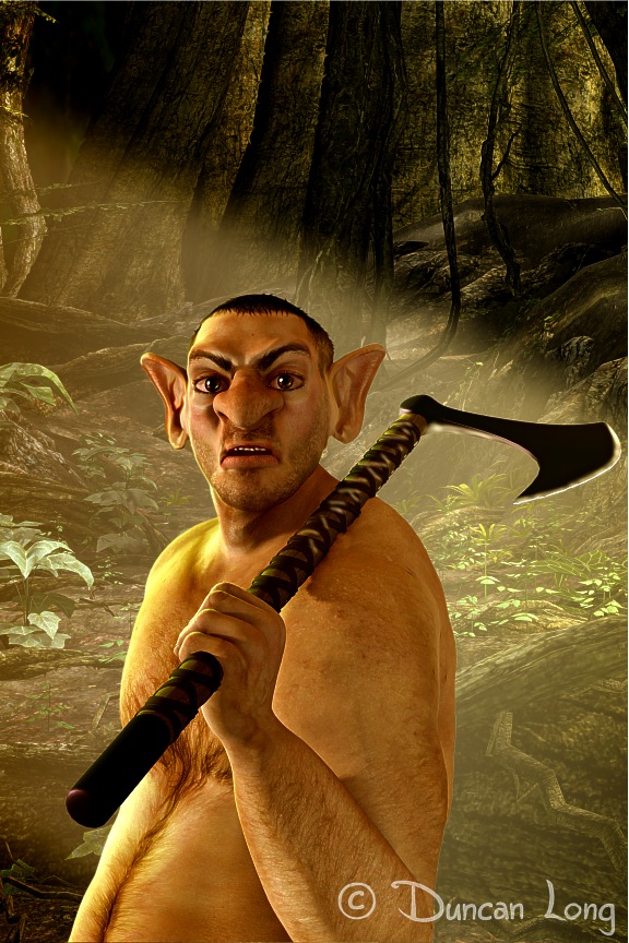
With fantasy creatures like trolls, gnomes, fairies, and such, the “look” needs to be pretty much what the illustrators of the late 1800s and early 1900s dictated in their fairytale books. As such, it is rather amazing how most people can identify which of these creatures they are looking at. Like this guy:
At the other end of the spectrum are the denizens of back streets. These guys must look human, while still looking almost unbelievably hideous. Again, a thin line between an illustration that works, and one that does not. Here’s my take on one such guy:
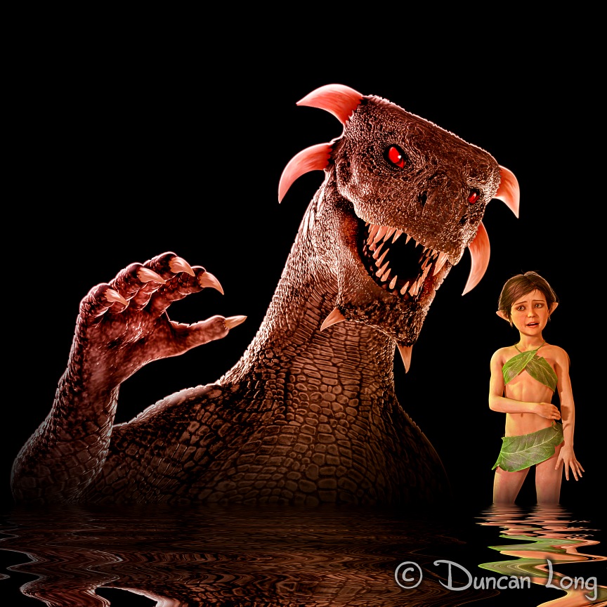
Dragons and fairies are perhaps the most standardized. While dragons can be skinny, horned or hornless, etc., etc., there’s still a very fine line between what viewers will recognize as a dragon and what they’ll perceive as something quite different (such as an alien or dinosaur).
Fairies are even more standardized, though like dragons, wings are sometimes optional in artwork. Here’s one such take on such art: “He’s Standing Behind Me, Isn’t He?”
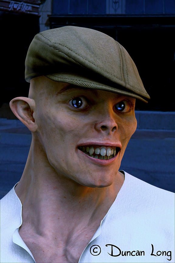
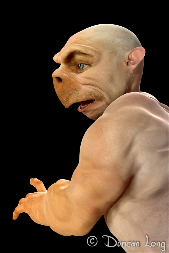
There’s also a fine line between creating something repellant and a creature that seems compelling or even potentially likeable. A lot of this has to do with having a human-like skin and eyes that seem friendly. For example, the guy below should seem monstrous, yet (to my mind at least) seems like he might be harmless if not friendly (and perhaps working in an 1800’s era side show).
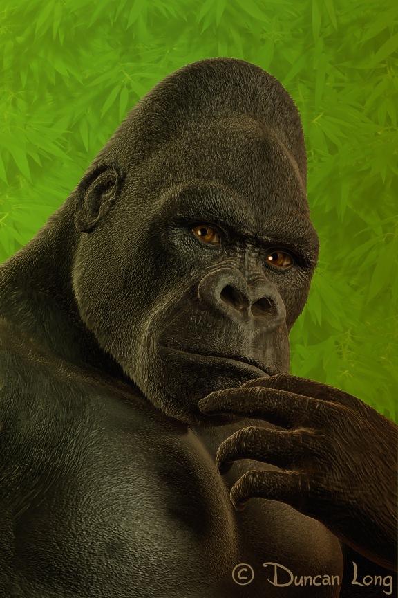
Another good example of how this works is with this painting I did of a gorilla. By giving him eyes that seem intelligent (coupled with the natural eye sockets that make gorillas tend to look like they’re about to pose a question), this guy can look sad and thoughtful — and therefore readily seems friendly to most viewers:
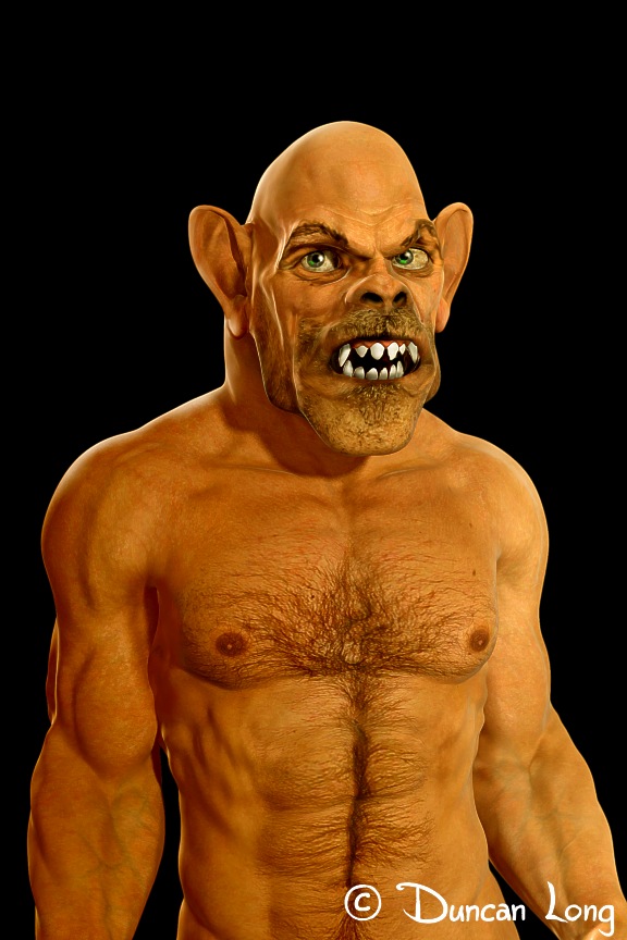
Of course human-like beasts, given a few teeth and a bit of a grimace, can also look anything but friendly. Here’s one such example who manages to look both dangerous and laughable, “What Are You Looking At?”
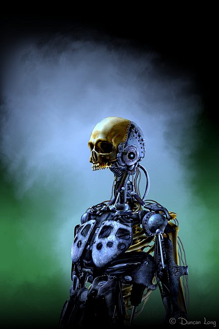
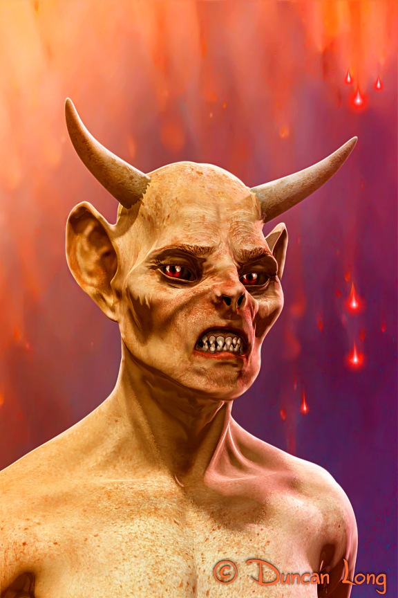
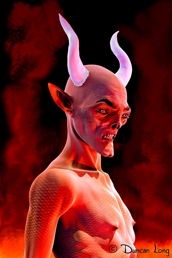
Demons and devils in artwork offer a whole lot of leeway when you’re depicting them. But even so, two horns, red skin, and perhaps scales seem to be more common than not. Here’s one such fellow I recently painted:
==================================
Whether creating monsters, demons, or fairy art for book and magazine covers, or devising less hideous characters for such use, Duncan loves working in the publishing industry. See more of his artwork at: Duncan Long’s Gallery of Book and Magazine Illustrations.