A Better Way to Sell Your Books

The Magic Book book cover artist Duncan Long creates covers that help sell your books.

For many self-publishing authors, sales have tanked due to the huge number of authors, and the fact that many are giving away their products to get a higher “sales” position (arguably 50 percent of zero is zero).

One way many authors have employed to get their books above the maddening crowd of mediocre, self published titles is by making their books look professional. People do buy books by their covers — a quality cover can sell books. Likewise, good editing, proper typography, and so form present a professional appearance that sells more books.

But there’s another important trick that I’ve discovered over the last few months.
I have one client (I do artwork for his books) who outsells my other clients by about 300 to one. That’s a big difference, especially since he has a number of books in print.

So what’s his secret?

It’s simple, but takes some time to pull off. Basically instead of promoting only each title he sells, he instead promotes himself. He has become an expert on the topics his books cover, and he regularly does guest interviews as well as having his own satellite radio program.

It’s an old trick that big publishers know and exploit. Big names sell. Hence the steady flow of ghost-written books with celebrities’ names pinned on the cover.
But my client has proven you don’t have to be a big movie star or have a”household name” to sell books. You only have to be a “celebrity” to a small but loyal fan base. Become that, and (like him) you can sell a whole lot more of your books.

So here’s my thought: If you’re an author, possibly it’s time to stop peddling books, and instead concentrate on becoming a “mini-celebrity.” An author with a loyal and growing fan base, can elevate himself above the screaming crowd of authors — and sell a whole lot more books in the process.

========================
Duncan Long has been in the publishing business for several decades. He currently is creating book cover and inner artwork to help his clients sell books. You can see his artwork at Duncan Long’s Book Cover Gallery.
Tags: , , , , , , , , ,

Comments (1)

Black and White (Grayscale) Short Story Art

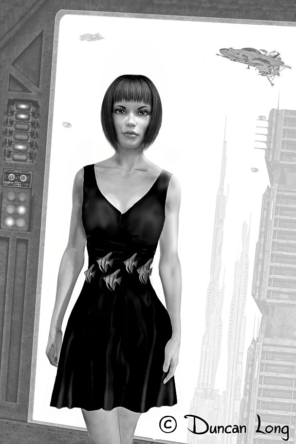
Artwork by illustrator Duncan Long for a science fiction short story.

Over the last couple of months, I’ve been working on illustrations for science fiction print magazine. As is traditional for sci-fi magazine, this publication will use only black ink on the inside pages (to reduce ink costs), the pictures therefore must be grayscale (often called “black and white” — though in fact they have all sorts of gradations between a solid black and a blank white).

The trick with B&W illustrations is to keep backgrounds, especially around characters, as close to solid black or white as possible behind the figure, so the character isn’t lost in background “clutter.” In this case, since the lady in the pictures has dark hair, a light sky in the background is perfect for making her stand out from the background.

And, yes, those are virtual, floating fish that are acting as her belt in the story (I’ll not say more less I give away too much of the plot).

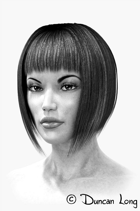
Here’s a “portrait” version of the sci-fi character, slightly angled so it doesn’t exactly duplicate her picture in the full-scene illustrations. (The editor may — or may not — use this additional picture depending on the layout and page count being aimed for).

Sci-fi magazine character art by illustrator Duncan Long

Print gives about three times as much resolution as does web artwork. Here’s a “detail” from the picture at the top. This added detail is one of the things that makes print magazines more popular than e-publications for many readers, especially when it comes to those books a magazines that have illustrations.

Detail picture for science fiction magazine story - art by Duncan Long

=============================

Duncan Long is a freelance illustration who has done artwork for Asimov’s Science Fiction Magazine, Amazing StoriesMuse Magazine, and many other publishers. You can see more of his artwork at: Duncan Long’s Book and Magazine Illustrations.

Tags: , , , ,

Comments Off on Black and White (Grayscale) Short Story Art

Yes, I Create Dragons for Book and Magazine Covers

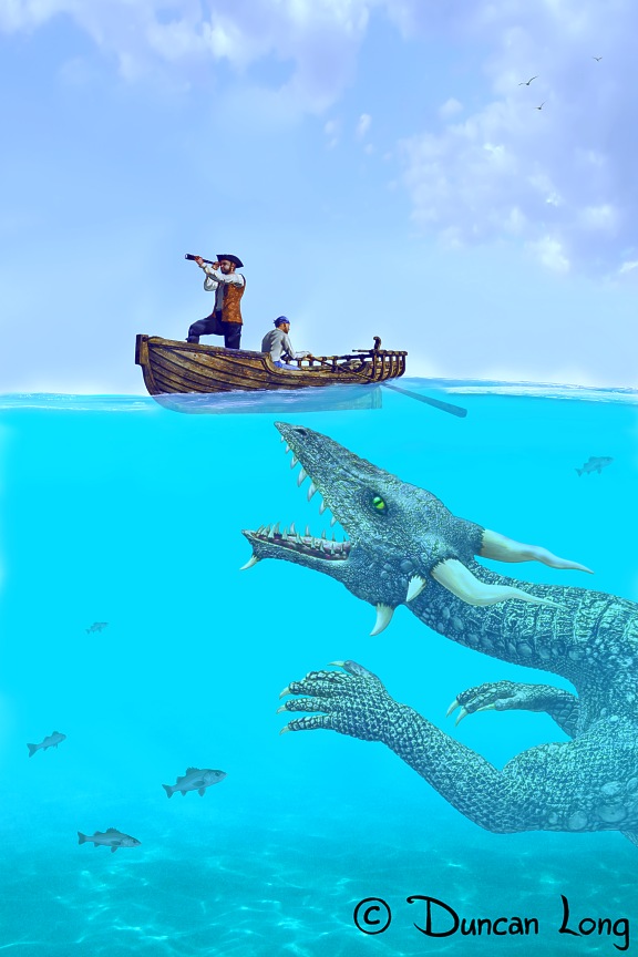
Sea Serpent Saga - dragon illustration by artist Duncan Long

Dragons, like the water dragon above (about to snatch a pair of pirates), are not easy to paint. Their complexity makes an artist devise painting shortcuts and hone his skill. And while dragons may be mythical creatures, everyone seems to have a pretty specific idea of what they should look like. And if the artwork is off even a little, critics high and low will be left howling. (And what artist likes howling critics?)

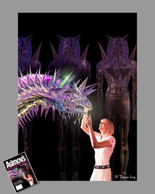
So over the years I’ve worked at my “dragon painting skills.” One of the first commercial successes I enjoyed with my dragon artwork was a “crystal dragon” for the cover of Asimov’s Science Fiction Magazine. Here’s the result of that work:

Illustration for Union short story -- artwork by illustrator Duncan Long for Asimov's Science Fiction Magazine64

Since then, I’ve worked on a variety of more “traditional” dragons for several book projects. Here’s one of those dragon illustrations (with, of course, a princess to feed him an apple, perhaps at risk to her hand).

Painting - Feed the Dragon - art by illustrator Duncan Long

Sometimes dragonish creatures appear in science fiction stories as well as in fantasy and fairy tales. These allow a little more leeway in creature design since viewers are willing to imagine less traditional monsters in their stories.

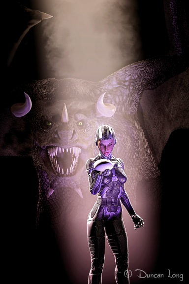
Here’s one such creature ready to snap up an android who has one of its eggs. Or perhaps you can make up your own story for this one (the illustration has no “home” yet on a magazine or book cover, so feel free to create your own legend to go with it).

Dragon's Egg artwork by book cover artist Duncan Long

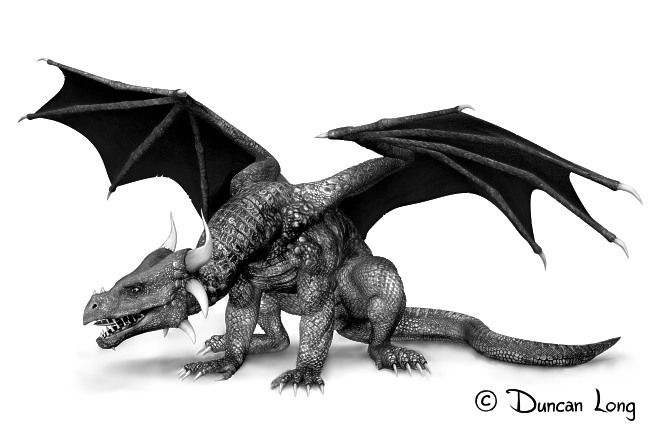
Finally, a black and white dragon (below) that became an inner illustration for a book about demons and supernatural creatures. This picture worked well as a book illustration, but I discovered (after finishing it), that the viewpoint angle has a lot to do with the viewer’s perception of size with dragons. Reptiles tend to maintain the same ratio of head size from tiny newbie to a giant old centenarian. Too, because a dragon’s size varies from one story to another, there’s no clear “scale” to their size. The creatures may be the size of a skyscraper in one tale, and a tiny creature sitting in the hand of a child in the next.

So here’s what I’ve realized. In addition to “scaling” a dragon’s size with buildings or human forms, we tend to judge their size by the viewing angle. Thus “viewing” downward on this creature (as in this drawing) tends to make it seem small. It isn’t hard to imagine an outstretched hand holding it.

At least not for me. And maybe that will be my next dragon project.

dragon2e drawing for a inner book illustration by artist Duncan Long

============================

Duncan Long creates illustrations for books and magazines, both for covers as well as inner pages. You can see more of his artwork at Duncan Long’s Online Gallery of Fantasy and Science Fiction Artwork.


Tags: , , , , , ,

Comments Off on Yes, I Create Dragons for Book and Magazine Covers

Book Cover Artwork Reveal

Book cover illustration by artist Duncan Long

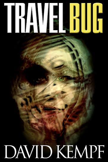
Here’s my illustration for David Kempf’s new novel (with lettering by Kib Prestridge).

Creating this picture took me down a different route than I commonly use in creating my artwork. This picture is a “composite” of two faces, a computer circuit board, and the air grill on a computer. The various elements were layered, and then nudged, color adjusted, and reworked until everything fit together.

Sort of.

In a terrifying way that seems to go beyond the “uncanny valley” and into the “valley of the shadow of death” perhaps.

The result is an unsettling attention getter that should serve Kempf’s new book well.

========================

Duncan Long is a book cover illustrator. You can see more of his artwork here: Duncan Long’s Gallery of Book Cover Artwork.

Tags: , , , , , ,

Comments (1)

Dieselpunk Artwork (for Book Covers), Part III

Mountain dreams - Dieselpunk artwork by illustrator Duncan Long

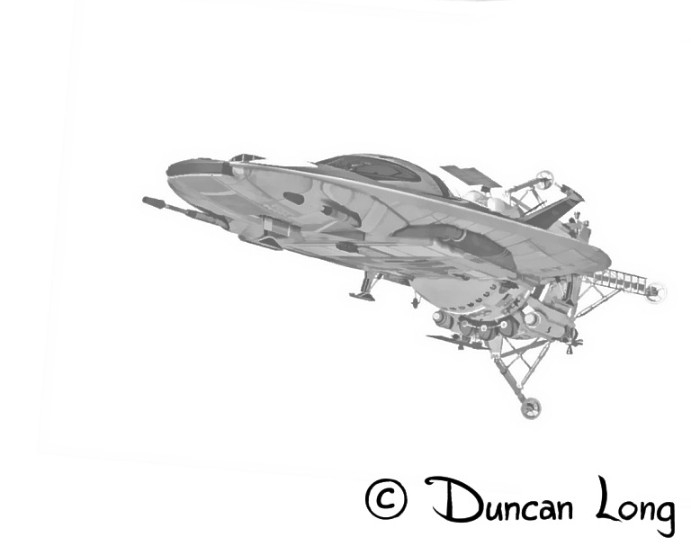
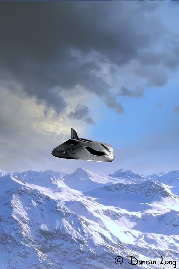
One final installment (for a while) to show off some of my Dieselpunk artwork. The pictures in this post are all artwork created for Stephen Quayle’s Empire Beneath the Ice. Above is the “Dorn” aircraft that the Nazis were working on during the end of WWII (and rumored to have become operational following the war — as detailed in Quayle’s fascinating look at history in his book).

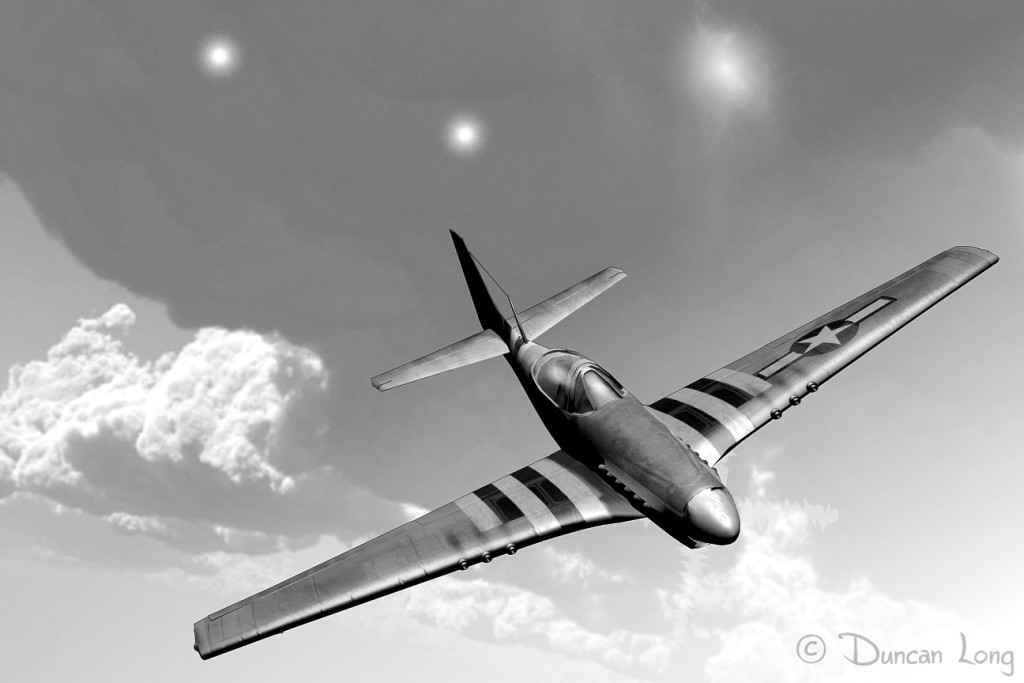
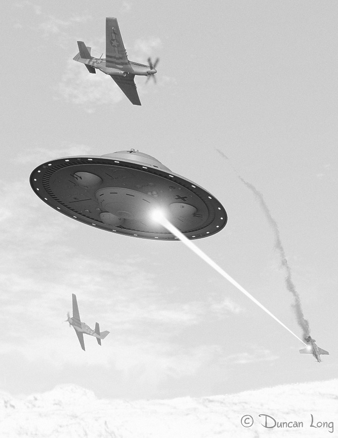
Below is another illustration for Quayle’s book, this one of a US Mustang fighter plane being pursued by the “Foo Fighters” that Allied pilots often saw in the skies over Europe, and which many airmen suspected were secret Nazi flying machines of some sort.

Book Illustration: Foo Fighters following a US Mustang fighter plane

Below is my concept of a battle in Antarctica between Nazi saucers and the US fighter planes that were part of Admiral Richard E. Byrd’s “Operation Highjump” mission in 1947.

UFO air battle with US fighter planes - book art by illustrator Duncan Long

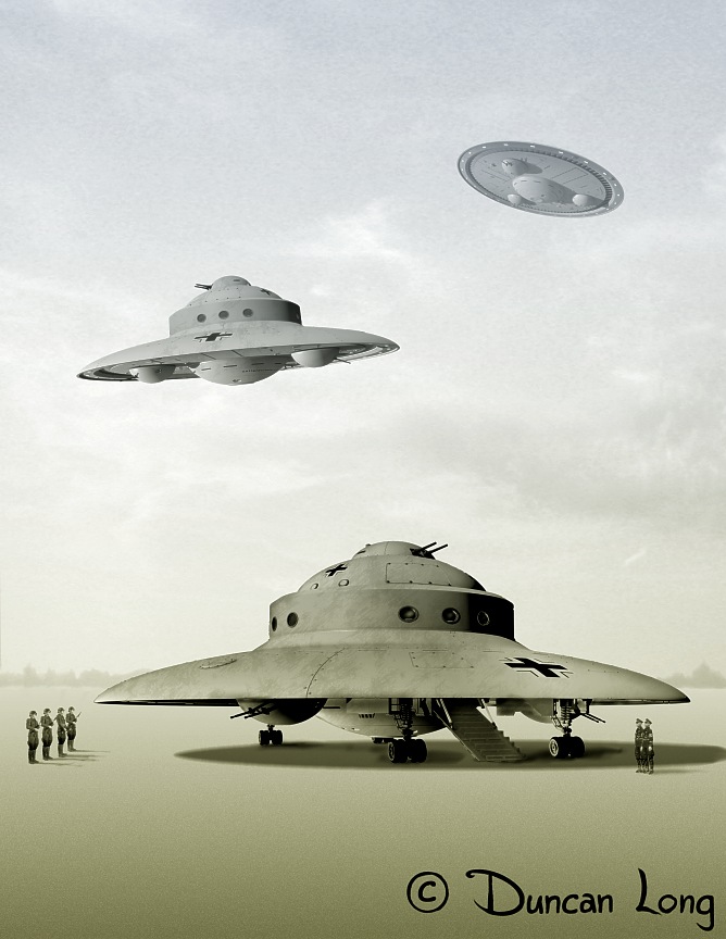
Some of the illustrations I did were designed to show the scale and overall design of Nazi saucers. Below is the “Haunebu II,” displaying the saucer from below, the side, and on a landing field. The addition of soldiers helps provide scale for the viewer.

Haunebu II illustration showing the Nazi saucer from below, a side view in the air, and on a landing field.

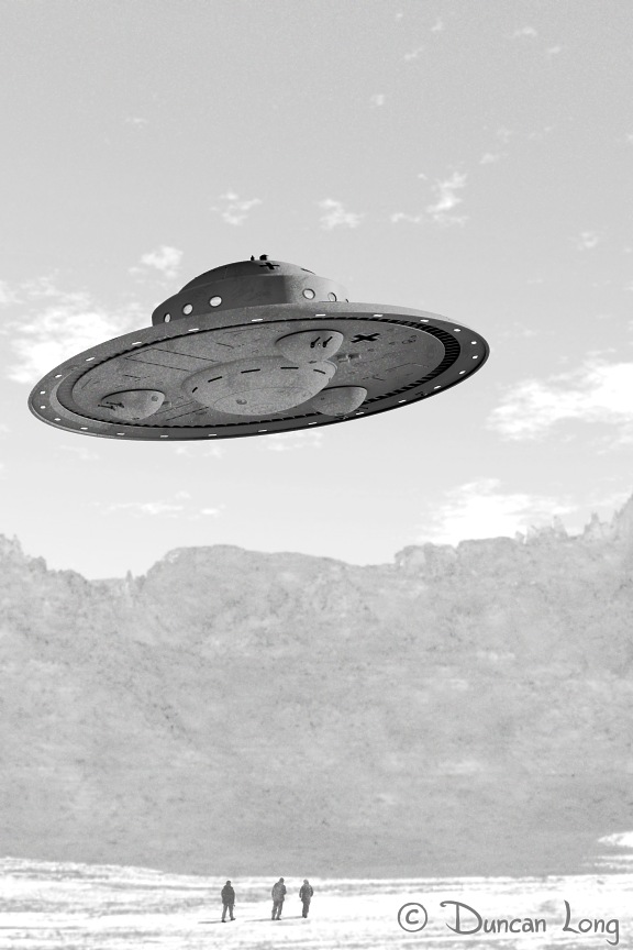
Below is another illustration I created of the Haunebu II saucer.

Drawing by illustrator Duncan Long of a 1947-vintage Nazi UFO.

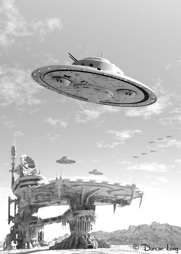
Finally, here’s an illustration I created of a Nazi saucer base in Antarctica. I added a formation of WWII German aircraft in the background to tie it both to history as well as give it more of a past appearance rather than futuristic. The black and white pictures also helped anchor the scene with the past.

Illustration by graphic artist Duncan Long of a Nazi Saucer Base in Antarctica

=============================

Duncan Long is a freelance magazine and book cover illustrator. You can see more of his artwork at: Duncan Long’s Book and Magazine Art.


Tags: , , , , , ,

Comments Off on Dieselpunk Artwork (for Book Covers), Part III

Dieselpunk Artwork (for Book Covers), Part II

Nazi base Diesel Punk book cover by illustrator Duncan Long

When writing my previous post about Dieselpunk artwork, I forgot the artwork I did about a year ago for Stephen Quayle’s Empire Beneath the Ice. These illustrations arguably fall into the Dieselpunk spectrum (in this case, uniting Nazi weapons, uniforms, and such with the German work on perfecting flying saucers at the end of World War II).

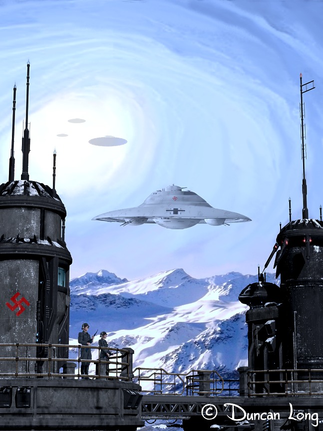
Above is the original book cover illustration I created for Quayle’s tome, combining both the look of a WWII movie coupled with the sci-fi elements of a fleet of UFOs.

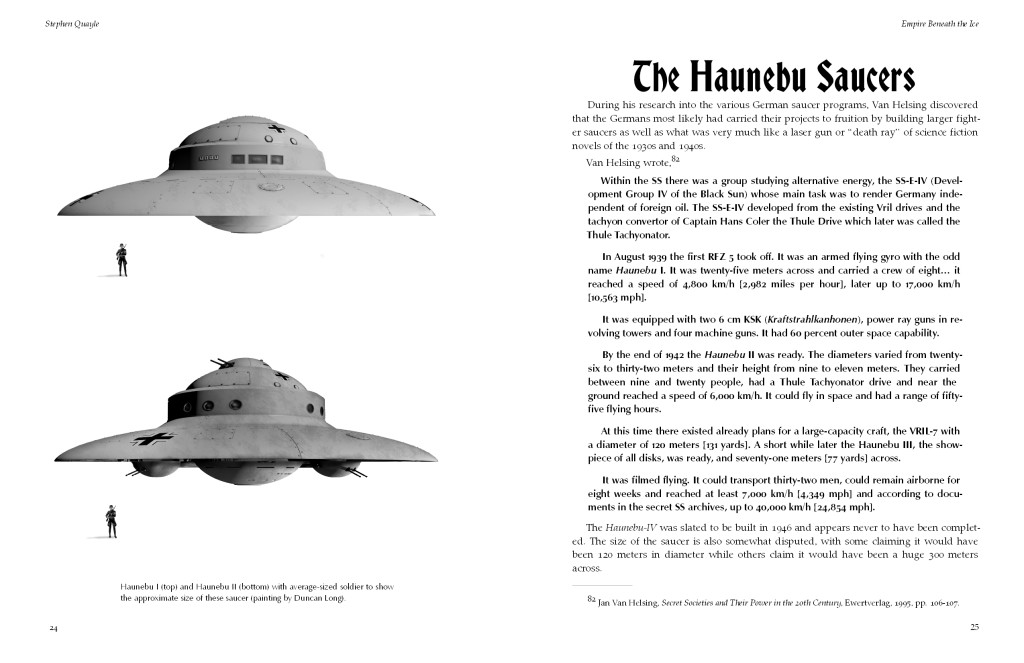
Shown below is the layout I did for the text, with a couple of my saucer drawings (with a Nazi soldier to provide scale). I also created a black lettering, Schwabacher style font for the headings in the text. The trick in creating the typeface was to rid it of the excess clutter so it became easily discernible to modern readers while still keeping a “German” feel to it. Hopefully I achieved that to some measure.

Empire layout layout of dieselpunk art by Duncan Long for Empire Beneath the Ice

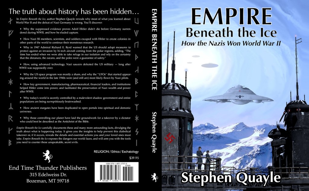
Here’s the final layout of the front cover. I also created a Runes font (which the Nazis were into due to its links to the Aryan races) for the two columns on either side of the back text. A modified Palatino typeface paired with Zaph Humanist was employed for lettering on the cover; I also used these two typefaces along with the Schwabacher style I’d created for the text layout.

All in all it was a massive project, but a lot of fun.

Plus, it was my first venture into Dieselpunk artwork.

Wrap-around dieselpunk book cover by artist Duncan Long

================================

Duncan Long is a freelance artist and graphic designer who creates illustrations for historic and most genres of fiction novels including mystery, science fiction, and fantasy. You can see more of his book and magazine illustrations at Duncan Long’s Online Art Gallery.


Tags: , , , , , , , , , , ,

Comments Off on Dieselpunk Artwork (for Book Covers), Part II

Dieselpunk Artwork (for Book Covers), Part I

War Women Dieselpunk artwork by Duncan Long

Dieselpunk is a science fiction genre that’s recently gained in popularity. It’s not actually new — there are throwbacks here and there, with alternative timelines and the like in science fiction movies and books. But it’s new to many readers and movie goers who are running into it today.

The Dieselpunk genre generally employs a combination of gasoline/diesel technology of the first half of the 20th Century with the retro science fiction designs seen in the 1930s-1950s. Often the “good guys” employ guns and machinery common to this period while the bad guys are armed with more futuristic things like rocket ships, death rays, and robots.

So basically if you have a story that you mix in a little of the original Flash Gordon or Buck Rogers sci-fi elements with World War II machinery and you’ve got the look and feel of Dieselpunk. (Two good examples of the genre can be found in a recent version of this “found footage,” 1917-style War of the Worlds video as well as in the movie Sky Captain and the World of Tomorrow).

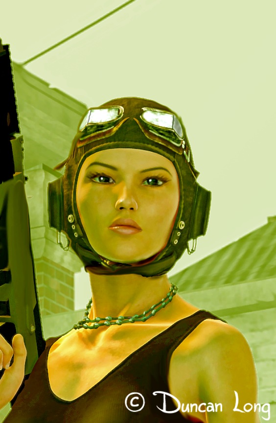
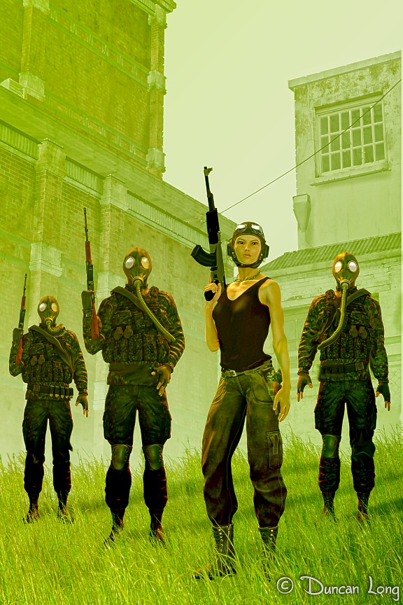
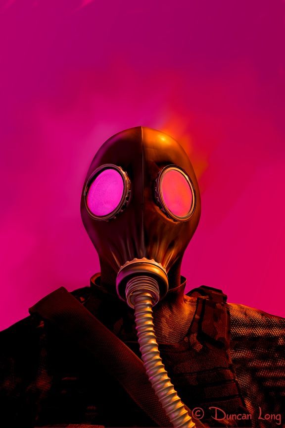
That said, I’ve been playing around with this style a bit (hoping to eventually land a book cover contract for some artwork in this style). Thus far, I’ve mostly employed some vintage gas masks, a WWI/WWII-era flier’s helmet, and some mid-20th Century machine guns. But it is rather amazing what a gritty feel can be achieved with just these elements.

Here are a few of my experiments, some of which I’m hoping will ultimately find their way to book covers.

Zombie hunters Dieselpunk art by illustrator Duncan Long

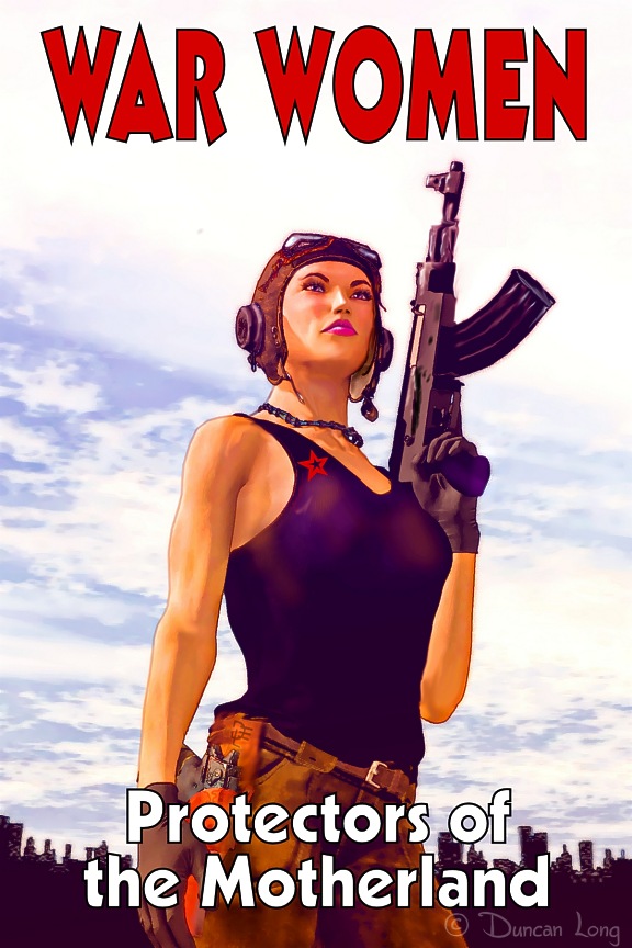
The AK-47, as its name suggests, was an automatic rifle created in 1947, which makes it a candidate for Dieselpunk artwork. Hence the guys and gals armed with this weapon.

Zombie hunters Dieselpunk book cover art by illustrator Duncan Long

The old Soviet gas mask design also appeared at the tail end of the 1940s, making it ideal for Dieselpunk artwork.

zombie warrior Dieselpunk book cover illustration by artist Duncan Long

=============================

When not experimenting with artwork for various genres of science fiction book covers, Duncan Long creates a variety of illustrations for magazines and books. See more of his art at Duncan Long’s Online Gallery.
Tags: , , , , , ,

Comments Off on Dieselpunk Artwork (for Book Covers), Part I

More B&W and Grayscale Book and Magazine Art

Character2_Black and White Book Illustration

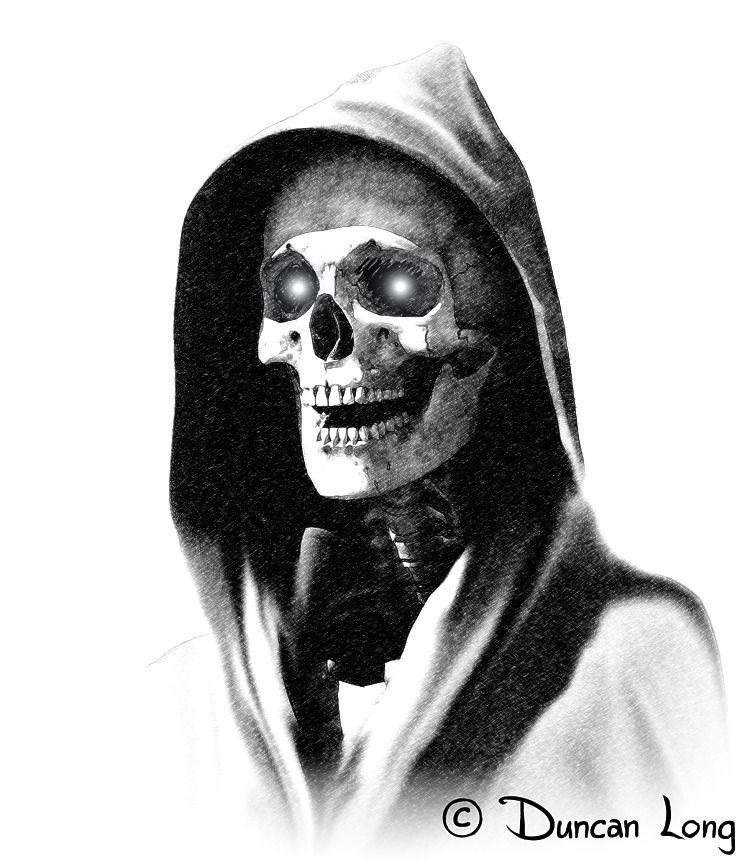
As noted in my previous post, black and white art is making somewhat of a comeback in novels and magazines (especially genre magazines). These illustrations act as “value added” enticements for greater sales, while adding only a little in expenses since the same black ink used for printing text will give fine results with grayscale pictures.

Above is a recent book illustration. Below is “Death” who appears in my Lighting War collection of short stories.

Wager - death Black and White Book art

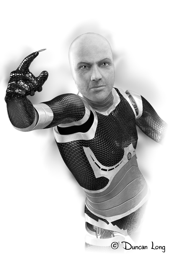
Here’s a cyborg I created for a short story in a sci-fi magazine:

Awake - cyborg b&w picture for a sci-fi magazine

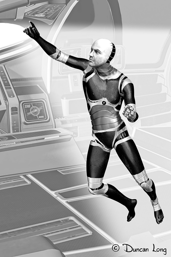
And a slightly different pose/angle illustration of the same character with a more detailed background:

Awake-Black and White Magazine Illustration

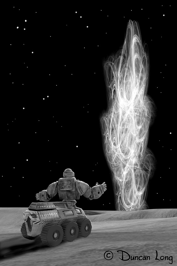
Finally, an illustration of a small rover (with artificial intelligence) who makes a strange discovery on a distant planet:

Sounding Cataract-Black and White science fiction magazine art

=============================

Duncan Long creates black-and-white illustrations (as well as color art) for books and magazines. You can find more examples of his artwork at: Duncan Long’s Artwork.

Comments Off on More B&W and Grayscale Book and Magazine Art

Black and White Book and Magazine Illustrations

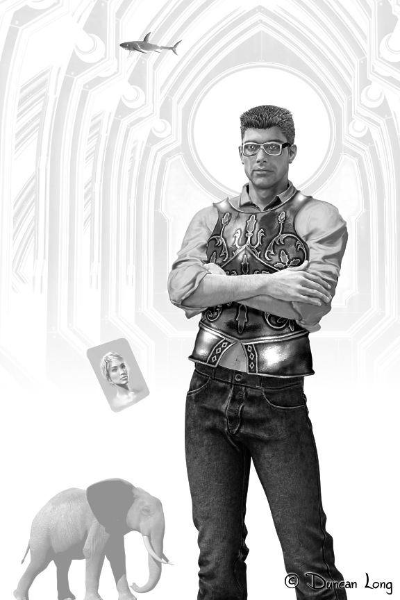
Bob the Hipster black and white illustration for a magazine

For many years, magazines and books used black and white or grayscale illustrations in their text. This cut the printing costs since only one ink was being used, while still supplying some visual interest, as well as capturing buyers who leafed through the publication at a newsstand.

Over the years, these illustrations pretty much vanished from novels, gradually being reduced to just a front plate picture or perhaps a partial sketch in the front matter of the book, and then finally all but vanishing.

But today, with a huge number of books going into print, many presses as well as self publishing authors are discovering that they can gain some extra “value added” pull by placing a few pictures in the text. And in today’s competitive market, such extras can translate into more enjoyment for the reader, and also added sales. As the old saying goes, “Every little bit helps.”

Here are a few B&W pictures I’ve recently created for various books and magazines.

And, yes, I would enjoy creating some for you, too.

Fight f - black and white art for a magazine

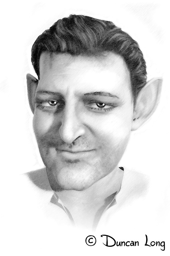
Here’s a little dwarf created for a short story “The Medical Emergency” in my Lightning War collection:

medical emergency dwarf black and white illustration for a book

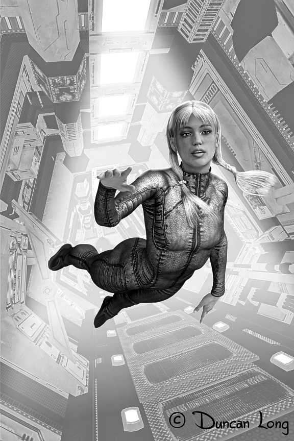
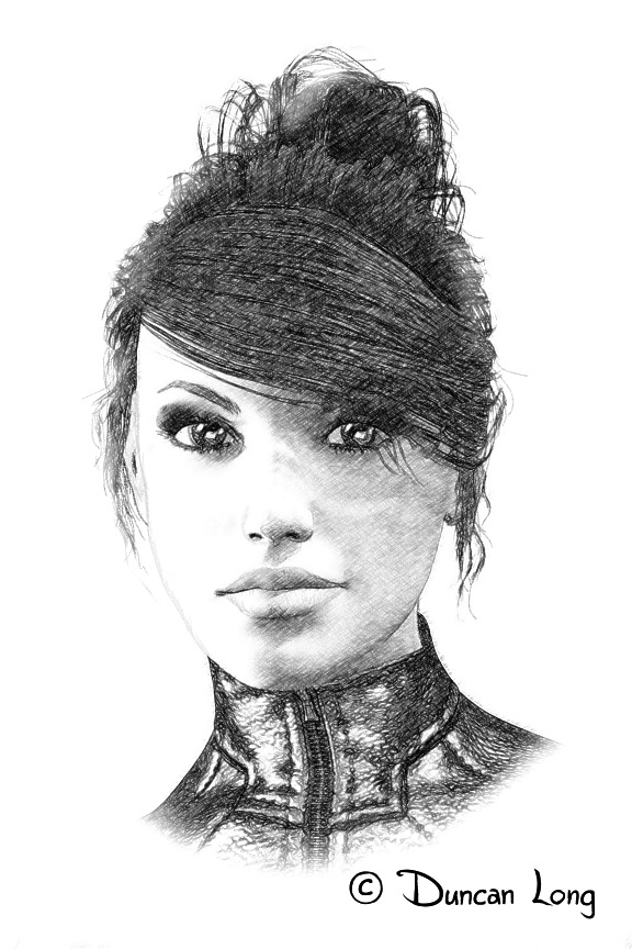
This is “Nikki” who appears in the science fiction novel Antigrav Unlimited 3.1:

Nikki - black and white art for a novel

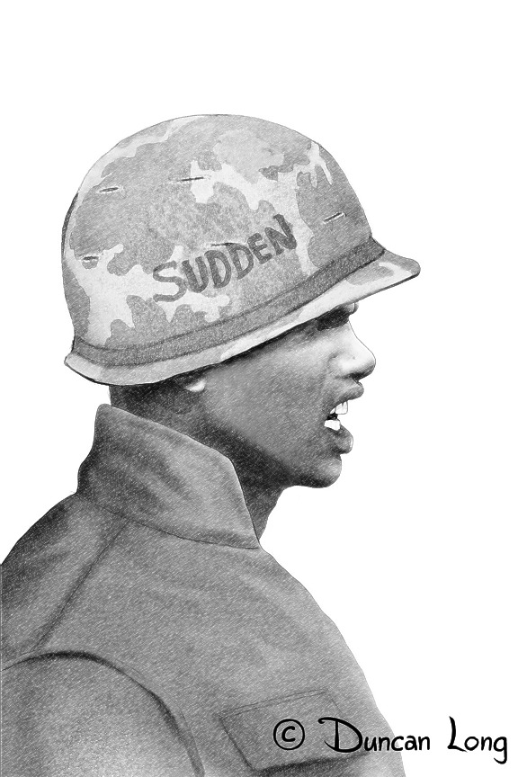
And, finally, “Sudden,” another character in a short story in Lightning War:

Sudden c low res black and white illustration for a book

===============================

Duncan Long is a freelance illustrator (and sometimes writer) who creates black and white artwork for use in magazines and books. See more of his artwork at: Duncan Long’s Portfolio.


Tags: , , , , , , ,

Comments Off on Black and White Book and Magazine Illustrations

My Cover Illustration for SQ Mag

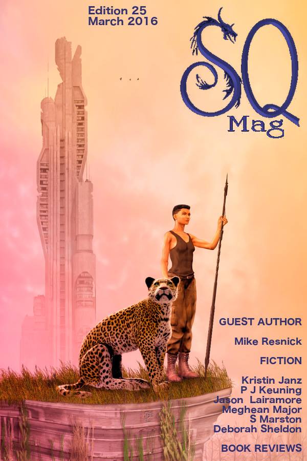
Cover illustration for SQ Magazine - with lettering - by cover artist Duncan Long

I had the honor of creating an illustration for the cover of the March, 2016 edition of EQ Mag. Above is the final layout. (And you can read the whole issue of the e-magazine is online for free here: March 2016 SQ Magazine).

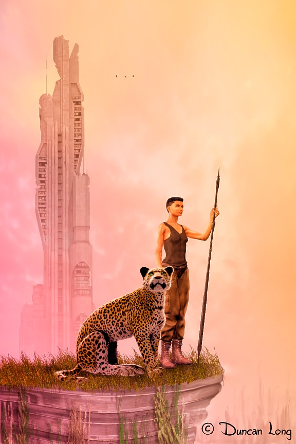
The cat and gal both started as 3D figures, posed, lit, and rendered to create reference “photos” that I employed to digitally paint the final illustration. The big plus of using 3D models this way is that the perspective, shadowing, and anatomy are all pretty much automatically there. That saves a lot of time (and time is important both in making money as well as in rapidly delivering the needed artwork to a publisher in a timely manner — especially with deadlines seemingly getting shorter and shorter).

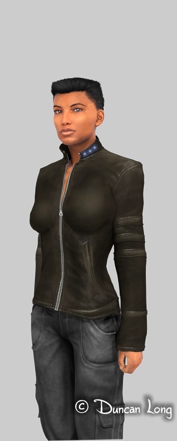
I had already created a 3D figure to employ as the female character in this picture. Here she is with a different pose and outfit:

Character created by illustrator Duncan Long for EQ magazine cover

Most of my artwork has pretty intense colors. I decided to use a more pastel palette for this illustration and the results are warm and spring-like (which I color picked from an old photo of the sky after a thunderstorm which I’d taken years ago) — in keeping with a March issue, perhaps.

Here’s the final magazine cover artwork sans lettering:

The Explorers - magazine cover art created by illustrator Duncan Long

========================

Duncan Long is a magazine and book cover illustrator, with artwork appearing on the covers of Asimov’s Science Fiction Magazine and Amazing Stories magazine as well as on books from HarperCollins, Pocket Books, and many other presses and self-publishing authors. See more of his art at: Duncan Long’s Portfolio of Magazine and Book Cover Art.


Tags: , , , ,

Comments Off on My Cover Illustration for SQ Mag