Starscapes for Book Covers and Magazine Illustrations

When I was a kid, the light pollution from mercury vapor lamps on farms as well as street lights from nearby urban areas wasn’t too bad yet, and we could sit in our backyard, look up, and see the Milky Way in the night time sky along with innumerable closer stars. We even spotted a polar spy satellite one night (long before any were officially in orbit — we never learned whether it was Soviet or American). It was truly an amazing sight and one of the things I miss about modern-day America where only the brightest of stars can be seen in more areas.

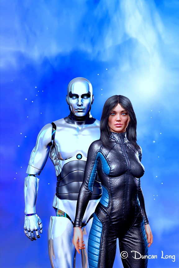
Possibly these memories are what inspires me (in part at least) to create a variety of starscapes for my book cover and magazine illustration work. These pictures seem always to strike a chord with viewers as well.

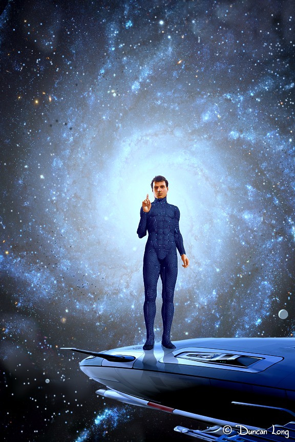
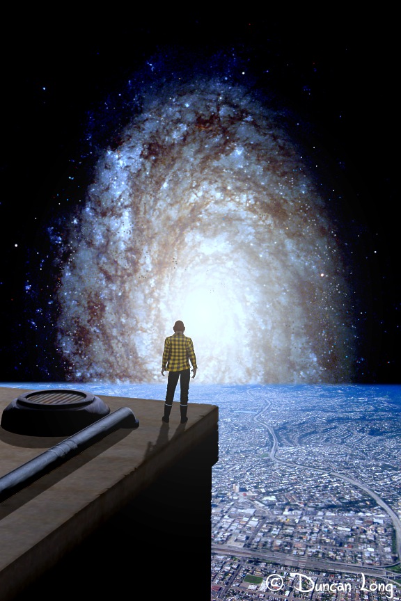
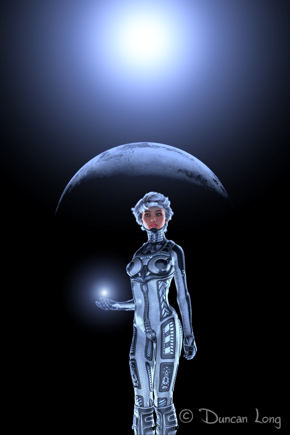
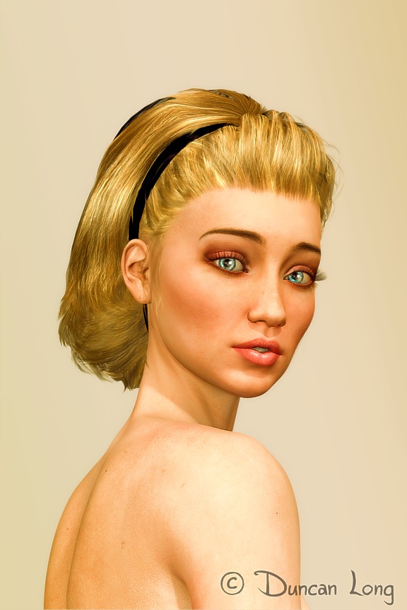
I’m posting four of these illustrations here today.

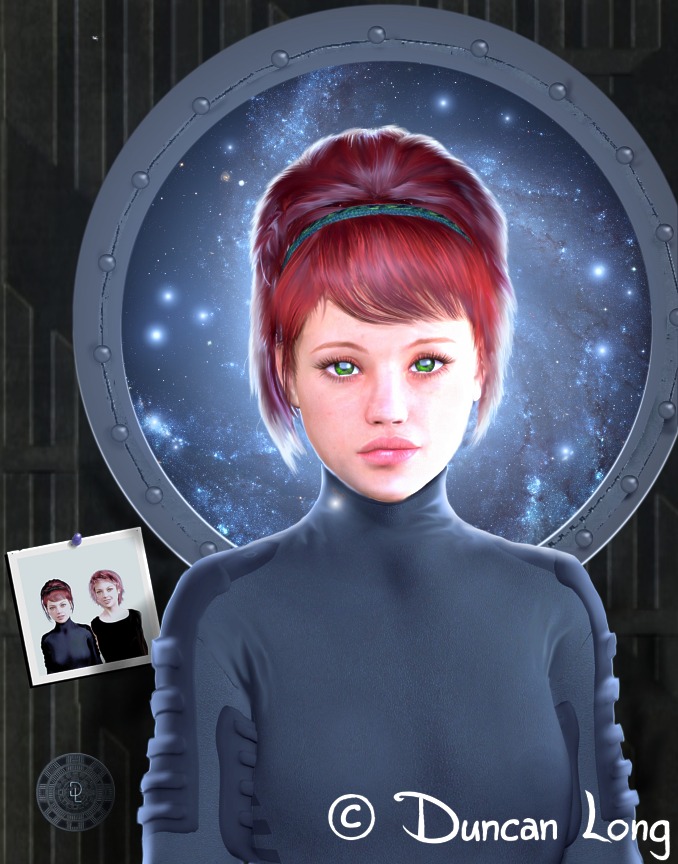
The one below was created for a short story in Muse magazine (about twins who age at different rates as one journeys on a faster-than-light spaceship and the other remains on Earth).

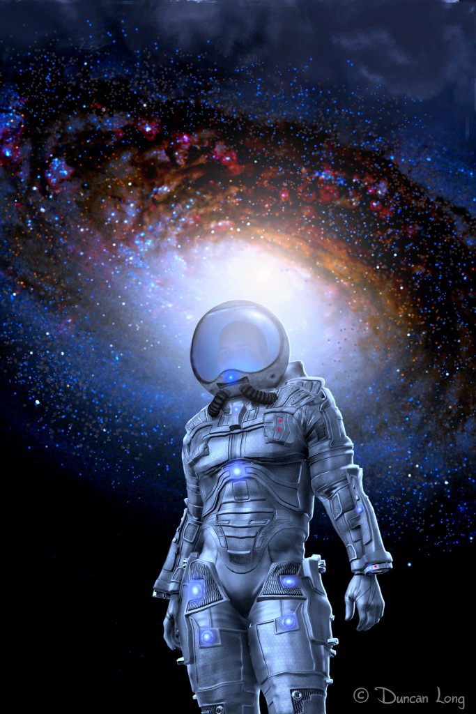
The picture at the top of this post (as well as the one below) haven’t found homes yet. But I’m hoping these illustrations will eventually grace the cover of a science fiction novel or magazine.

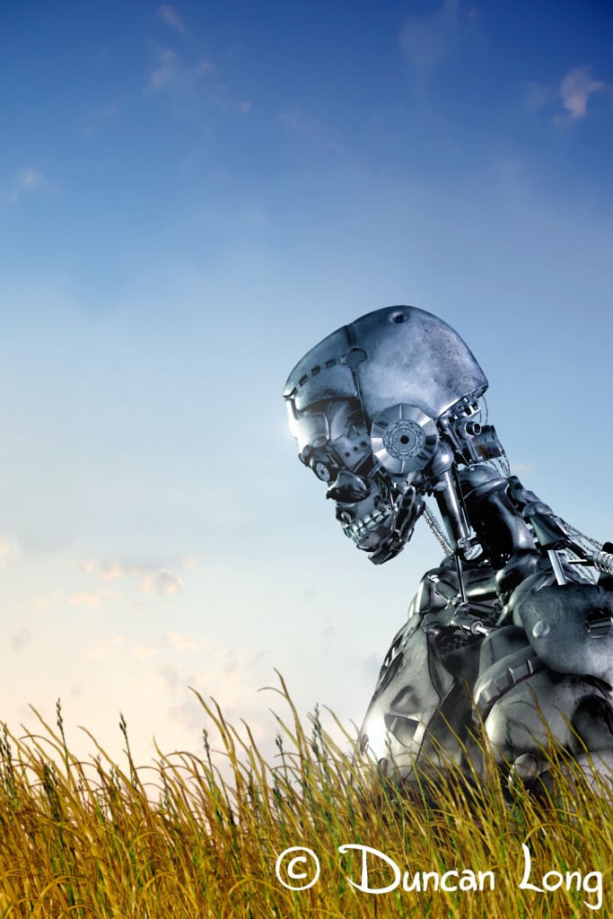
The illustration below found its way to a book cover: The third installment in Richard Thieme’s Foam trilogy.

========================

When not missing the night sky of his youth and painting starscapes, Duncan Long often creates other science fiction and fantasy illustrations on a variety of subjects and themes. You can see more of his artwork (including other starscapes) at Duncan Long’s Online Gallery.

Tags: , , , , , , ,

Comments Off on Starscapes for Book Covers and Magazine Illustrations

Yes, I Can Create a Spacesuited Gal for Your Sci-Fi Book Cover

Space GLobe - book illustration by Duncan Long

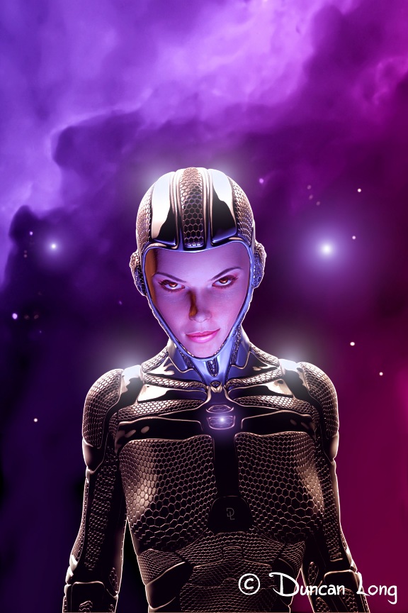
Lately, I’ve been employing 3D character creation for realistic book cover and magazine illustrations — sort of “photographs of the impossible.” The obvious big plus here is that I can offer the realism of a photo while creating art that would be impossible (or very expensive) to photograph.

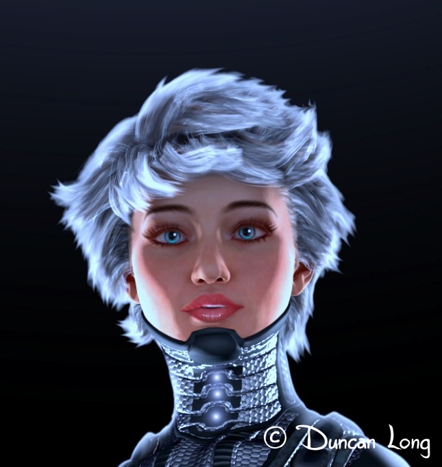
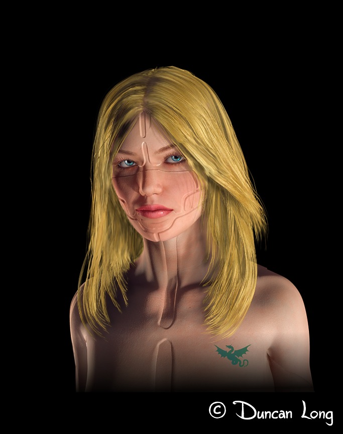
This process of creating science fiction book cover art or a magazine illustration like the one above starts with the creation of a basic character like this one:

Ceegee - character portrait to establish the character's appearance

Once her basic features are to my (and my client’s) liking, the proper hair and costume can be added to give her a more sci-fi appearance:

Space GLobe character with proper hair, lighting, and costume

When costume and hair are finalized, I’m ready to create an illustration with the character posed and lit properly along with a background that goes with the story. Soon, we have a book or magazine illustration.

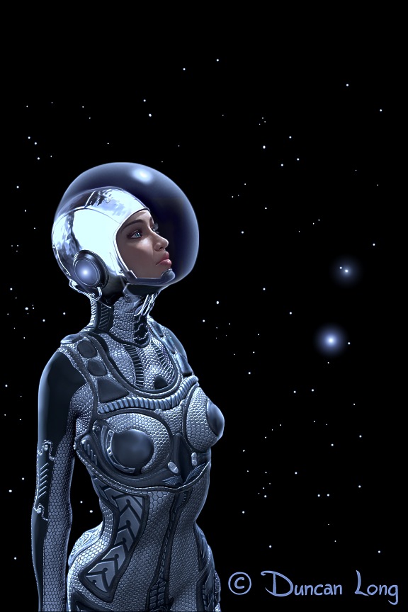
The big plus of these 3D characters (in addition to their realism) is that they can be posed in any of a variety of ways with the “lights and camera” placed creatively as well. Thus this space-suited character can be used as the basis of a digital painting like that at the top of this post, or (by painting in a clear plastic helmet faceplate and giving her a space cap) viewed from the side like this:

Gaze Into Space artwork for book cover

================================

Illustrator Duncan Long creates artwork to illustrate stories in books and magazines. You can visit his online portfolio here: Duncan Long’s Portfolio of Science Fiction and Fantasy Art.

Tags: , , , , , ,

Comments (3)

Yes, I Can Create Weird Creature Art for Your Story

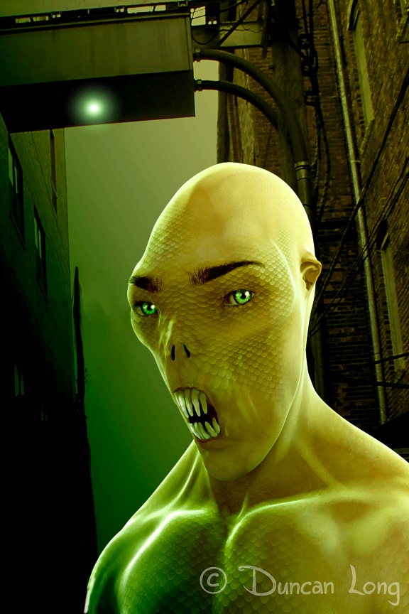
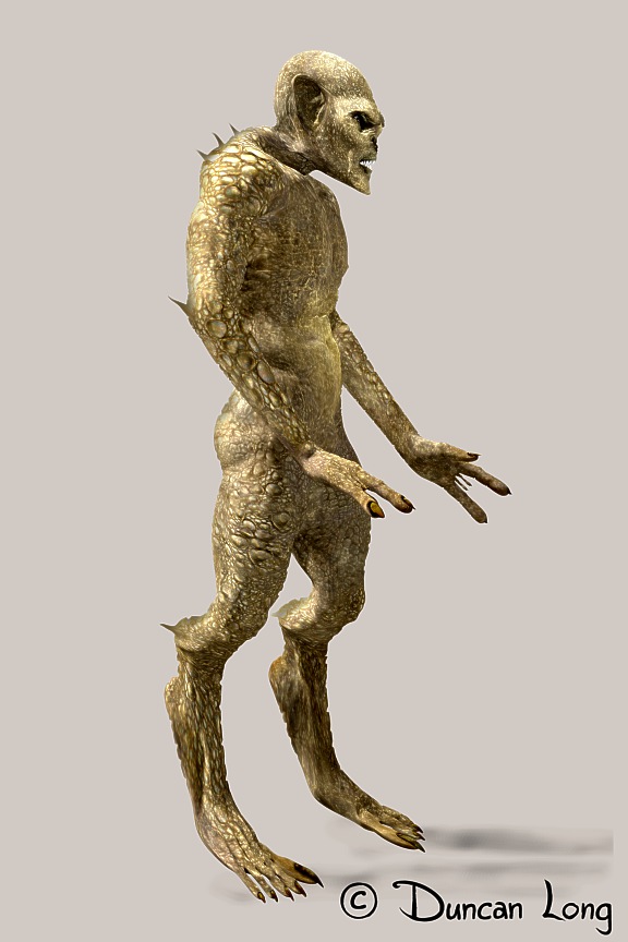
Night Creature creature artist Duncan Long's creation for a book cover

Sometimes, some pretty strange characters need to be illustrated for book and magazine stories. Whether science fiction, fantasy, or horror, often a weird monster (big or small) is key to the plot as well as hooking a reader.

So I find myself assembling some pretty strange characters when illustrating such stories. As of late I’ve been creating 3D models for this purpose. While the initial work is harder, the payoff is a figure that can be posed and have its “lighting” altered to make a very realistic picture — or series of pictures.

And if a pose or the lighting isn’t quite to a client’s liking, changes can be rapidly made to get things just right.

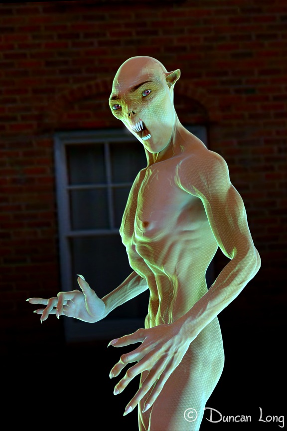
For example, the “Night Creature” above can be relit, posed, and have a background added to create the creature pictured below:

Night creature illustration by book cover artist Duncan Long

Another plus of this process is that I can make a quick “render” of a figure I create and send the resulting picture as an email attachment to a client. This makes sure we’re on the same page before I start the final illustration. If the creature needs a tweaking, it’s easily done at this point and little time is lost in the process of creating the book or magazine artwork. Here’s the “full body shot” of a 3D character:Demon 8 demonstration render by magazine illustrator Duncan Long

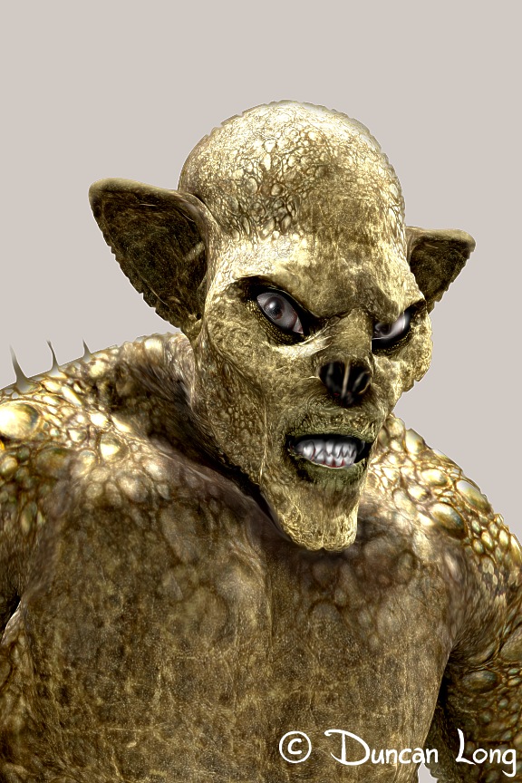
And here’s the same creature in a “closeup portrait” shot.

Demon 8 reposed to glar at the viewer - artwork by Duncan Long

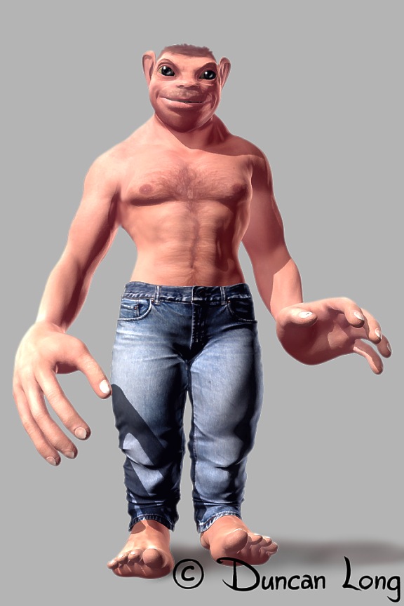
Here’s another weird creature:

chip 3 book story creature by Duncan Long

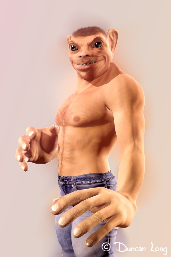
And from another angle…

Chip the Alien magazine art by illustrator Duncan Long

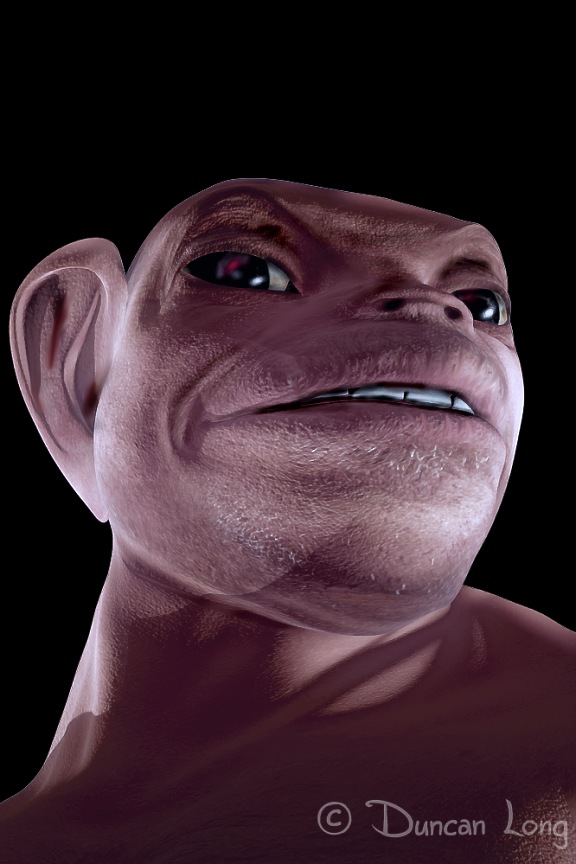
Now notice how this “cute” creature becomes ominous with the proper lighting:

Chip 2b with ominous lighting to give a more monstrous look.

Once the creature’s design has been finalized, I can then move to the actual illustration work with suitable lighting and background in place along with any weapons, clothing, or other features the creature needs to have. This process results in a creature tailored to the writer’s story, with a step-by-step process that is both rapid and also pretty painless for both the artist as well as the author and publisher.

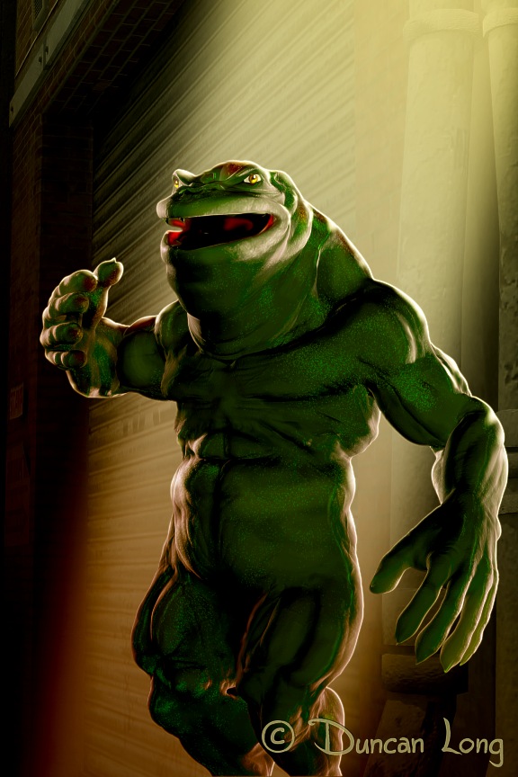
Here’s one such final picture: “Killer Toad.”

Plan 10 - Killer Toad book cover creature with final lighting and pose - illustration by Duncan Long

=============================================

Duncan Long is a freelance magazine and book illustrator, working for indie publishers as well as large presses. You can see more of his artwork at his Online Gallery.

Tags: , , , ,

Comments (3)

From Character Creation to Book Cover Art

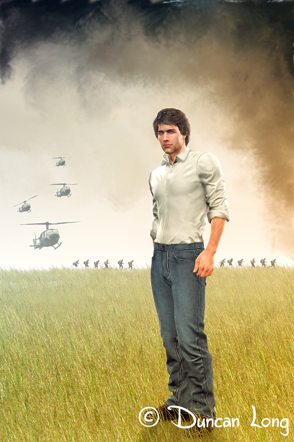
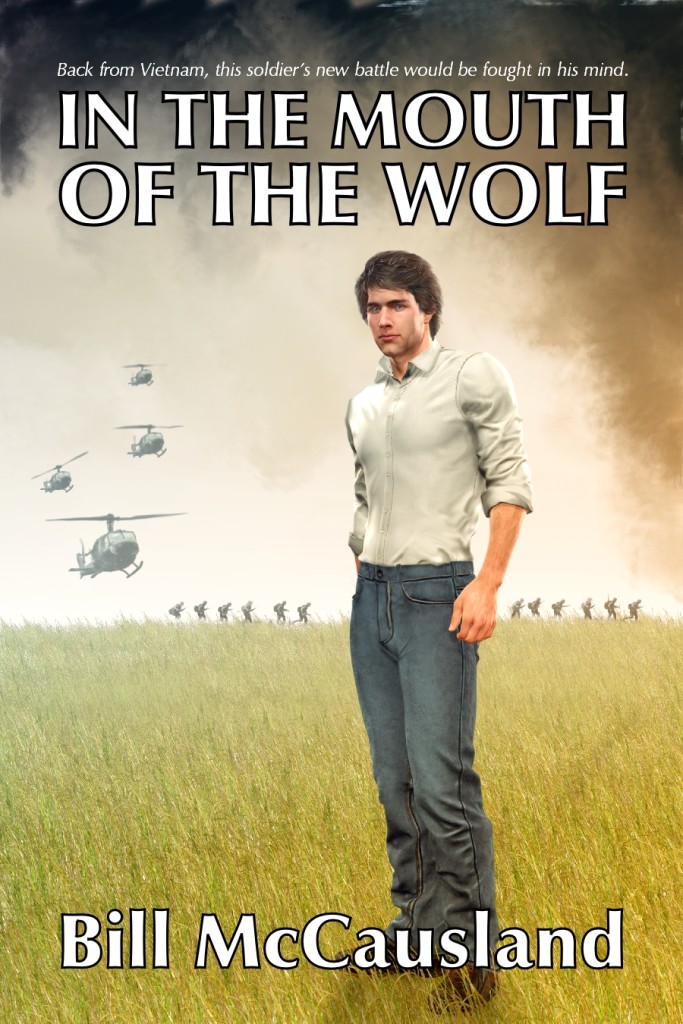
Bill McCausland Book Cover illustration

Once a character design is settled on (you see how I go about doing this when working with an author and/or press in my previous blog post: 3D Modeling and Book and Magazine Art), we are ready to move on toward actually creating the final cover illustration (like the one shown above for Bill McCausland’s novel In the Mouth of the Wolf).

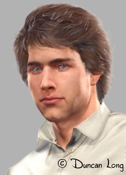
My next step after finalizing the basic character is to create another “sketch” like the one shown below, which tacks down the character’s expression and hair style.

Characer detail design for book cover art

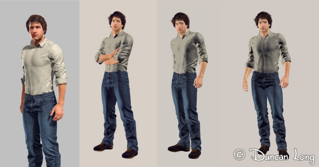
Once that is finalized (along with his costume — in this case casually dress with jeans, shirt, and sneakers) and gets the client’s OK, we must determine the pose. Since I was working with a 3D model, I was able to quickly pose the character and create the low-resolution renders below.

Character poses for a book cover illustration

The author liked the third pose, so (after discussing several ideas for what might be a suitable background) I was set to create the whole illustration.

The beginning of the story is set in Vietnam during the US involvement there in the 1960s/1970s, so I opted for a simple design that gave a hint of what a bit of the story would be about, while leaving the character in the foreground in very un-soldier-like clothing and hairstyle. By keeping the background sort of foggy/hazzy and obviously a battle scene, with the foreground very un-militaristic, the result is a dreamlike picture that hopefully suggests a memory or flashback.

After I’d painted in various elements of the scene and added/modified the render of the character to the foreground, my next step was to create a “dummy” (mockup of the cover) with lettering so the press and author could see how everything could fit together in the final a cover layout. This is the point where I cross my fingers and hope my “vision” of the cover is what the client wants to see as well.

In this case, everyone liked the results so I created a final, polished version of the picture at print resolution, and sent it to the press for the final layout of the book cover.

Bill McCausland Cover Mockup with art and lettering

===============================

Duncan Long is a freelance illustrator who creates book and magazine illustrations for indie publishers, self-publishing authors, and large publishers. See more of his artwork at Duncan Long’s Online Portfolio.

Comments (1)

3D Modeling and Book and Magazine Cover Art

Painting created using 3D model as reference for book cover figure.

Over the last couple of years, I’ve shifted from the (digital) painting of figures for book and magazine illustrations to employing 3D models in-house which I then use as references for painting the book cover figure.

The big plus of the 3D modeling is that I don’t have to start over should a client say, “Could you rotate him to the left.” With a regular painting, rotating the figure meant starting over; with a 3D figure, it’s pretty easy work with just a little painting over the figure to get him looking realistic. The old way meant starting over and hours or even a whole day wasted; the new way with 3D modeling can reduce the process considerably (though it still isn’t “instant” – ha).

The other advantage with 3D modeling / painting is that rather than sending the client crude, cartoonish sketches of a proposed character, I can now email low-resolution pictures with the lighting and shadowing in place, as well as various details, that make it close to what will be seen in the final version of the cover illustration. The client sees a much more polished and professional sketch rather than something that looks a little like something their 4th grader might bring home as an art project.

So where before, clients sometimes were alarmed at the crude sketches I sent (thinking the sketch reflected the level of work that would find its way to the final cover), now the 3D modeling allows me to paint/polish the 3D render a bit and send them something that promises to be very professional when finished.

No more panic.

No more having to reassure the client that the final painting wasn’t going to be a crude horror of a cover.
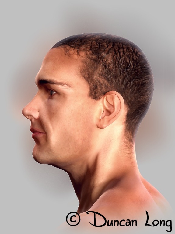
Side view painting created using 3D model as reference for book cover figure.

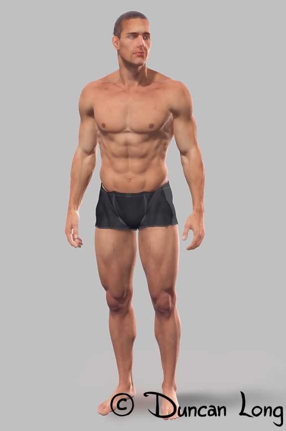
Once the 3D model is finished, I can not only generate the full-figure picture of it, but also rotate it for a profile and portrait closeup shot so the client can see exactly what the character looks like — and then ask for changes if the model isn’t quite what the client has in mind for the character.

For example, the figure shown here (produced for a project I’ve just started work on) proved to be a little too old, a little too muscular, and his face a bit too skinny. With the 2D painting like I used in the past, these changes would have meant starting all over. With a 3D model, it meant playing with a few “dials” for about an hour or so to reduce the muscle tone, fill in the cheeks, and reduce some of the lines in the face. I then rendered pictures of the new version, painted/touched them up, and emailed the new body/face to the client. Shortly I heard back from the client — and we had our new character, the guy the author wanted on his book cover.

For me, the process of using a 3D model has become pretty painless, without the frustration of having to start all over to finally get to where the character needed to be should my vision not jive with that of the client.

Don’t get me wrong — 3D modeling still entails a lot of work. And it has taken me about two years to get to where I feel like I’ve mastered the process to the point that it is useful for my illustration work. But now that I’ve reached this point, all that time and work is paying off. The process is smoother and, just as importantly, gives professional results at the “sketch” level.

And when a client says, “Could you raise his right arm a bit and rotate him 45 degrees to the left?” it’s no long a hair-pulling crisis.
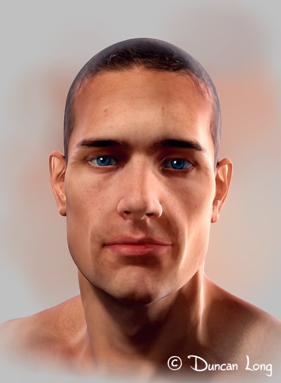
Portrait view painting created using 3D model as reference for book cover figure.

=====================

When not playing with his 3D models, Duncan Long works as a book and magazine illustrator and sometimes author. You can learn more about his illustration work (and see samples of book and magazine covers he’s created) at Duncan Long’s Online Gallery.
 

Tags: , , , ,

Comments (1)

Book Cover Art: Cyborgs, Robots, and Transhumans

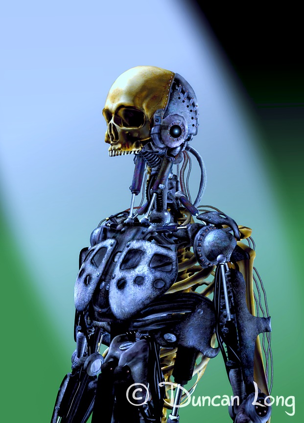
Steel and Bone - cyborg robot skeleton -- the stuff of nightmares by Duncan Long

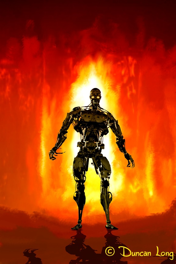
Cyborgs, robots, and even some of the ideas in the transhuman/singularity sphere are full of terror for many of us. For starters, many modern robots (as well as that introduced in theĀ TerminatorĀ series) bear a terrifying resemblance to animated, steel skeletons — basically the stuff of nightmares.

Nor are these just horror or science fiction devices any more: There are folks actively developing these terrors over at DARPA and who knows where else. And many are being designed for use in warfare, adding another level of terry to the mix. Somewhere out there we know there may be a “Hunter / Killer” with our name on its chassis.

Little wonder then that these creatures are figuring in book cover art and magazine illustrations.

My illustration above, “Bone and Steel,” was created to reflect the aftermath that might result with the combination of a human being augmented and intertwined with robotic parts — sometime after death of the living parts of this symbiotic mix. The missing jaw adds to the horror (and that idea isn’t uniquely mine; I’ve seen it elsewhere and first noticed it with a cyborg charcter in the movie Fortress (1992)).

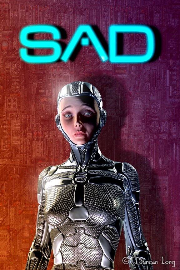
Sad - a cyborg illustration by Duncan Long

“Sad” was created this week upon learning of the death of a friend interested in cyberpunk and science fiction. It, too, reflects a certain horror brought by today’s experiments in robots. Is the face human (a gal in a tight-fitting suite), are we looking at a mechanical body with a human face, or is this a totally robotic creature with a simulated plastic face? It’s increasingly hard to know. Today’s robotics are starting to manifest as very lifelike automatons even as work is being done to fuse human elements with mechanical.

The lines are blurred, and with that blurring comes an element of fear.

Modification - transhuman movement of piercings, inserts, scarring, and tatoos by Duncan Long

Finally, my picture “Modifications” which reflects the push of the Transhuman movement to alter the human form with piercings, inserts, scarring, and tattoos. The results are surprising and — at times for many of us — terrifying ways as well.

Yes, it’s a brave new world, and today’s artwork for magazine and book covers reflects what’s going on.

Or hopefully will.

Because these three pictures don’t yet have homes on book or magazine covers.

Anyone????

Anyone???

==================

When not turning his nightmares into his own private artwork and trying to peddle it on the net, Duncan Long works as an illustrator for small / indie presses and self-publishing authors. See more of his book cover artwork at Duncan Long’s Portfolio of Book and Magazine Art.

Tags: , , , , , ,

Comments (3)

Illustrations Hoping to Become Book Covers

Cyber Gal 5 book cover illustration by artist Duncan Long

I’ve spent the last few days creating illustrations for the fun of creating them. As such, they don’t have “homes” yet on the cover of a book or magazine — but I’m hoping they will soon. Even if they don’t have the fortune of gracing a cover, the plus is that I have a lot of fun making pictures, and like everything else, creative work like this hones my skills and enables me to put onto paper (well… into pixels) what I envision in my mind — not an easy skill to master.

So here are the cyberpunk gals, robots, and miscellaneous good and bad dream elements of my endeavors.

Hopefully they’ll bring a little joy to visitors’ hearts.

And maybe… just maybe… they’ll eventually become illustrations for stories in books and magazines.

Red book cover artwork by artist Duncan Long

Cyborg Pet cover artwork by artist Duncan Long

Fire Eater book cover artwork by illustrator Duncan Long

Post Bellum book cover artwork by illustrator Duncan Long

=========================

When not digitally painting for fun, Duncan Long works as a book and magazine illustrator. His artwork has been used by HarperCollins, Muse, Pocket Books, Asimov’s Science Fiction, and many other presses and self-publishing authors. See more of his art in Duncan Long’s Illustration Portfolio.


Tags: , , , , , ,

Comments Off on Illustrations Hoping to Become Book Covers

Novel Writing: Telling a Great Story

There’s a wealth of how-to material on the Internet. Like everything else on the Net, when it comes to writing fiction, some of the articles are good — some not so much. But here are three articles that have some meat to them when it comes to what makes a good story:

First, an interesting look at the Psychology of What Makes a Great Story — and why a story teller is more concerned with imparting understanding and meaning than logic, with the story functioning on two different planes at the same time. (I’m pretty sure this could be applied to stage plays, film, and paintings as well.)

Writers Digest offers Seven Simple Ways to Make a Good Story Great.

And finally, The Slippery Question of What Makes a Great Book.

====================

When not studying the story telling techniques employed in writing, Duncan Long attempts to tell tales with his illustration work for novels and short stories. You can see examples of his artwork at Duncan Long’s Gallery.
Comments Off on Novel Writing: Telling a Great Story

About Amazon’s Kindle e-Books Warning Message

CSLP - Summer reading poster illustration book

There’s a little confusion about how Amazon is going to be flagging typos, etc., in Kindle ebooks sold at Amazon. Some publishers and writers initially thought that minor typos, foreign words, or words not in a spellcheck might merit the same treatment as poorly edited books.

However that does NOT appear to be the case.

It now appears that most of the flagging will occur at the pre-approval/proofing level. Additionally (at least initially), human beings on the Amazon side of the process will be overseeing the process of flagging items in text to avoid any disasters. So overall, the new changes promise to be a good thing for those producing quality ebooks, and a not-so-good thing for those trying to flood the marketplace with half-finished monstrosities.

Of course time will tell.

Here’s a good article from John Doppler that gives the facts on what’s know about all this thus far.

=========================

When not fretting over Amazon’s latest changes in how it rates books and gives them marketing positions, Duncan Long creates book and magazine illustrations. See online examples of his artwork at his Book and Magazine Illustration Portfolio.

Comments (1)

Great Art Can Mean Great Book Sales.

Book cover design, artwork, and layout.

Here’s a thought-provoking lecture from Chip Kidd (filmed February 2012 at a TED conference), that offers some useful tips and concepts for designing books.

As he notes, designing books is no laughing matter, especially when it comes to selling books. And, as Kidd notes, “Great art can mean great sales.”

However, in the case of this lecture, designing books offers more than a few chuckles. Check it out: Designing books is no laughing matter. OK, it is.

While you’re at it, please take a moment to explore some of my own book design work.

Comments Off on Great Art Can Mean Great Book Sales.