Finding Badger Spied In Atlanta

Finding Badger graphic design and layout of the print book cover by illustrator Duncan Long

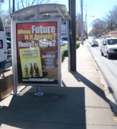
Author Holly LaMora has informed me that Finding Badger is now appearing in display ads at bus stops in Atlanta, GA. Here are a couple of shots she sent along:

Finding Badger Bus Shelter Ad Atlanta showing book cover artwork by Ilustrator Duncan Long

Finding Badger Bus Shelter Ad In Atlanta

Finding Badger Bus Shelter Ad Atlanta showing book cover illustration by artist Duncan Long

Closer look at Finding Badger ad

Billed as a “Metaphorical Journey of Transformation,” Finding Badger is available in paperback and Kindle format at: Amazon.com.

(For a behind-the-scenes look at the creation of the illustration for the cover of this book, check out: Just Out: Finding Badger by Holly LaMora.)
====================
Duncan Long paints book covers and illustrates books and magazines. His work appears on books from HarperCollins, PS Publishing, Pocket Books, Moonstone Books, and Enslow Publishers. Long has also created three cover illustrations for Asimov’s Science Fiction Magazine and numerous more for the The Sun tabloid. You can see more of his artwork at Duncan Long’s Portfolio
=====================


Tags: , , , , , , , ,

Comments (1)

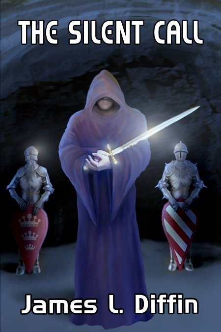
Book Cover Artwork for The Silent Call

Silent_Call_Book cover illustration by artist Duncan Long

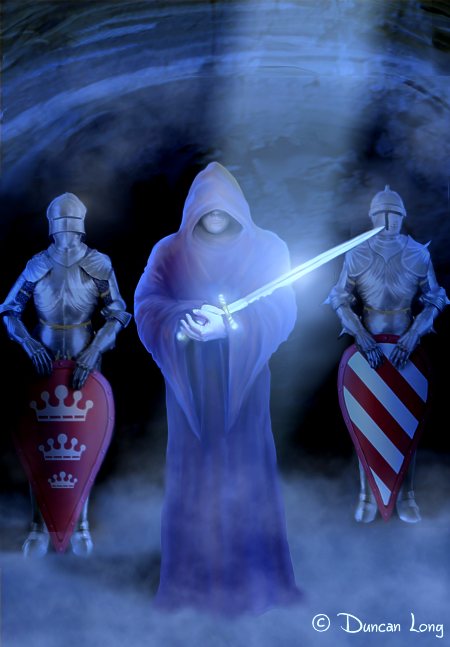
Here’s the cover illustration I created for James Diffin’s new science fiction/fantasy/action-adventure novel The Silent Call.

The author wanted to picture a pivotal scene in the novel where the hero (John Ryder, a young American chess grand master) discovers there may be a modern-day Merlin in his life, with the magician taking the hero to an underground chamber where a mysterious figure appears holding Excaliber.

Several concept illustrations were created. One of the first, though in the ballpark, didn’t quite work due to the stream of light coming from overhead.

Silent Call book cover illustration by artist Duncan Long

This was followed by an illustration that lacked the sunlight but retained the light reflecting off the sword.

Silent Call Book Cover artwork by Illustrator Duncan Long

The colors seemed a bit too intense in this version so they were shifted a bit and toned down to create the final cover shown at the top of this post. In order to establish that the story has science fiction elements as well as fantasy, we employed a futuristic-looking typeface (a slightly modified version of Bitstream’s Handel Gothic).

James Diffin’s Silent Call is available at Amazon.com.

====================
Duncan Long creates book cover artwork and book illulstrations for self publishing authors as well as large presses including HarperCollins, Asimov’s, PS Publishing, Enslow Publishers, Pocket Books, etc. See more of Long’s artwork and graphic design work at Duncan Long’s Book Cover Portfolio
=====================


Tags: , , , , , , , , , , , , , ,

Comments (6)

Book Publishing Odds and Ends

"The Narrator" an illustration by artist Duncan Long for Poe's Poem

"The Narrator" an illustration by artist Duncan Long

Sometimes I discover a variety of tidbits that aren’t quite enough for a blog entry, but which I suspect will be of interest to those connected to the publishing industry.

So…

Authors can now autograph their Kindlel ebooks for fans — via KindleGraph. Authors may sign onto the service via Twitter accounts or set up a new account at the site.

Encyclopedia Britannica announced that after over two centuries, it will discontinue its print volumes. Talk about an end of an era. One has to wonder if many newspapers and magazines may soon follow this trend. The tough part isn’t ending the printing as much as making money with an online and/or e-version of the publication. It will be interesting to see how this is done. Or, worse, seeing it fail to prove doable.

If you’ve been wondering why the ebooks you purchase from Apple seem more expensive than the equivalent through Amazon.com, here’s an article with a possible answer. It will be interesting to see if the Justice Department will bring a case against Apple and the large presses involved. And also fascinating to see if Apple fans embrace being gouged by the company they so valiantly support.

Recent research by book sellers suggests that an ebook can enjoy 178% better sales when the publisher adds enhanced metadata components such as the short/long descriptions, reviews, and author bio to the metadata of the title. Perhaps that extra effort spent cobbling together metadata pays off after all.

Press releases can also help boost sales of books. News Digest International is accepting news and press releases from authors; submission is free.

Many book cover designs head south because of a very simple problem: Too much “stuff” in the layout. Some sound advice from American painter and illustrator Harvey Dunn about what to do when a cover illustration isn’t working: “Take something out.” Generally very good advice.

And the inverse is true as well.

A perfectly good book cover design can quickly be ruined when someone dictates adding just a little more to it. Less is better, especially when many book cover illustrations will be reduced for web advertising and print catalogs. With cover design, when in doubt, leave it out.

Finally, Author R.S. Guthrie reports that for a very short time, his ebook Black Beast: A Clan of MacAulay Novel will be available for 99 cents in a variety of formats including Cloud Reader, Kindle for PC, Kindle for Mac, Kindle for iPhone, Kindle for iPad, and Kindle for Android. Snap up some of these inexpensive copies while you can.

And now… back to work.
====================
Duncan Long has worked in the publishing industry for several decades. Currently he works as a book and magazine illustrator for self-publishing authors as well as large presses including HarperCollins, Paladin, Asimov Science Fiction Magazine, Pocket Books, ILEX, and others. Find samples of Long’s illustrations and graphic design at: Duncan’s Book Artwork Gallery
=====================


Tags: , , , , , , , , , , ,

Comments (8)

Six Illustrations — Something Borrowed, Something New

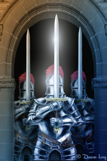
The Last good fairy book artwork illustration

The Last Good Fairy by book artist Duncan Long

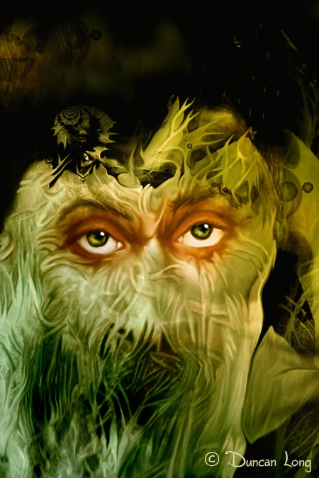
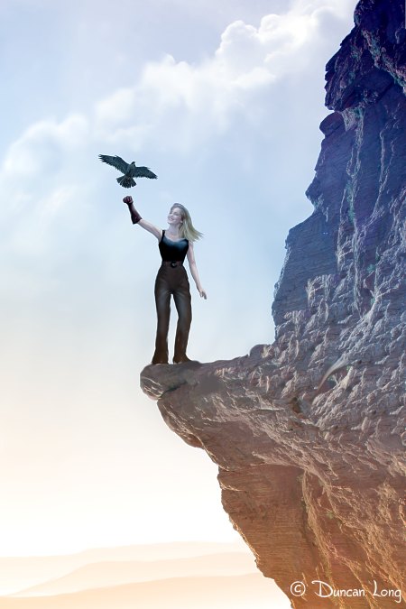
The last few days have been busy for the flying monkeys at the Duncan Long Studio, with six (count ’em, six) new illustrations looking for a book or magazine story to illustrate. Three in the fantasy category, two horror, and one that is… well, just pretty. Fans from way back may recognize that “Artifacts” and “The Falcon” are greatly reworked versions of illustrations that had been retired from my portfolio due to their not being quite up to speed in previous incarnations; it’s nice to be able to submit them back into circulation.

Old or new, all rights to these illustrations are available, from use as book cover artwork to mouse pad, t-shirts, and all points in between.

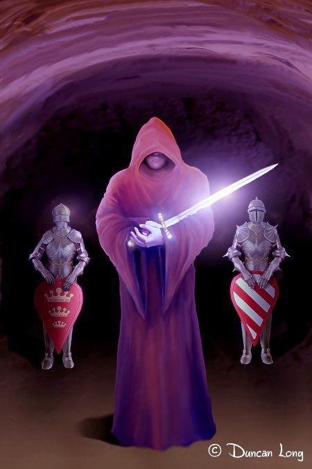
The Royal Guard - fantasy book cover artwork

The Royal Guard by book illustrator Duncan Long

Falcon - book illustration by artist Duncan Long

The Falcon by book artist Duncan Long

Artifacts - illustration by book artist Duncan Long

Artifacts by book illustrator Duncan Long

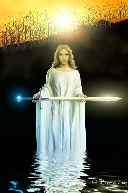
Lady of the lake book illustration by artist Duncan Long

Lady of the Lake by book illustrator Duncan Long

Witch come back horror book illustration by artist Duncan Long

Witch Come Back by book artist Duncan Long

In closing, I should note that some have been protesting my calling the workers here at the Duncan Long Studio “flying monkeys.” However, I think in all fairness this term isn’t far from the mark given their hairy bodies, tails, and wings. If it flies like a flying monkey…

====================
Duncan Long and his UFMs (unidentified flying monkeys) illustrate magazines and books. Long’s illustrations can be found on the covers of Asimov’s Science Fiction Magazine and The Sun tabloid as well as books from HarperCollins, PS Publishing, Pocket Books, and Enslow Publishers. Long also creates book cover artwork for many self-publishing authors. See more of his artwork at Duncan Long’s Magazine and Book Cover Portfolio
=====================


Tags: , , , , , , , ,

Comments (13)

Two Book Covers for the Price of One

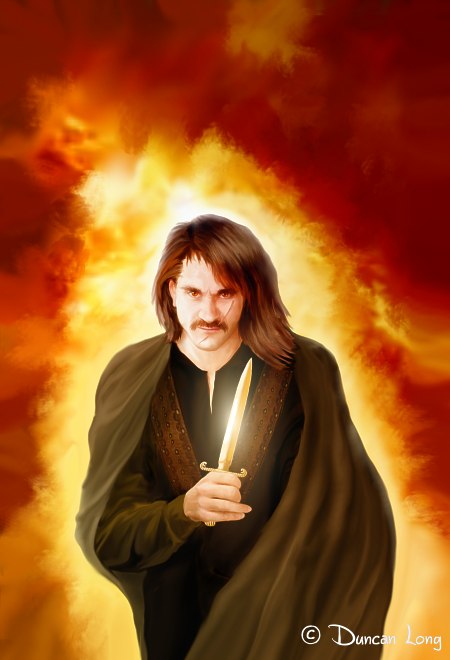
 Richard Falken book Cover illustration by Duncan Long

Cover Illustration: Richard Falken - La Espada Vengadora

I was recently contacted by Spanish author Richard Falken about creating a pair of covers for his upcoming adventure series. The writer had a limited budget for his covers and was wondering if I’d consider creating a single illustration and then letting him use it for the first two books in the series, perhaps with a change in the background for each book (fire for the first and “green fire” for the second).

With digital illustrations, such a modification is pretty easy to create. Modifying the color tones of the other elements in the picture to match the background makes everything hold together.

So this was the course of action we elected for the covers.

But…

I soon realized that with just a little planning and a few changes, I could actually make his second cover even more different from the first. The trick was to keep the cape, hand, and weapon of the character on separate layers.

Once this was done, it became fairly easy to change the character’s expression, hair, and cape to create subtle differences between cover one and two. It still was obvious that the books were in the same series, yet there were enough differences to make it function as a new second illustration for the book.

Knowing that the character armed himself with both a sword as well as knives in the stories, I then did something that digital artwork lends itself to: I lengthened the knife’s blade to make it a sword, then adjusted the hand guard and grip ever so slightly to transform them into a sword. After repositioning his hand slightly and painting two relaxed fingers (from the knife-holding pose) into closed position (to hold a heavier sword), I had a new illustration for Rubén’s second book cover.

So here’s how the second cover illustration turned out:

 Richard Falken Book 2 artwork cover illustration

Cover Artwork: Richard Falken - El Libro Negro

And so… two book covers for just a little more than the price of one.

You can learn more about these books and author at Richard Falken’s site.

====================
Duncan Long creates book illustrations and graphic designs for self publishing authors around the planet as well as larger presses including HarperCollins, the Asimov’s Science Fiction tabloid, PS Publishing, Pocket Books, Enslow Publishers, etc. Explore Long’s illustrations and book cover designs at Duncan Long’s Book Cover Portfolio
=====================


Tags: , , , , , ,

Comments (5)

How Did You Create That Book Illustration?

Mary's Hope-002

Mary's Hope - Cover Illustration for Asimov's Science Fiction Magazine

I’m often asked how I create my book cover artwork and magazine illustrations. So I decided to write a little about that in this post (and also to create a reference page for folks asking this question in the future).

First off, while I try to achieve a traditional, painterly look with much of my work, in reality it’s digital. There are no framed paintings to buy and no paper drawings available. I appreciate the inquiries as to which canvas and drawings I have for sale, but the truth is there are none. All I can offer those needing something to hang on the wall is a pocketful of electrons. (I may create posters or prints one day, but right now those are on the back burner.)

When creating illustrations for publishers, there are many pluses to painting digitally, from reduced cost of supplies, to easier experimentation with layouts, to ease of getting the finished illustration to press — so many that it puts painting with traditional paint and brush in the same category as writing a book manuscript with pencil and paper. Yes, it can be done, but the ease of doing it via a computer makes the choice a no-brainer, at least for me.

Of course regardless of the medium, the training of the artist shows through. My art background is that of a self-taught pen-and-ink illustrator, basically creating illustrations for the technical books (mostly about firearms) that I wrote way back when. As computers started to get fast enough to produce viable artwork for print, I made the switch to that mode of drawing/painting and have never looked back since. My drawing tools were boxed up and never used again (though I may get them out to hang on the wall one day soon as they do have some emotional connection to me even today after all those hours spent hunched over a draftsman table).

My pen-and-ink background of drawing realistic depictions of hardware and such translates into a similar effort to create very realistic paintings with my digital artwork. There’s more detail in my illustrations than one might otherwise see, and sometimes to the point that my artwork is confused with photos.

Today, many digital artists still start their artwork with pencil sketches that they then scan into the computer and from there work with the picture digitally. That process just isn’t for me; I work digitally from start to finish these days. It’s just faster, cleaner, and (for me) more natural.

My software of choice is Corel Photo-Paint. Most of my work is done on the old Window 95 version 8 of Photo-Paint with the newer version (X5) employed for some processing of illustrations.

I find Photo-Paint has all the brushes and tools I need, and after using it for years, I can work very rapidly with it without the mechanics of running the program getting in the way of my flow of ideas. Photo-Paint also allows for shortcut key modifications (so all commands can be issued from my left hand while my right is working with the graphics tablet) and fast toggling between two tools.

I occasionally create 3D renders which then go to Photo-Paint for extensive reworking. However I do this less and less as it’s often faster for me to just paint what I want to see. Most 3D software seems amazingly obtuse in its layout and commands, and very counter intuitive in how it is operated. There are rays of hope (like Sculptris) but these seem few and far between.

On those rare occasions that I do create a render for background or such, I generally employ an elderly copy of Vue or (very rarely) Poser — the latter to work out lighting and perspectives for the most part. (I find Poser creates very “plastic” looking figures so it’s a mistake to drop the renders directly into a picture as a shortcut to actually painting a figure; the results are very poor unless I’m trying to create a store manikin or android.)

So for many of my illustrations, all the work is done in Photo-Paint 8 these days.

Currently my hardware consists of a HP workstation running Windows XP Pro with most of my drawing/painting done via a Wacom tablet.

As for the flying monkeys at Duncan Long Studio… Well, that’s another story.

====================
Often found slaving over a hot digital tablet while shooing invisible flying monkeys, artist Duncan Long creates illustrations for novels and magazines including HarperCollins, Pocket Books, Mermaid Press, Moonstone Books, and the books of many self-publishing authors. More of Duncan’s book illustrations and graphic artwork can be explored at Duncan Long’s Portfolio
=====================


Tags: , , , , , , , ,

Comments (9)

The Making of a Book Cover: O’Dwyer’s Relentless

Relentless book cover artwork by illustrator Duncan Long

Relentless book cover artwork by illustrator Duncan Long

I recently created the cover illustration and layout for both the ebook and print version of Relentless by P. J. O’Dwyer. It proved to be a challenging project offering a great payoff with the resulting beautiful cover. It also allowed me to play a small part of the effort to help alert the public to the mistreatment of wild horses in the US and Mexico, as well of the “horse rescue” efforts going on in these two nations.

Here’s the one-sentence synopsis for Relentless:

When six horses go missing, headstrong horse rescue owner Bren Ryan becomes her neighbor’s prime suspect — she’s in the business of saving them, and he’s a kill buyer who slaughters them for profit.”

From there the plot weaves into a murder mystery with enough action and suspense to satisfy any reader.

Needless to say, it has garnered some great reviews. Here’s one:

Relentless is a stirring and intriguing story that intertwines the important issues facing our horses. It made me laugh, cry and left me hanging on the edge of my seat more times than I can count.” –Shelley Sawhook, American Horse Defense Fund Washington, DC

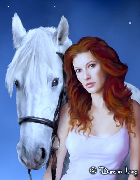
The tough part in creating the book cover illustration proved to be getting the face of the heroine right. At one point or another at least six different faces appeared for the gal and nearly as many poses. Eventually I got it right with this version:

Detail of book cover illustration by artist Duncan Long

Detail from final version of the book cover illustration.

The cowboy in the background proved equally tough to get just right, and finally I simply used much of the artwork I’d created for another book cover that was sitting on my computer hard drive. I’d started that cover but it had never been used since the publisher abandoned the project. So the cowboy and the grassy background and night sky from the older project came back to life with this cover.

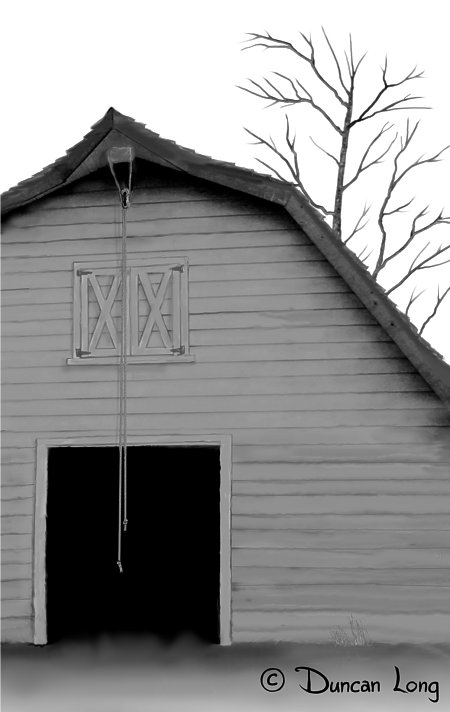
The original vision for the cover had also called for a barn in the background, but this proved too complex a picture for the eye to easily take in, especially with an ebook cover (since the book would be available both in print as well as ebook version).

Having spent no little time painting the barn, I lobbied for making it a “bonus picture” inside the book, which the publisher went along with. So I ported the barn from color to B&W, did some touch-up work, and it was pretty much ready to go:

Barn inner book illustration for novel.

Inner book illustration of the barn for the novel.

In painting the horse, I discovered I had some emotional connection to the project. When I was a preschool kid, my dad (who had grown up on horseback and in fact had helped herd horses from Colorado to central Kansas when he was a boy) took me out to my granddad’s farm to meet my dad’s old horse. Armed with a sugar cube, I looked up into the white furry face noting the creature’s amazingly long eyelashes. As I held out the sugar cube, a huge muzzle descended and the treat vanished, leaving me with a damp palm and a memory that will last forever.

That memory became the horse painted into the cover illustration.

So in the end, memories, old projects, and new ideas were all woven into the project. The illustration became that proverbial synthesis of elements that (hopefully) is greater than the sum of its parts.

Here’s the final layout with the text that I added for the completed front cover:

Relentless book cover layout by illustrator Duncan Long

The final layout for the book cover.

You can learn more about the book and its author at P. J. O’Dwyer’s web site.

====================
Graphic artist Duncan Long creates illustrations for novels and magazines, sometimes also doing the layout of book covers. His work has appeared on book covers offered by HarperCollins, PS Publishing, Pocket Books, Mermaid Press, and many the titles of many self-publishing authors. More of his illustrations and graphic artwork can be found at Duncan Long’s Portfolio
=====================


Tags: , , , , , , , , ,

Comments (6)

Book Cover Illustration for The White Lilac

Christina Adams White Lilac book cover illustration

Cover Illustration for Christina Adams' White Lilac

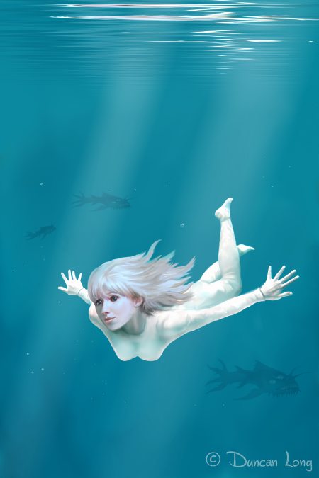
Here’s the cover illustration I created for Christina J. Adams’ new science fiction novel The White Lilac.

The trick was to create a cover illustration that the viewer would perceive as a young woman in water — rather than a gal floating in the air or space. To achieve this, I worked with a variety of blues and placed a couple of beams of light through the murky scene. I then created a water reflection of the top of the illustration, and painted in a variety of bubbles and bits of dirt and sediment which are almost always present underwater.

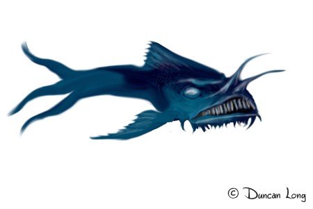
One catch: The scene was an alien ocean. So I tried to create some alien fish. Not an easy task (and perhaps not achieved completely) since Earth’s deep water fish tend to take on alien, even nightmarish aspects. But I tried to cobble together something that might at least hint of an alien ocean far from our planet.

White Lilac alien fish concept painting

White Lilac alien fish concept painting.

By rotating, resizing, and monkeying with the tail of this single fish image, I created three fish for the price of one — without going to all the work of actually drawing three.

Finally, to help potential readers tell at a glance this is a science fiction novel, we employed a typeface with a little sci-fi “flavor.”

The result:

Christina Adams White Lilac cover layout and illustration

You can read a couple of chapters of The White Lilac as well as order a Kindle copy of the book at Amazon.com.

====================
Duncan Long creates book cover illustrations for self publishing authors as well as larger presses including HarperCollins, the Sun tabloid, PS Publishing, Pocket Books, Enslow Publishers, etc. See more of Long’s illustrations and book cover design at Duncan Long’s Book Cover Portfolio
=====================



Tags: , , , , , , , , , , , ,

Comments (8)

Why My Face Appeared On a National Tabloid

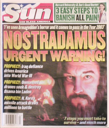
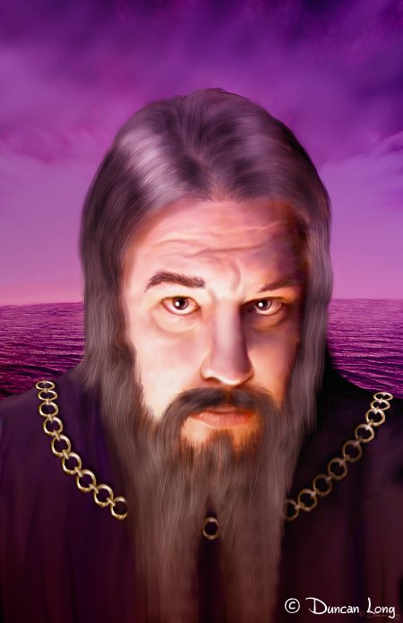
Nostradamus Duncan Long tabloid illustration artwork

Nostradamus -- Or Is It? -- Illustration by Duncan Long

As noted in my previous post, I sometimes create illustrations for newspapers, magazines, tabloids, and non-fiction books. In the case of historic figures, there’s often no reliable references to what the person looked like, and few historic paintings as well. In such cases an illustrator is often called upon to recreate the figure, working on very sketchy details.

Yet the finished picture must look “real” to the viewer and ideally will capture some of the mystery or personality of the historic personality,

I often use models and photo references for my digital paintings. Occasionally this can lead to amusing results.

One such time occurred when I employed myself as the model for a Sun tabloid story about Nostradamus. About all the specs they had were based on one old painting that might — or might not — have actually looked like this cryptic and perhaps visionary writer.

Basically, he was an old guy with a beard and a long nose.

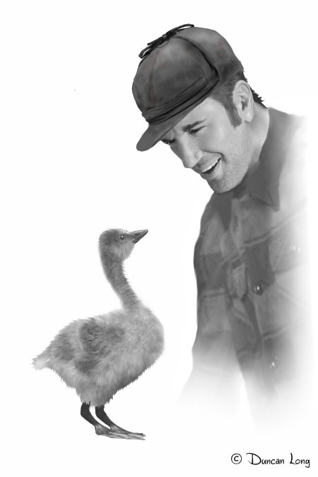
Well, as the flying monkeys in the studio will tell anyone who asks, there’s one old guy who works here that meets these requirements. So I was enlisted to provide the reference photo — shown below.

Nostraduncan reference photo for newspaper-magazine-tabloid illustration

Reference photo used for newspaper tabloid illustration of Nostradamas

Originally the Sun‘s art director’s plans called for “Nostradamus” to be holding a book (hence the pose in the reference photo). However we soon modified the concept to be just a closeup of the prophet’s face. After lengthening his/my hair and beard, etching in wrinkles, and altering his nose a bit, the illustration was completed (and inhouse became known as “NostraDuncan”).

"Nostradamus" cover illustration for The Sun Tabloid

"Nostradamus" cover illustration for The Sun Tabloid

I work on a number of projects at any given time, often leaving family members blissfully unaware of the chaos that’s ensuing on book and magazine covers around the world as my illustrations make their way to various presses. This means that the first time a cover illustration might be spied by relatives is when it appears at its final destination.

In the case of this portrait of Nostradamus, the surprise was sprung on the artist’s spouse as she checked out at Walmart. Waiting in line, she was horrified to discover that, up and down the checkout lines, right there on the front of the Sun tabloid, was her husband’s sorry face. Or at least close enough to his sorry face to be recognized as him.

A moment of fear gripped her heart as she wondered if the story might be about a missing ax murderer, an alien in human form, or the like. Imagine her relief to discover it was only the portrayal of a respected historic figure.

Whew!

Such experiences teach a spouse not to panic.

Readers with an eye for detail will notice that 2003 didn’t prove to be the year Armageddon happened.

But there’s always 2012, right?

====================
Duncan Long creates illustrations for both fiction and non-fiction books, tabloids, and magazines. His illustrations have appeared on magazine and book covers from the Sun, HarperCollins, Pocket Books, Asimov’s Science Fiction, Enslow Publishers, and many other presses and self-publishing authors. Enjoy more of Duncan’s illustrations at: Duncan’s Art Portfolio
=====================


Tags: , , , , , , ,

Comments (14)

Yes, I Can Create Nonfiction Book Illustrations

"Charlie and Zed" from Linda Franklin's "On a Wing and a Prayer" book series.

"Charlie and Zed" illustration: Linda Franklin's "On a Wing and a Prayer"

While most non-fiction books and magazine articles are illustrated with photos or technical drawings, occasionally such publications will need an illustration similar to those seen with fictional works, the reason being that no photographs are available of the subject being covered in the account. That’s when an illustrator who normally finds himself creating artwork for fictional stories may be called in to create a picture.

Such artwork is a little tricky since the imagination doesn’t have free rein. The illustration has to be as close to reality as is possible. Contemporary accounts of historic figures, studying photos of artifacts from the period, and so forth all come into play. The result is an illustration that may — or may not — be precise, but is as accurate as the knowledge of the author, publisher, and artist will allow.

So although most of the book and magazine illustrations the flying monkeys at Duncan Long Studio create are for the covers of novels and magazine fiction, occasionally we tackle non-fiction projects. Here are a few I decided to showcase in today’s blog, written on a very gloomy US Presidents Day.

Child's Witness to Genocide book cover illustration artwork by Duncan Long

Cover Illustration and graphic design by Duncan Long

"Gus" illustration for Linda Franklin's "On a Wing and a Prayer" book series.

"Gus" illustration for Linda Franklin's "On a Wing and a Prayer" book series.

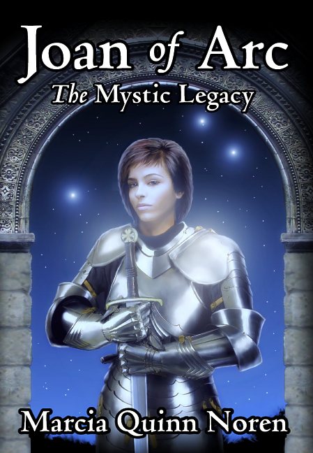
illustration for Joan of Arc by

Illustration and graphic design for Joan of Arc by Marcia Quinn Noren

Cover artwork and illustration for Prof Silvers Lottery System

Cover design and illustration for World Marketing Group

"Tequila" for Linda Franklin's "On a Wing and a Prayer" book series.

"Tequila" illustration for Linda Franklin's "On a Wing and a Prayer" series.

"Nostradamus" cover illustration for The Sun Tabloid

"Nostradamus" cover illustration for The Sun Tabloid

====================
In addition to creating non-fiction artwork for books and magazines, illustrator Duncan Long often creates the cover designs for novels and magazine covers. His artwork has appeared on magazine and book covers from HarperCollins, PS Publishing, Pocket Books, ILEX, Asimov’s Science Fiction, Moonstone Books, Enslow Publishers, and many other presses and self-publishing authors.
Enjoy more of Long’s illustrations at: Duncan’s Illustration Portfolio
=====================


Tags: , , ,

Comments (3)