Giving Your Book the Cover Art It Deserves

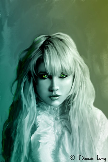
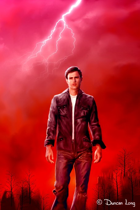
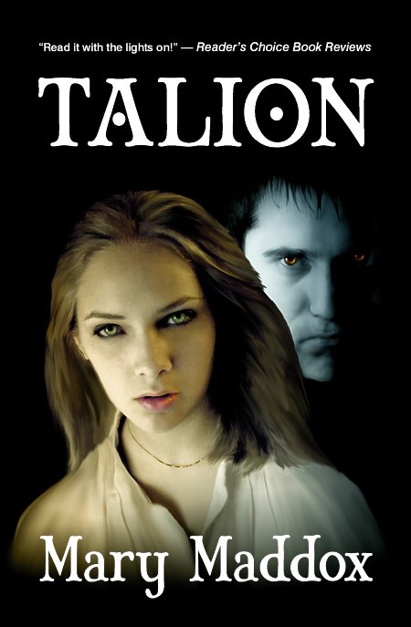
Mary Maddox Talion Novel - cover artwork illustration by Duncan Long

Author Mary Maddox recently wrote of her experience in choosing an effective cover for her novel Talion. Originally she’d selected a very attractive, abstract photo for the cover — yet it failed to sell the book. At a book signing, one blunt person who told her, “I’m not buying your book because I don’t like the cover. It tells me nothing. I have no idea what the book is about.”

Ouch.

Fortunately, the author thought over the rude comment and realized there was an element of truth to it. The abstract cover was attractive, yet failed to convey any insight as to the genre and subject of the book. The story encompasses horror, mystery, and the supernatural, yet the cover art reflected none of this.

So, Maddox set out to find a new cover illustration. (Rather than write more about how Maddox went about finding and choosing her cover artist and her thoughts about the importance of selecting a suitable book cover, I’ll direct readers to her blog when she offers some tips about choosing the right cover art for your book.)

Cutting to the chase, I was called upon to create a new cover illustration that would display two characters from her story. My cover illustration wasn’t nearly as beautiful as the first, yet it will likely serve the book much better because the faces on the cover will help the book connect with potential buyers, and the lighting, colors, and expressions reflect the horror, suspense, and mystery genres the tale encompasses.

To tack down the feel of the story and genre just a tad more, I selected a typeface that was a little misshapen and ominous, giving the lettering a sinister feel that complemented the tone of the story.

When we’d finished, we had a cover that conveys the ominous tones of the book (which a reviewer at the Charleston Times-Courier described as “Silence of the Lambs meets The Turn of the Screw…. The story is propelled by suspense, and made delicious by Maddox’s Ray Bradbury-like gift for deft, deep-shadowed description.”)

And, yes, it’s the book is the proverbial “good read.” You can read samples from the book (as well as buy a copy) at Amazon.com.
====================
Duncan Long illustrates book and magazine covers including those needing new cover art. His artwork has appeared on a number of books from self-publishing authors, small publishing houses, as well as large presses. Find other samples of Long’s book art at: Duncan’s Book Art Portfolio
=====================


Tags: , , , , , , , ,

Comments (4)

5 Book Cover Illustrations Looking for New Homes

Deep Space Thoughts - book cover illustration looking for a book cover to be on.

"Deep Space Thoughts" by book cover artist Duncan Long

Another set of illustrations from the flying monkeys at the Duncan Long Studio. These illustrations were created for my personal pleasure, but hopefully eventually will find homes on book or magazine covers. Subject matter covers science fiction to horror to fantasy, with perhaps a few stops in the Twilight Zone.

For those interested in purchasing the rights to any of these, please note the title under the picture to get me “on track” with our negotiations (it is so embarrassing to sell the rights to the wrong piece of artwork — ahem).

Sometimes Darkness wins book cover artwork illustration

"Sometimes the Darkness Wins" book cover artwork by Duncan Long

Low Noon - book cover illustration

"Low Noon' - book cover illustration by Duncan Long

Teen Witch book cover artwork

"Teen Witch" book cover artwork by illustrator Duncan Long

Storming Heaven - book cover artwork by illustrator Duncan Long

"Storming Heaven" - book cover artwork by illustrator Duncan Long

As this is written, all five of these illustrations have all rights available including book and magazine cover rights. It will be interesting to see where these appear. That said, there is work to be done on contracted covers… so back to work.
====================
Duncan Long illustrates magazines and books for self-publishing authors, indie publishers, and large presses. Discover more of his illustrations at Duncan Long’s Magazine and Book Cover Portfolio
=====================

Tags: , , , , , , ,

Comments (6)

Creating Artwork for the US CSLP (2013): Part II

Simple illustrations are sometimes better than complex artwork

As noted in last week’s blog, I wrapped up the illustrations I created for the 2013 US Collaborative Summer Library Program (CSLP). In last week’s post, I showed the work that went into the poster. But there was a bit of other artwork for the project including spot art (for t-shirts, coffee mugs, and other items for promoting the program) and also a book mark.

Originally, the plans called for a simple reduction of the poster illustration for use as the bookmark. But as the poster became more and more complex, it quickly became apparent that it wouldn’t work as a bookmark.

early book poster illustration for the summer reading program

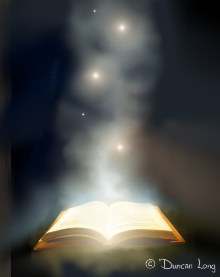
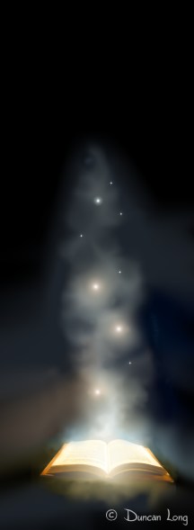
So I was soon working on a new design that would employ at least the book/smoke/magic lights from the original. As it turned out, the book/smoke/magic lights proved to be all that was needed, and thus the final book mark is just that (as seen in the illustration at the top of this blog).

But sadly it took me a while to realize this truth, and thus I spent a little time wandering in the design wilderness that illustration can become. (On the plus side, digital artwork lends itself to recycling. So elements that failed to be of use in this project will likely be pressed into service in future projects.)

So here are some of the “runners up” that resulted in my search for a suitable design for the US CSLP (2013) bookmark:

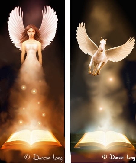
Artwork for two bookmark designs for summer reading program (2013)

Two more illustrations for bookmark design - neither used.

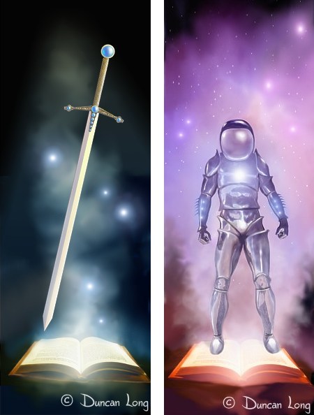
Sword and spaceman illustrations tried for bookmark design

In the end, I dropped the pirate, pharaoh, spaceman, horse, fairy, and sword — and went with the simpler design of just the book/smoke/and magic lights. Often simpler is better, and that was certainly the case this time.

Bookmark illustration created for the US CSLP (2013)

Final version of the bookmark created for the US CSLP (2013).

Finally, as noted in a previous blog, the fate of the mermaid was up in the air with some on the committee opposed to her and others okay with her. I have word now that she failed to make the cut and won’t appear on the poster. Which is fine. It’s been my experience that when there’s doubt about whether or not an element should be in a painting, it should be removed. “When in doubt, throw it out” is a good rule of thumb for most creative work, and this poster is no exception.

And, as noted above, she’ll very likely appear in some other future project where she’ll be more at home. Until then, she’ll swim quietly and peacefully in my mind.

mermaid - library poster artwork CSLP

======================
Knowing the joys of a simple bookmark design, Duncan Long works as a professional book illustrator. Enjoy more of his book artwork at: DuncanLong.com.

Tags: , , , , ,

Comments Off on Creating Artwork for the US CSLP (2013): Part II

Black Siren Books Announces Release Date for Relentless

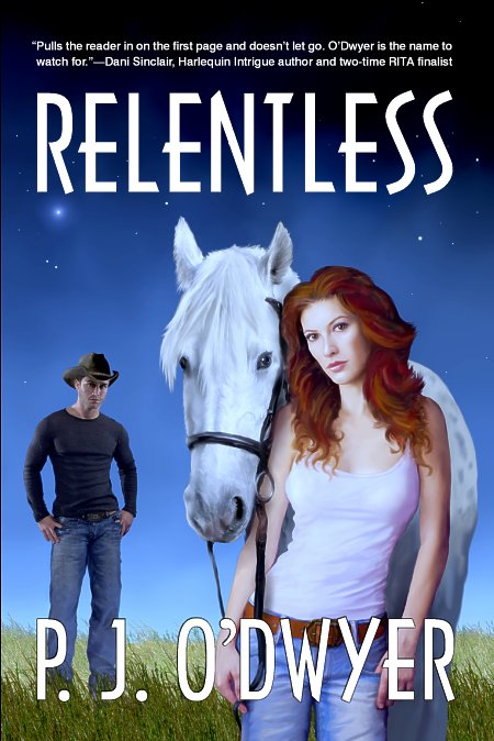
Relentless book cover layout by illustrator Duncan Long

Cover illustration and layout for romantic suspense novel RELENTLESS

Black Siren Books has announced that April 15th will be the launch date for its debut novel Relentless by writer P. J. O’Dwyer. The author is an award-winning author of romantic suspense. She believes writers have a responsibility to educate as well as entertain: “To write a story that is relevant to our time and that can effect positive change through awareness is a precious opportunity.”

O’Dwyer has done more than just effect positive change through her writing, however. She was recognized for her role in helping to unveil Saving America’s Horses new brochures at this year’s HORSE WORLD EXPO in Timonium, Maryland. Not surprisingly, the plight of horses also figures prominently in her new book Relentless.

It was a pleasure for me to create the book cover illustration for this romantic suspense novel and do the layout for this novel as well (including both the dust jacket for the hard back version as well as the paperback cover layout). You can read more about the process of creating the cover for this romantic suspense novel as well as see the inner book illustration for the novel in my previous blog about the creation of this book cover.

You can learn more about the book and its author at P. J. O’Dwyer’s web site.

====================
Duncan Long creates illustrations for romantic suspense novels and artwork for other genres, sometimes also doing the layout of book covers. His artwork appears on novels and non-fiction books offered by HarperCollins, PS Publishing, Pocket Books, Black Siren Books, and many the titles of many self-publishing authors. More of his illustrations and artwork can be explored at Duncan Long’s Portfolio
=====================


Tags: , , , , , ,

Comments Off on Black Siren Books Announces Release Date for Relentless

Science Fiction Novel Cover Illustration: Jen of Earth

John Backus-Jen of Earth book cover artwork by book illustrator Duncan Long

Yesterday the cover for best-selling author John Phillip Backus’ science fiction novel Jen of Earth was completed. The book is the first of a series of sci-fi adventures. The cover illustration was created by combining elements of two previous digital paintings I’d created which the author had selected as models for his cover.

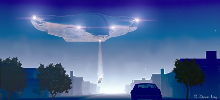
The two parts were the organic spaceship in “When Monsters Come Down Maple Street”…

Monsters science fiction novel cover artwork by book illustrator Duncan Long

… and the space background, sans spaceship, of “Interplanetary Travelers”:

Travelers science fiction novel cover illustration by book artist Duncan Long

After the two parts were combined, we fiddled a bit with the layout and star cluster, and at one point it became binary suns, but these proved to lack the “space dust glow” that the author wanted to see on the cover.

Star glow difference for science fiction novel artwork

Once the illustration was to the liking of all involved in the project, Backus did the final layout himself, adding a favorite typeface over the illustration (I personally love the way the “R” curves along the moon, and the star cluster shows through the “O”). And that completed the front cover for this science fiction novel which will launch this new series of stories.

John Backus Jen science fiction novel cover layout artwork

You can read more about this science fiction novel at John Phillip Backus’ site.

====================
Duncan Long illustrates book and magazine covers for a variety of genres including science fiction, fantasy, mystery, and horror as well as creating technical drawings for non-fiction books. His artwork has appeared on the covers of a number of science fiction novels from self-publishing authors, small publishing houses, as well as large presses. Discover more of Duncan’s science fiction illustrations at: Duncan’s Illustration Gallery
=====================


Tags: , , , , , , ,

Comments (2)

Creating Artwork for the US CSLP (2013): Part I

mermaid - library poster artwork CSLP

Last week, the flying monkeys at Duncan Long Studios wrapped up the illustrations I’d been hired to create for the US Collaborative Summer Library Program (CSLP) 2013 program.

Talk about a dream come true!

As a kid I can remember summer outings to the cool indoors of our tiny brick library where I searched dusty shelves for mystery, science fiction, and adventure stories to read. Those were treasured days and I consumed everything from Robert Heinlein to dog-eared copies of Edgar Rice Burroughs’ pulps, to the many Nancy Drew and Hardy Boys mysteries that librarians across the nation seemed to view as essential reading. Biographies (P. T. Barnum to Alexander the Great) and science books rounded out my adventures.

So when I was hired to create some artwork for the CSLP, from the onset I wanted the artwork to reflect some of my childhood adventures. The whole project a joyful journey down memory lane — with being paid becoming the frosting on that cake.

But it wasn’t all fun and games.

The pressure mounted as I realized my illustrations would be appearing in thousands of public libraries across the USA, with potentially millions of children and adults who participate in the program viewing (for better or worse) my artwork.

Adding to the pressure was the impressive illustrators in whose footsteps I’d be walking: Christian Fuenfhausen. Rafael Lopez, David Shannon, Svetlana Chmakova, and Ursula Vernon among others.

And the process was a little stressful as well. Each proposal went to a committee whose members were spread across the US, each potentially feeding suggestions and changes back to the art director. Fortunately for me, the art director on this project was Heidi Green; she did a fantastic job in sifting through the suggestions, summarizing them, and then adding some suggestions of her own.

Little by little we advanced until finally the finishing touches were more or less put on the final poster, book mark, and ten pieces of spot art that comprised the project.

But there were detours.

Of course when starting down the path of creating an original piece of artwork, the first question is: Where to begin?

Since this project was all about books (and I won’t reveal the actual theme for 2013 — I’ll let the CSLP handle that), I started by creating an illustration of an old book:

CSLP - Summer reading poster illustration book

The illustration looked old and interesting — but not so magical. So next I added some special glow and a few magical spheres rising from its pages:
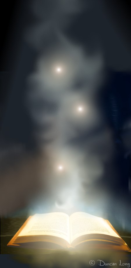
Summer reading poster illustration magical book

This seemed like a good building element for the poster. And it might have made a great poster by itself (and did later become the bookmark for the project — more on that in an upcoming post). Did I mention detours?

The biggest one was all my fault. When I started my work, my “mind’s eye” idea was to put elements from fantasy, science fiction, history, action-adventure, and science onto the cover — basically the reading I most enjoyed in my youth. Something like the little pigeonhole calenders children play with before Christmas, opening up a new picture for each day in the countdown to that special day.

To serve this purpose, I devised a bridge-like structure with different scenes peeping out from each archway. Here’s one of the more polished early results:
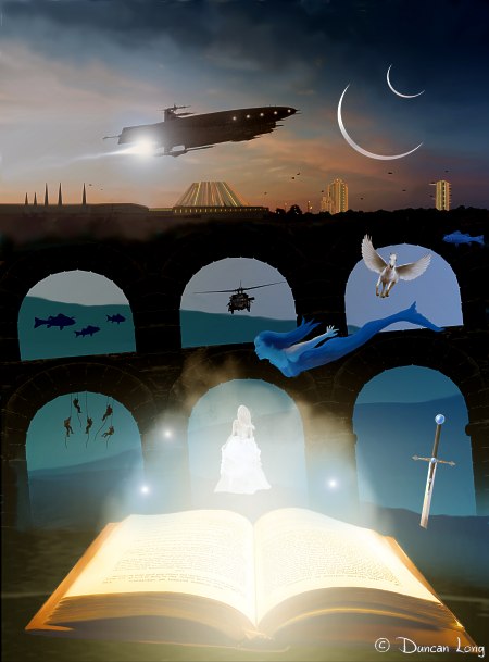
early book poster illustration for the summer reading program

Now in a perfect story of creativity, I would have submitted this poster illustration first thing, it would have been accepted, and I would have been on schedule, my poor art director would have spent little time pulling out great handfuls of hair, and I would have gone on to other things (I can say this with confidence since this is very nearly the design we eventually settled on for the final poster).

However at the time I created it, the artwork seemed way too cluttered. And the flying monkeys agreed. So instead of sending this version to the art director, I went back to the single book with the magic fog rising from it and added reduced elements from the illustration I should have submitted:
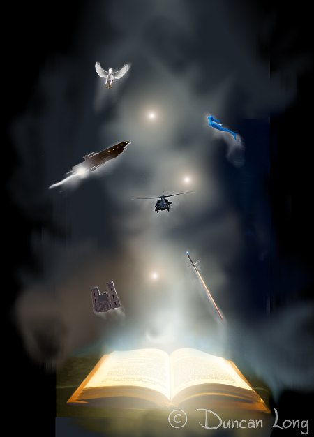
summer reading book poster artwork - version 5

Not surprisingly, the committee (likely a bit terrified by what they saw) suggested adding faces and/or characters to the poster so young viewers could more easily identify with it.

This led to what I call the “Angry Fairy Underground” poster (and, no, I don’t abuse drugs — I’m just warped). This quite possibly is the worst idea ever submitted to the committee:

angry fairy poster illustration 6k

Understandably the Angry Fairy Underground met with a cool reception. This was followed by what I call the “Our Gang” poster:
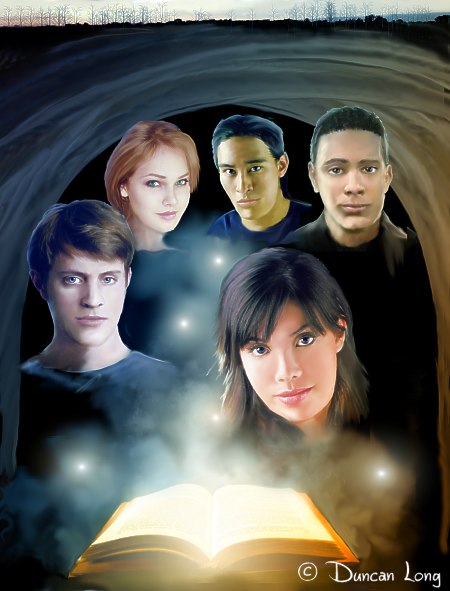
our gang poster illustration 7d faces

At this point, I could tell everyone was getting a bit worried if not panicked, though they were kind enough not to avoid disparaging remarks about those who had hired me for the work (I did here some muttering about a firing squad).

Going through the files I’d done thus far with the hope of determining where things had derailed, I discovered the original bridges version of the poster I’d done (but never submitted). Separated from it by a few weeks now, I found it looked a whole lot better than I’d first thought.

So with desperate hope, I submitted it:
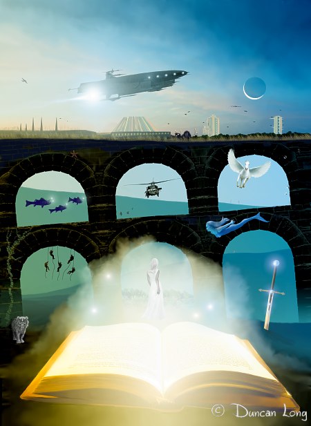
final poster illustration 4 Z11

The committee liked it, the art director liked it, and I liked it. Finally we had our poster.

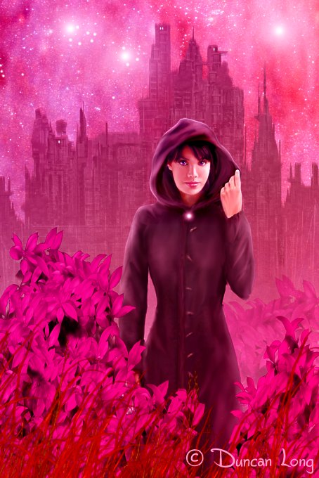
This final version has many of the elements I wanted in the poster, from mythology to science. And as I polished the scene, I was able to add a lot of tiny details and surprises for those willing to spend a little extra time studying it, including some crows, a hidden face, a ghost (inside the arch to the left of the sword), a “lady in white” looking at a “Secret Garden” in the central panel, a white tiger (down in the lower left – a character from one of my unpublished novels), vines, a starfish, a WWII “Flying Fortress” and a more modern B-52 bomber flying alongside the spaceship. (I’m hoping the final print will show these smaller details– though the inks used for printing and the resolution of the print may scuttle a few of these features.)

The only thing up in the air right now is the mermaid. Some on the committee seem opposed to her and others okay with her. She’s modest as mermaids go, but possibly a bit too risqué for the public library. And I’m okay with having her removed if they so decide; after all, I’m not anxious to have irate folks burning my posters in some backwoods part of our nation.

======================
When not stirring up trouble in the backwoods, Duncan Long works as a professional book illustrator. See his book illustration portfolio at: DuncanLong.com.
======================

Tags: , , , , , , , ,

Comments (1)

Odds and Ends: Book Cover Illustrations & Artwork

I’ve done a number of book covers the last few months that were pretty straight forward and thus no stories to tell (or tall tales to make up… even the flying monkeys are stumped). So I thought I’d just list/show them here without further ado.

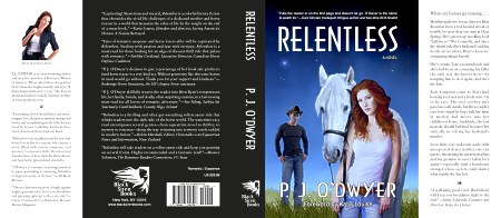
First, the dust jacket version of P. J. O’Dwyer’s Relentless: which I created the cover illustration for as well as doing the layout.

Relentless book cover dust jacket artwork

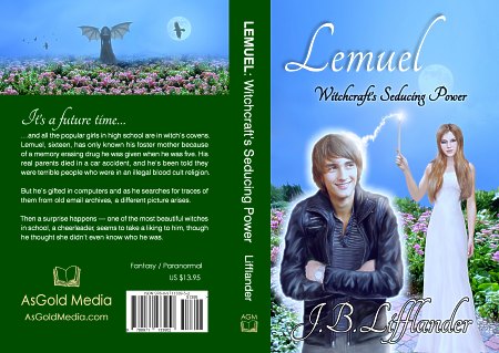
I also created the layout and illustrations for two covers for J. B. Lifflander’s new novels (published by AsGold Media). These are interesting in that we’ve employed a second landscape illustration for the back covers, enlarging elements from the front cover:

Lemuel book cover illustration and book layout

Lifflander-Disguised book cover artwork layout

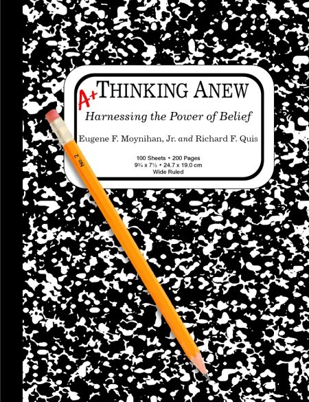
A “theme notebook” for Eugene F. Moynihan, Jr. and Richard F. Quis’ Thinking Anew, a manual for helping those suffering from PTSD (Post Traumatic Stress Disorder):

Thinking anew book cover artwork

World Marketing Group needed a utilitarian cover for its Lottery System manual:

World Marketing Group book cover artwork

And finally, an illustration for the cover for Cameron Leigh’s upcoming science fiction novel (whose title is undecided right now — I hope to update with more information on this book later):

Book cover illustration for Cameron Leigh's new science fiction novel

And that’s a wrap, as they say.
====================
When not swatting at the flying monkeys in his studio, Duncan Long designs book cover, generally creating the illustrations as well. His artwork has appeared on a number of books from self-publishing authors, small publishing houses, as well as large presses including Pocket Books and HarperCollins. You can find many more of his artwork at: Duncan’s Book Illustration Portfolio
=====================



Tags: , , , , , , , , , , , ,

Comments (2)

Book Cover Artwork: The Sisterhood

John Backus book cover layout with finished illustration artwork

This week we finished the cover for best-selling author John Phillip Backus’ The Sisterhood: After the Fall, Book Three. The novel is a post-apocalyptic science fiction series.

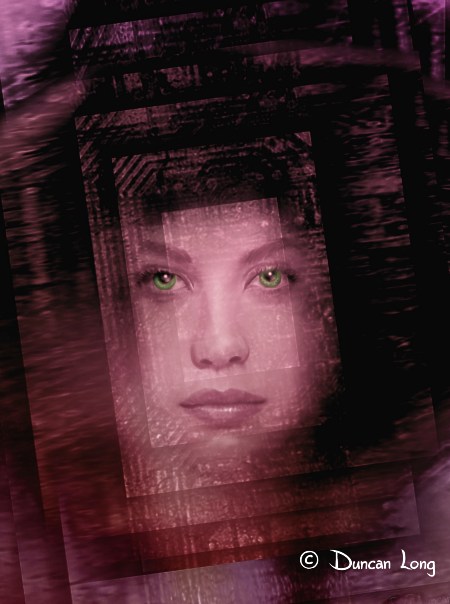
For our starting point with this book cover illustration, John selected one of the digital paintings in my online gallery “Virtual Friends.”

Virtual Friends original illustration for book cover.

As the project progressed, much of the background was darkened to allow lettering to be read more easily and also to reshape the face slightly. Then runes and an icon John had commissioned were added to the composition. Originally the icon was placed over one eye as shown here and rune “scaring” was painted down the other side of the face.

Book cover illustration with icon over eye

The plus of this design was that it avoided a very symmetrical layout. However, as the work progressed, it seemed the layout wanted to be symmetrical, so instead of fighting things, I finally moved the icon to the center of the forehead (for a “third eye” feel), rotated the face so it was plumb with the world, and ran the runes down both sides of the face. This seemed the best solution and everyone was happy.

At first…

Then we noticed an odd “mental glitch” caused by the scar-like runes. Up close, the runes looked great. However with a reduced picture (which was likely to be seen in catalogs, distant viewing of book shelves in stores, or perhaps even on the ebook cover version of the title), the scarring was transformed by most viewer’s minds into facial hair.

YIKES!

Yes, we had the bearded lady on the cover rather than some mystic-looking gal the author had hoped for. (I’m not sure what mechanism in the brain causes this; but if care isn’t taken in painting a female face, any darker color, shadowing, or extra texturing tends to be perceived as five-o’clock-shadow or even facial hair, often creating an effect the artist prefers avoiding.)

The solution was to smooth all the runes except those right under her eyes. Once this had been done, she become what everyone was wanting to see.

Final illustration used for the book cover

You can read more about this book as well as a sample chapter from it at John Phillip Backus site.

====================
When not inadvertently creating bearded ladies, Duncan Long illustrates book and magazine covers. His artwork has appeared on a number of books from self-publishing authors, small publishing houses, as well as large presses. You can find many more of Duncan’s illustrations at: Duncan’s Book and Magazine Illustration Portfolio
=====================


Tags: , , , , , , , , , , , ,

Comments (4)

Another Demon in the Freezer

Anthony DeCosmo Kindle Cover illustration by artist Duncan Long

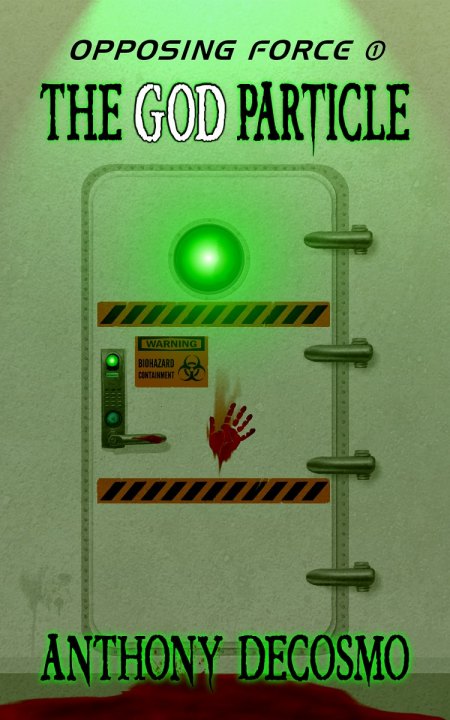
I recently completed the cover artwork for Anthony DeCosmo’s action-adventure/techno-thriller The God Particle which is the first in his “Opposing Force” series.

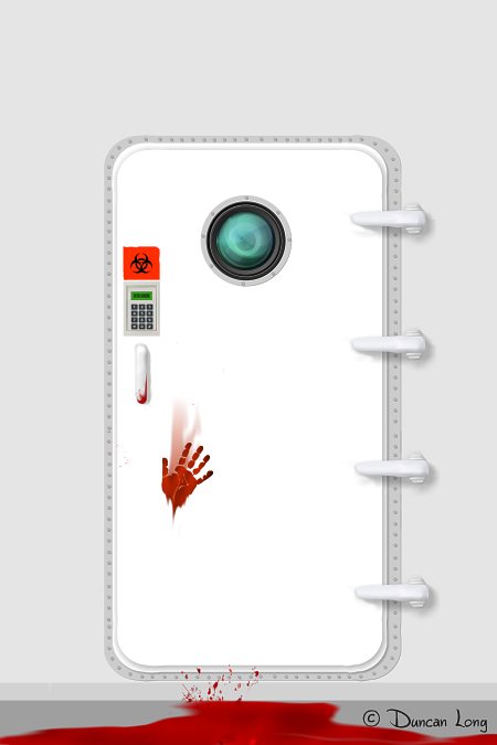
The key requirement for the cover was that the environment look like a new lab with a biological containment door. After doing a little research on what a bio-containment door should look like (I had pictured it as a submarine door complete with wheel in the middle of the hatch — nope), I was soon on the right track. After designing several different locking access systems, we finally settled on the one shown above (which has elements from several actual access systems).

The one hiccup in the process came about because the door and walls needed to appear to be surgically clean (well, except for the blood from an “incident” that occurs early in the novel). I soon discovered that a pure white door and wall was not only a bit boring, it also proved less than ominous, and pretty fake looking as well.

Early Anthony DeCosmo Book Cover Illustration by book artist Duncan Long

The “fix” was adding a layer of dirt, stains, and random texture to the illustration along with three green light sources; these gave the picture a more menacing and realistic appearance.

Along the line the original locking system was replaced by a more robust one, along with larger and more warning decals; to keep the door looking “used” the decals were “scuffed” to make them look like they’d been there a while.

Basically the virtual wear and tear made for added realism.

The God Particle book cover illustration by book artist Duncan Long

Finally, I should mention that no human beings were injured in the making of this book illustration. Well, except for that unfortunate incident when one of our flying monkeys gained access to our studio’s assault rifle.

But that’s another story.

Anthony DeCosmo’s The God Particle is slated for release via Amazon.com as a Kindle book. And more in the techno-thriller series should be following after that.

====================
Duncan Long creates book illustrations and book artwork for large publishers, small presses, and self-publishing writers. Find more of his book illustrations and artwork at Duncan Long’s Book Artwork Portfolio
=====================


Tags: , , , , , , , , , ,

Comments (2)

Book Artwork: To beard, or not to beard…

Stranded Angels Book Cover Design Artwork Illustration by illustrator Duncan Long

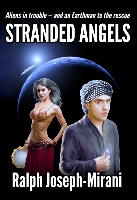
Last week we completed the cover illustration for Ralph Joseph-Mirani’s science fiction epic Stranded Angels. This book cover turned out well with a nice flowing line from the sun rising at the rim of the earth with an orbiting spaceship — both pointing first to the dancing girl, then to the hero of the story, and finally to the diamond he’s holding — which in turn mirrors the idea of the star at the upper left of the picture.

So from a compositional standpoint, it worked out well. Better yet, it wasn’t one of those dry academic exercises in composition that are theoretically good but don’t look too great to the eye. The lighting turned out well, too. From the glowing sun to diamond, with a bit of light filtering through the tambourine. Lots of nice highlights and all contrasting with the jet black background.

No doubt about it, this one’s a keeper.

(And, of course, one might argue it’s hard to miss with a cover design when you have a dancing girl in it — nine out of ten flying monkeys agree.)

There was one odd turn in the process of creating the cover (and as of this writing, I’m not sure how this story will turn out). The hero might — or might not — have a beard. It’s never actually detailed in the novel, and the setting is in a time and place where beards were common, but so were clean-shaven faces. I created two versions of the picture, one with the guy having a bare face, and the other with him sporting a nicely trimmed beard; this will allow the publisher to see both and then decide from there.

Two version of book cover illustration side by side

In situations like this, sometimes a writer and/or publisher will agonize over which version of a book illustration to choose. It’s been my experience that when you get to the point where it is hard to decide, there’s really no wrong decision to make. Either will work almost equally well, so even flipping a coin delivers the right “answer” (though I’ve yet to hear of a client flipping a coin — perhaps one day).

Currently the publisher appears to be leaning toward the clean-shaven look. Thus, the version above to introduce the cover.

For those wondering how the alternate book cover illustration might appear, here’s the artwork, sans type:

Book Cover illustration with beard - artwork by illustrator Duncan Long

====================
Duncan Long and his band of flying monkeys create book illustrations and book designs for large and small presses as well as many self publishing authors. You can see more of Long’s illustrations and graphic design work at Duncan Long’s Art Portfolio
=====================


Tags: , , , , , , , ,

Comments (2)