Now You See It, Now You Don’t

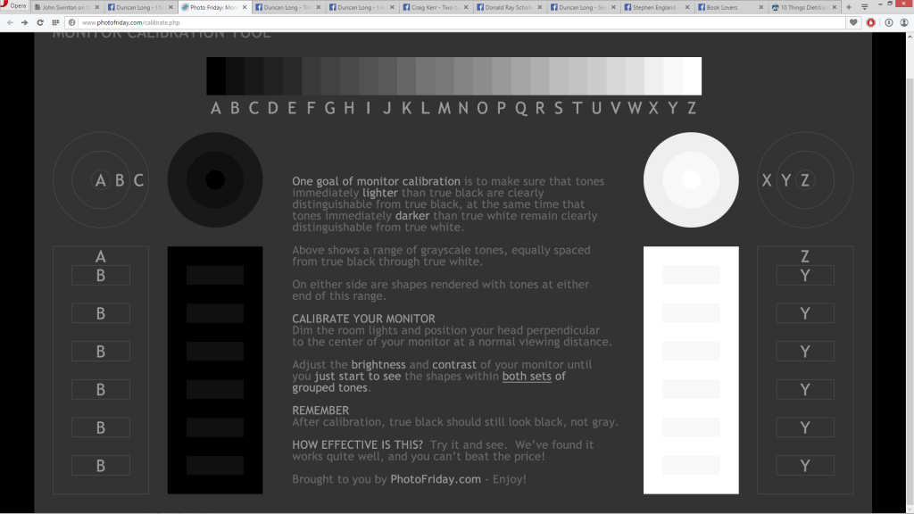
Screenshot from PhotoFriday's monitor calibration page.

Over the years, I’ve found that sometimes clients can’t get a good idea of what an illustration will look like because their monitors aren’t properly calibrated. While today’s monitors generally do a pretty good job of reproducing the correct color ranges that will appear in a print picture, they don’t do so well with the brightness and contrast “out of the box.” And often users compound the problem by jacking up the brightness and contrast to produce more vibrant colors.

This can cause serious problems when a book cover illustration goes to press. It generally will come back darker than the client expected due to a screen being too bright.

Sometimes this isn’t too bad a surprise. Other times the client is devastated.

And the artist (me) can be left puzzled. After all, his monitor is properly calibrated so the cover is pretty close to what appeared on his monitor all along — and he has been modifying the illustration to suit the client’s dictates. The catch is that what the artist saw and what the client gave the okay on are two different pictures.

Fortunately there’s a way to quickly for a client to get a monitor into the proper ballpark of brightness and contrast.

Simply go to these online sites and tinker a little bit, and a monitor should be set to give a pretty close approximation to what will appear in print. PhotoFriday.com will generally be all that’s needed. But sometimes DisplayCalibration.com will help. Here are the links:

PhotoFriday.com and DisplayCalibration.com

One final caution: Because monitors produce colors with light and print, with inks, some of the colors you see on a monitor just can never be quite the same in print with the four color inks most presses use. That means monitors will generally give you more vibrant colors, and the bright red, green, and blue hues of a monitor will be impossible to precisely reproduce with the CMYK (cyan, magenta, yellow, and black) pigments most presses employ.

The approximations can be very close in most cases. But they just can not be perfect. There are limitations to the colors that can be achieved with inks. (This changes with presses using additional pigments — but these are not yet common in the publishing industry and this situation isn’t likely to change any time soon due to the expense of such presses.)

For a more detailed look at the color systems in print and monitors, see “Color Systems – RGB & CMYK.”

======================

Duncan Long is a freelance Illustrator whose work has appeared on book and magazine covers including those marketed by HarperCollins, Pocket Books, Asimov’s Science Fiction, Moonstone Books, and those of many other presses and self-publishing authors. See more of his artwork at his book and magazine illustration portfolio.


Comments Off on Now You See It, Now You Don’t
Creating the Cover Art and Layout for Prisoners of Eroak

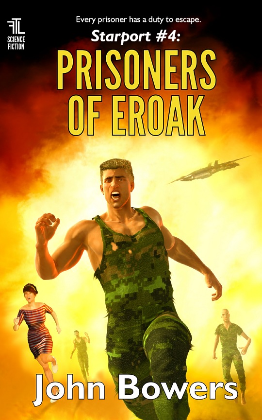
John Bowers Prisoners of Eroak science fiction novel cover layout, illustration, and book design

Another of the new cover illustrations for John Bowers’ science fiction “Starport” series of novels. As the title shows, this is for Prisoners of Eroak.

This cover presented a problem that is often encountered in creating book covers: A title that takes up two lines, thereby dictating that the illustration have more “real estate” at its top, and also something not too important at the bottom where the author’s name usually takes up residence. This isn’t much of a problem provided it’s dealt with up front. To smooth the process in creating this cover art, I laid out the text first, then used that template to guide the placement of the various elements of the picture. I also took pains to make the top section of the illustration dark so the title would show up well).

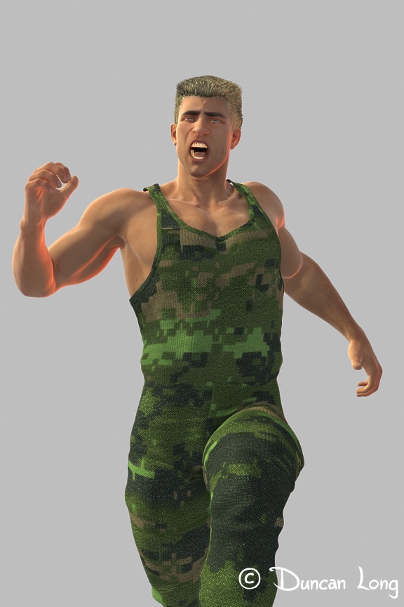
Since we needed to have a number of people running from a large explosion/fire, and since I paint everything digitally, I decided to create the various figures using 3D software. So toward this end, I created a 3D figure of one of the soldiers, and then used that figure to render three slightly modified “people” to create three cover elements “for the price of one” as it were.

To make these guys look like individuals instead of clones, I then painted over each render, giving them slightly different sleeves (or lack thereof), different hair colors (or no hair), and so forth. Here’s the basic model with the original shirt and hair for the “up front” character. (I rotated him slightly in the cover picture to make the cover layout a bit more dynamic and less “squared” on the  horizontal/vertical plains.)

Render of figure for Starport science fiction series cover artwork

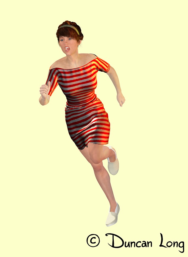
I also used a 3D model for the female character, who (in the story) was a secretary captured and held in same prison the soldiers were in — and who made her escape with them. One of the pluses of a 3D model in this case was that the computer “painted” the strips I painted and loaded into the model as a UV tile — which was fortunate as my first attempt had the stripes running the wrong direction (vertically) for the story. Fortunately rotating my tile 90 degrees and re-rendering the gal and her dress was a very quick and simply fix for the final layout of the cover illustration.

Gal in stripped dress render for novel cover design artwork

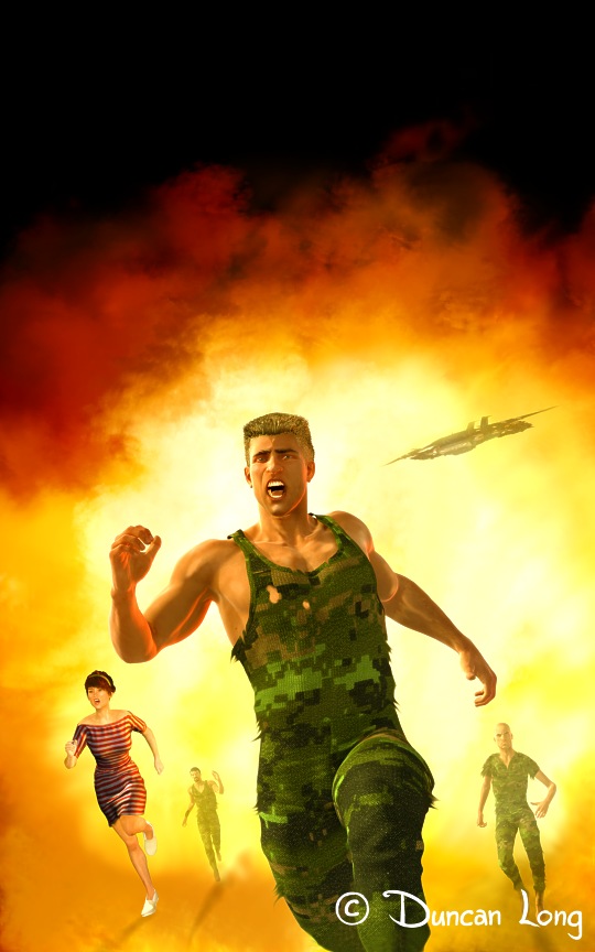
These four characters and a distant space craft (to help establish that it is a science fiction story) were then layered over the explosive background I’d painted. I then painted shadows into the whole thing and did some touch-up work on the characters here and there.

Once the digital painting was flattened, I then dropped it into the text layout I’d done at the first of the project, and it was basically done.

John like the cover illustration and layout so it was practically done after the “first draft” (after I changed the stripes on the dress).

Here’s the cover illustration sans lettering.

Final illustration by Duncan Long for the science fiction novel cover

As the cover suggests, this is an action-packed science fiction story. You can read sample chapters and find out more about Prisoners of Eroak at Amazon.com.

=====================
Book illustrator Duncan Long has created covers for HarperCollins, Amazing Stories, Pocket Books, Asimov’s Science Fiction, Mermaid Press, and many other publishers, small presses, and indie/self-publishing authors. Find more of his book cover art and designs at Duncan Long’s Book Cover Portfolio.

Tags: , , , , ,

Comments Off on Creating the Cover Art and Layout for Prisoners of Eroak

Creating Famine Planet‘s Sci-Fi Novel Cover Art

John Bowers sci-fi book cover design artwork and illustration by Duncan Long

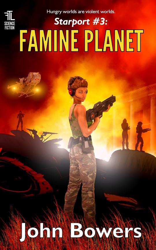
We’ve had a busy couple of weeks creating new book cover illustrations for some of John Bowers’ science fiction “Starport” novels. Above is the final artwork created for book three in the science fiction series Famine Planet.

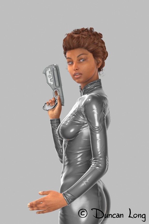
One of the main characters in this novel is introduced in the previous book of the series, and I’d created a 3D model for Guerrilla Girl (you can read more about this cover here).

Kiaya test render for science fiction book cover art by John Bowers

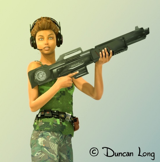
So “she” was available to be employed for this next novel where she appears.I gave her some new armament and communications headphones, then a new pose, and she was ready to go back into active duty on the new cover.

Famine planet test render for science fiction novel cover illustration

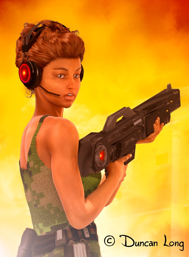
The original “camera shot” above was not the character at her best. She’s thin and having the arms extended to hold the gun put on the emphasis on spindly arms and a gun that seemed a tad to long. Interestingly, simply rotating her a bit without changing anything but her eye position greatly improved her appearance (below — with the rifle at the same relative length as above — only the angle of viewing changing).

Famine Planet science fiction book cover detail artwork

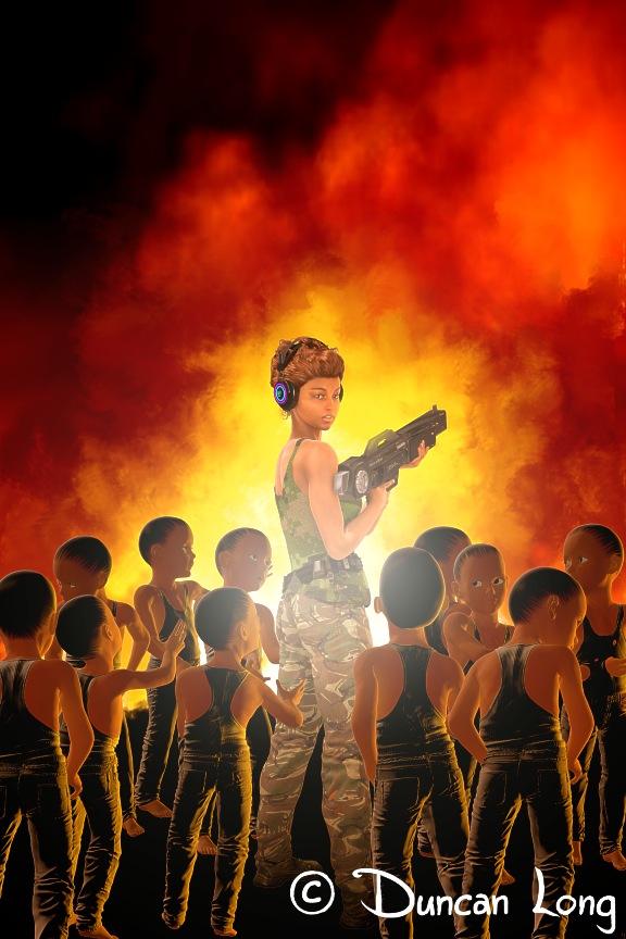
My original idea had been to have bunches of starving children surrounding her. So…

sci-fi-book-cover-artwork illustrator by Duncan Long

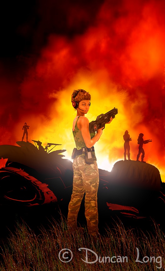
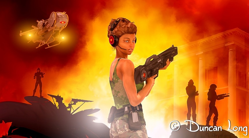
Which was interesting, but not very compelling and (I suspected) probably not an actual scene from the novel. So I scrapped the idea (the kids were painted on different layers from the soldier), and then added some torn up machinery/junk along with some futuristic soldiers to suggest a battle had taken place.

sci-fi book cover illustration by artist Duncan Long

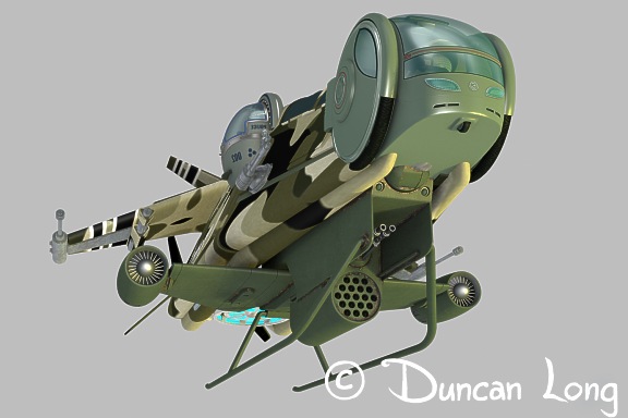
This idea appealed to the author, but didn’t quite complete the scene he wanted. He suggested adding the military “sled” (troop carrier / gunship) from the previous cover. So I used that 3D model with a different position/camera shot, to create another element for the picture.

science fiction troop transport / gunship created for novel illustration

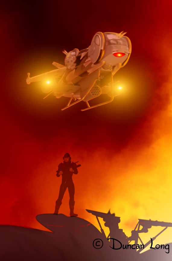
Here’s the model with some lens flare and the proper background, coloring, and details painted in:

Famine Planet detail of spacecraft and soldier for science fiction book cover

Finally, I also painted a very faint building on the right behind the two soldiers. This completed the illustration and, after approval, it was ready to drop into the cover layout I’d designed for the book. Done!

Final illustration for science fiction novel cover

You can read sample chapters and find out more about Famine Planet at Amazon.com. If you like an exciting science fiction adventure, you’ll love this novel.

=====================
Duncan Long creates science fiction illustrations for books and magazines. In addition to doing work for indie presses and self-publishers, he’s created covers for HarperCollins, Amazing Stories, Pocket Books, Asimov’s Science Fiction, Mermaid Press, and many other publishers. See more of his sci-fi artwork and book designs at Duncan Long’s Book Cover Portfolio.

Comments Off on Creating Famine Planet‘s Sci-Fi Novel Cover Art

A New Occupy Eroak Cover for John Bowers’ Sci-Fi Novel

John Bowers Occupy book cover illustration for his sci-fi novel

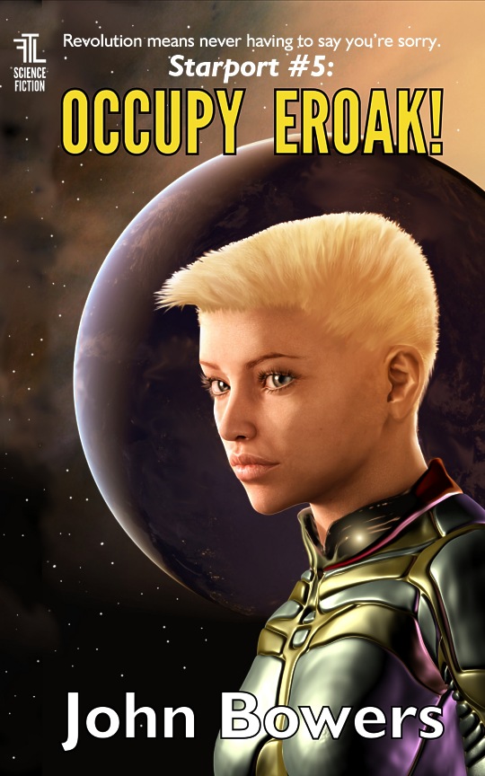
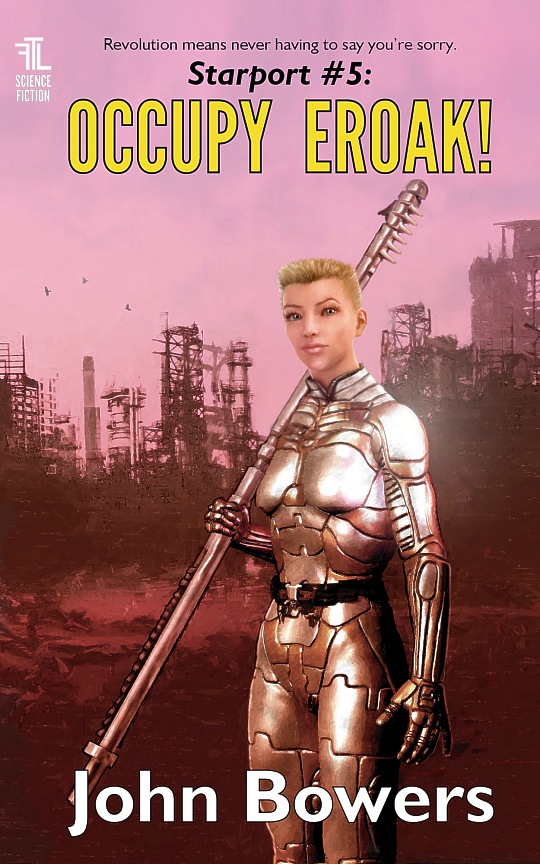
We’ve had a busy couple of weeks creating new cover illustrations for some of John Bowers’ science fiction “Starport” series. Above is the final illustration and layout of the updated cover for Occupy Eroak.

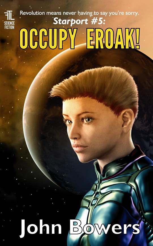
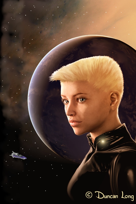
As is often the case, I created several several versions of the illustration before we finally got to something that worked well. Perhaps the most interesting is this brunette version of the final cover art (which is one of those “close, but no cigar” things often encountered when working on book covers):

John Bowers Occupy science fiction novel cover art by Duncan Long:

It just didn’t work as well as the blond version, in part because of the contrast with the shadowed area of the planet behind her (and possibly the blue/purple armor).

Previous cover pictures didn’t work at all. I’d created a 3D model for this project, which allowed me to pose the character in a variety of ways, and then painting “over” that model, adding features in front of and behind her to unify the concept.

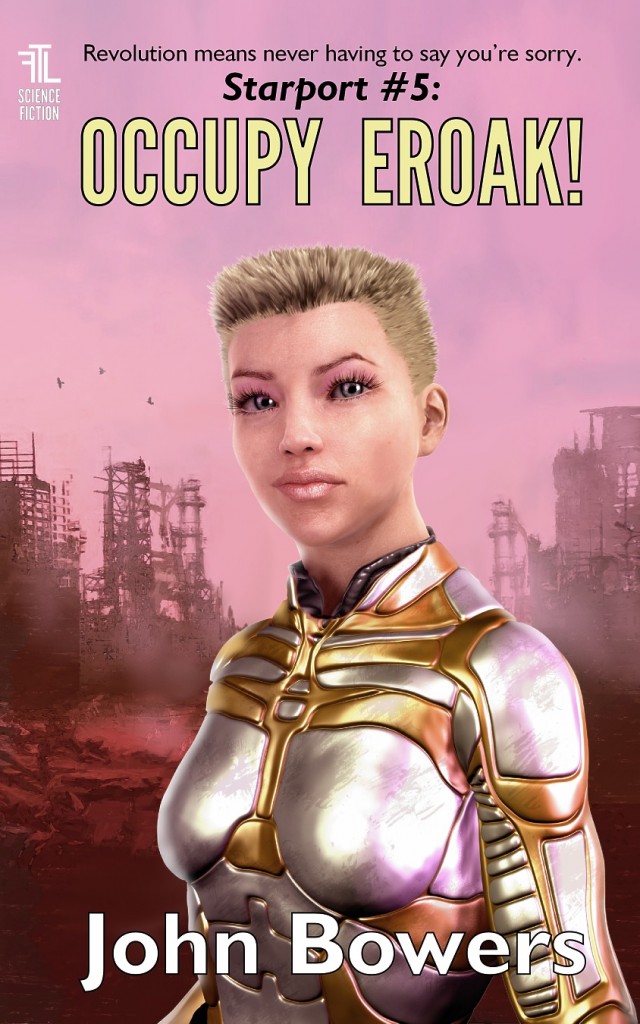
But having that 3D model didn’t make creating the cover a piece of cake. Here are a couple of attempts that just did not work: .

John Bowers Occupy science fiction art for novel cover

And…

JohnBowers Occupy science fiction novel cover artwork by illustrator Duncan Long

Part of the problem with these two “head-on view” figures was a lack of dramatic lighting and shadows. However, I think the main reason these didn’t work was simply that this character looks much, much better in profile where you can see her hairdo and sharper features. Head-on she has a baby face and her hair just looks short rather than flat-top short. So, yes, even computer characters have their good and bad sides when it comes to posing them.

In the end…  we decided blonds would have more fun on the updated cover for John Bowers’ book. Ironically, this was the first version (below) that we started with before our “wandering in the wilderness” of alternate versions. Sometimes you have to life in the boondocks a while before you appreciate what you’ve left. That was the case this time, and a few lessons were learned as well.

Original art design for the science fiction novel illustration by Duncan Long

You can read sample chapters from this book (as well as purchase the Kindle version) at Amazon.com. If you like science fiction adventure, check out the whole Starport series.

=====================
Artist Duncan Long creates book cover illustrations for many genres including science fiction, action adventure, and fantasy novels. His clients inclue many indie publishers as well as self-publishing authors. He’s created covers for HarperCollins, Amazing Stories, Pocket Books, Asimov’s Science Fiction, Delta Press, and many others. See more of his book cover artwork and designs at Duncan Long’s Art Portfolio.

Tags: , , , , , , ,

Comments Off on A New Occupy Eroak Cover for John Bowers’ Sci-Fi Novel

Creating a Cover Illustration for John Bowers’ Guerrilla Girl

John Bowers-Guerrilla Girl book cover illustration-large

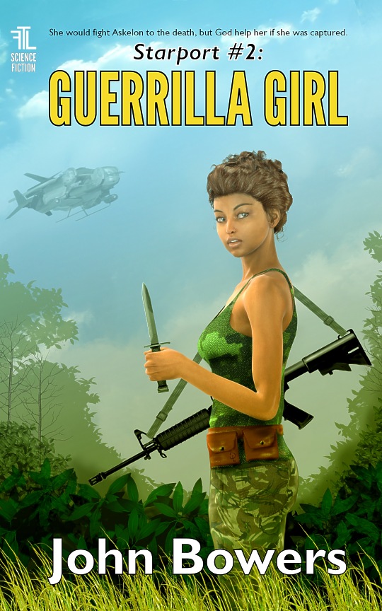
We finished up the book cover illustration for the second installment in John Bowers’ science fiction “Starport” series, Guerrilla Girl last week. Amazingly enough, the novel is already available for sale today at Amazon. The final version of my cover artwork (and layout) is shown above.

For the project we started with a 3D model (which is more easily posed). Here’s the first test render (with a few touch-ups in Corel PhotoPaint) that I created to establish the character for the cover.

Gray suit test render for science fiction book cover art

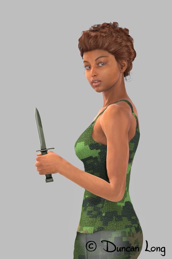
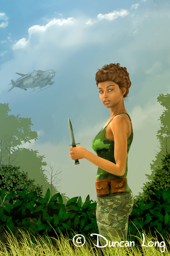
The face and pose were close to what John wanted to see, but the costume was wrong. So the next round of work was to create a camouflage outfit for the character. We decided to arm her with a bayonet rather than a pistol.

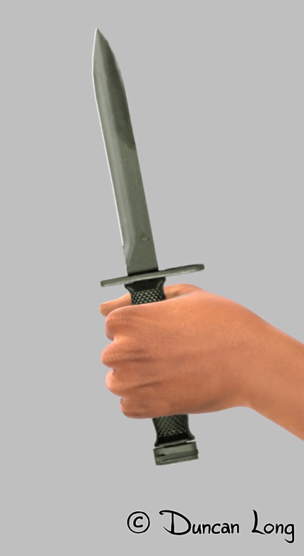
The female hand is not at its best when viewed from the palm side with a “hammer” hold on a knife (the hold dictated by her less than muscular arms). A saber hold is prettier but I opted for a logical hold over a pretty one. So we had this pose and weapon:

Sci-Fi hero illustration for science fiction book cover.

This was close (though the camouflage on the pants wasn’t working, so it would be replaced by a different material matte).

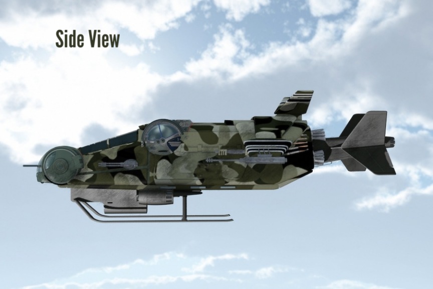
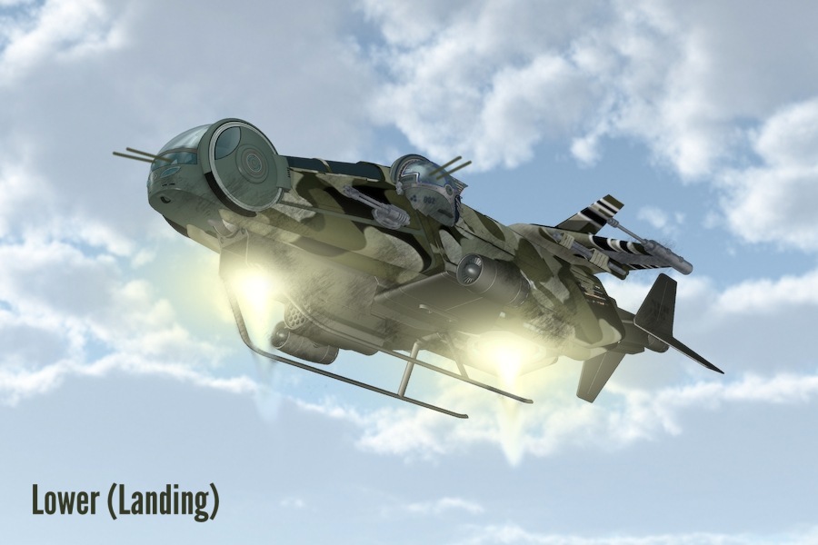
The next step was to create a space vehicle would would appear in the distance. It was created by combining several different 3D models I had on hand, removing parts, adding, mixing and matching to create a Frankenstein futuristic looking sky thing. Here are the test renders/illustrations to establish the concept (the final version had a lot of the detail and color removed so the vehicle would appear to be in the distance).

Military Sled proof of concept render/illustration.

Military Sled low view proof of concept render and painting for book cover.

Next the components were put together and background layers painted in along with a grass layer in front of the character to add some depth:

John Bowers novel test cover layout for book illustration.

This was close to the final version with the camouflage on the pants now working.

The character seemed a bit vulnerable when armed with only a knife, so we decided to add a US M4 carbine on a sling to her armament (as seen in the final version of the cover above). Since both the bayonet and carbine were side views, I simply painted them into the picture as flat 2D layers rather than creating a 3D model for each of them. This is faster while allowing a high level of detail.

Here are a couple of “closeups” from the “character layer” of the final book illustration:

Bayonet - detail from final book illustration.

Face detail for the science fiction novel artwork.

Creating this cover illustration and then the lettering/layout was a fun project, and I’m really happy with how the book cover turned out.

You can learn more about Bower’s science fiction novel, read sample chapters, and purchase a copy at Amazon.

Check it out: Like the rest of the Starport series, Guerrilla Girl is a fast-paced great read.

=====================
Duncan Long is a book cover illustrator who creates artwork for many indie and small presses as well as doing work for HarperCollins, Amazing Stories, Pocket Books, Asimov’s Science Fiction, Paladin Press, and many other publishers. Check out more of his book cover illustrations at Duncan Long’s Artwork Portfolio.

Tags: , , , ,

Comments (1)

Book Cover Art for Martin Wilsey’s Science Fiction Novel

Still Falling- Martin Wilsey science fiction novel artwork by illustrator Duncan Long

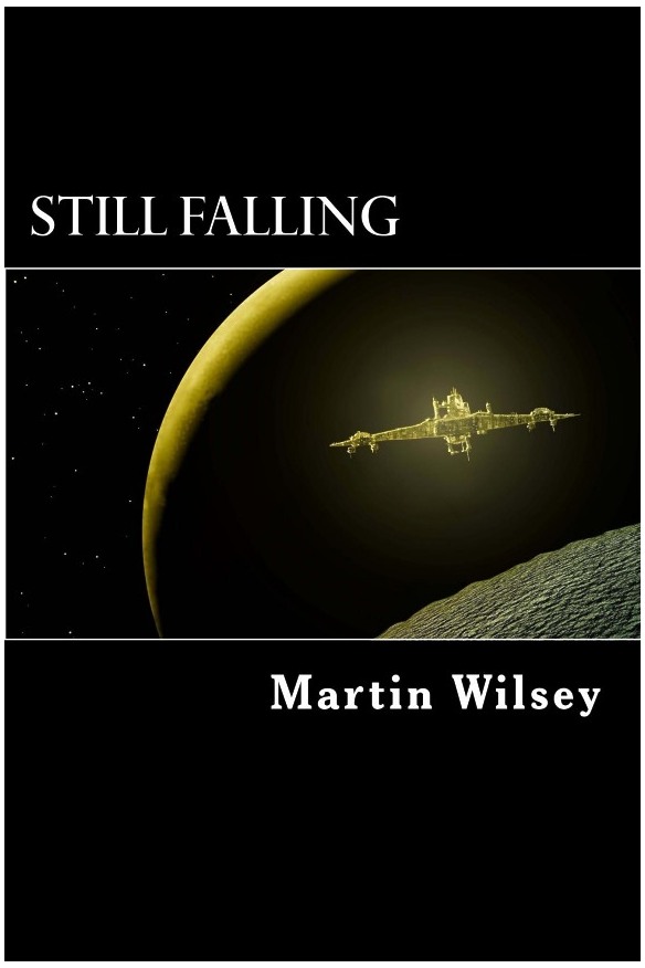
The cover (above) of Martin Wilsey’s new science fiction novel Still Falling. This cover layout is a beautiful example of how cropping can make a dramatic change in the impact of an illustration. While I created the artwork for this cover, I didn’t do the layout — and am quite jealous of the work (ha).

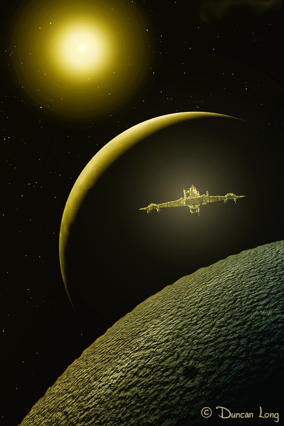
Here’s my original illustration that was submitted for the book cover. Sometimes, cropping is much better than simply lettering over the artwork. Always a good technique to keep in a designer’s bag of tricks.

Somewhere off Deimos science fiction book cover illustration by Duncan Long

You can read a sample chapter and order the book at Amazon.com.

======================
Duncan Long is a book illustrator who has done work for many indie authors and small presses as well as HarperCollins, Pocket Books, Asimov’s Science Fiction, and Amazing Stories. See more of his book illustrations at: Duncan Long’s Art Portfolio.

Tags: , , ,

Comments (7)

April Rane’s novel Magnolia Murders Now Available

April Rane's Magnolia Murders book cover artwork and design by Duncan Long

I got word from April Rane that her novel Magnolia Murders is now available.

Yes, that’s my artwork and layout on the cover.

The tricky part to this book cover project was getting the flower positioned and sized properly. Due to the black background, it’s easy for the eye to perceive the flower as being gigantic and just a short distance in front of the character — not at all what we wanted.

Early book cover illustration with larger flower that doesn't work well.

Eventually we settled on the layout at the opening of this post, with a smaller flower and an orientation that also “points” toward the gal’s face, directing the viewer to her.

On the plus side with a black background, the light reflections from the light backgrounds add to the beauty and realism, with an almost magical quality. I played around with the old idea of a “black cat in the night in a coal bin” with her dark blouse that in fact is only sketched in along the edges of her arms and shoulders.

I don’t normally recommend dripping blood on a cover, but the flower/blood were key to the story, and the natural color of the magnolia’s center lends itself to the dark blood red. So I think this illustration works well with this cover/story concept.

US readers can see sample chapters and buy the ebook at: Amazon.com

Comments (4)

The Making of Ming (the Cover)

Ming cover layout and artwork by Duncan Long

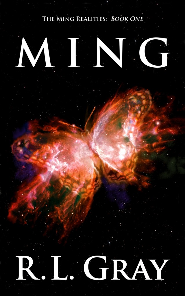
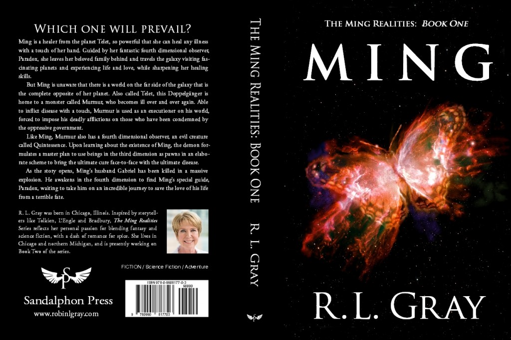
I had the pleasure of recently finishing the book cover illustration and layout for book one in the new science fiction series Ming by R. L. Gray.

The design work was pretty straight forward with this project. I studied the “butterfly nebula” (via the Hubble telescope), then painted my own version with a few nebula dust and star enhancements to bring out the butterfly in it. We then adjusted the colors for a bright reddish/yellow hue, and we set to go.

For the layout, I chose the classic Trajan typeface for the front lettering, adding extra space between the title lettering to permit filling the large space the letters needed to occupy (which is always more satisfactory than widening the letters themselves and destroying the proportions of these beautiful, classic characters).

Ming cover layout created by Duncan Long

On the back cover, I used Trajan for the headline, then Garamond for the other text, the latter being another classic typeface that fits well with Trajan (at least to my eye).

I also created a small icon for the fledgling publisher to use as a trademark. This was designed around the “S” and “P” from Sandalphon Press with the addition of a pair of stylized wings I created for the project. Several variations were made, and the one everyone liked the best was chosen for the final version.

The result is a distinctive icon that can be displayed on the spine as well as the back of the books in the series. I packaged the final design into a TrueType font so it can be employed by the publisher in a variety of ways in-house as needed.

The company logo icon designed by artist Duncan Long

You can preview several chapters and buy a copy at Amazon.com.

R. L. Gray’s website also gives a nice synopsis and other information about the book.

===========================
You can see more of Duncan Long’s book cover design work and book illustrations at Duncan Long’s Portfolio.

Comments (1)

Character Art for Books and Screenplays

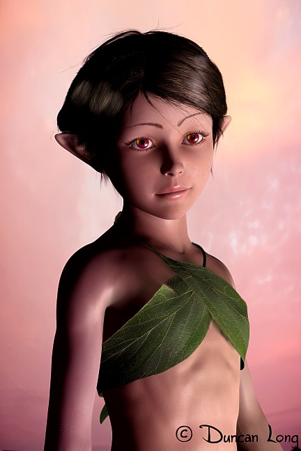
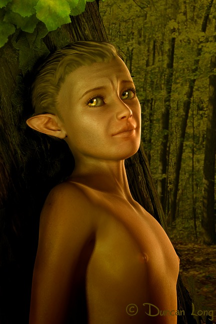
Fairy book illustration

Over the last couple of years, I’ve found myself creating more characters for screenplays as well as the inner pages of novels and non-fiction books. For writers by artwork for their documents, illustrations can be an important “hook” for attracting t little more attention from potential buyers. With today’s highly competitive markets, such an edge can help sell a book or screenplay.

Above is a little fairy that eventually will become a black and white (actually “grayscale”) picture for an upcoming book about little creatures. I generally create artwork in color (in case a client decides to use it on a cover or in color ads) and then desaturate it to create a B&W picture.

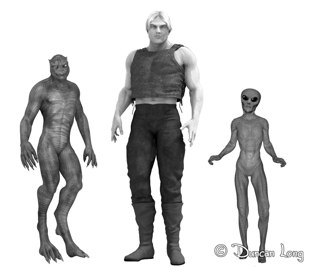
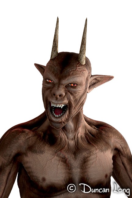
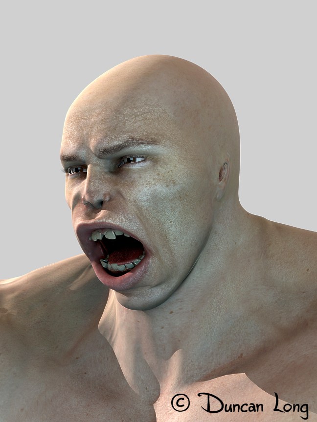
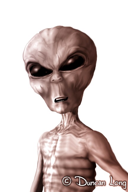
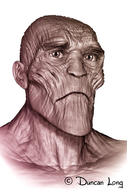
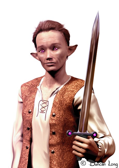
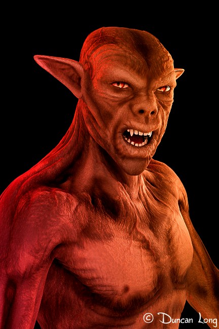
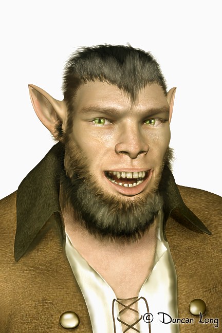
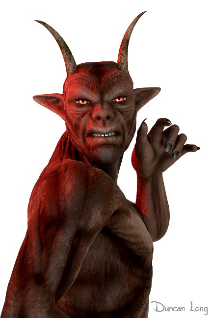
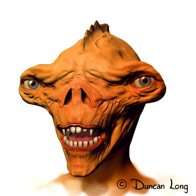
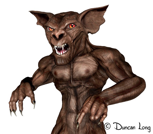
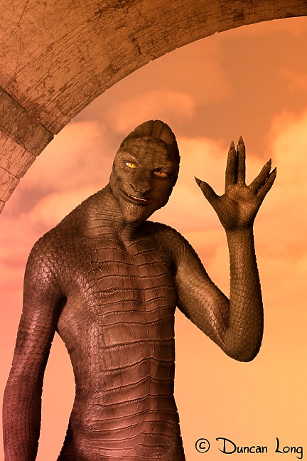
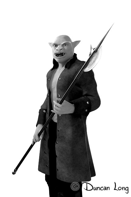
Below is an assortment of aliens, little creatures, demons, and other monsters that are each slated to appear in either a book or screenplay.

Three Alien Types - black and white illustration for book text

Mantrap b6 detail for book illustration

Demon 5 horned B&W art for book illustration

Ogre illustration created for a movie script

Gray Alien book illustration

Woodsman supernatural sprite book art

Elf armed with a Sword book illustration

Demon 5 -- a little Middle Ages look -- for book illustration

Leprechaun book illustration

Horned Demon with Hand - book illustration B&W

Nightmares hammer head book art

Gremlin - art for inner book illustration with text

Reptilian Invader book artwork

Troll - black and white illustration for text

Pan - Hide and Seek - book artwork

———————–
You can see more of my artwork for books, games, and screenplays at Duncan Long’s Gallery.

Comments (2)

Anthony Pacheco’s The Wælcyrie Murders Pre-order Now

Science fiction novel ebook cover for Kindle

The Kindle version of Anthony Pacheco’s science fiction novel The Wælcyrie Murders is now available for pre-order from Amazon. The ebook will be available on January 30, 2015.

The Wælcyrie Murders is book two in the Lexus Toulouse science fiction/mystery series. Here’s a bit about the plot:

Out of the Gifford-Pinchot Forest stumbles a wælcyrie, shot with irradiated bullets and radiation poisoned unto death. To kill a wælcyrie, a slowly dying species engineered by humans in the war to help them fight is an unforgivable, vile crime. Lexus vows to bring the killer to justice, even if she has to go undercover in one of the worst places she can imagine: high school.

As the blurb suggests, the book is clever but also often emotionally moving. And full of unforgettable characters. (I’ve finished book one in the series — Armageddon’s Princess — also available from Amazon — and liked it very much. Imagine Robert Heinlein at his best, with more sophisticated humor, and some seriously hi-tech gear, and you’ll have a good feel for these stories. Yes, they’re fantastic!)

The ebook cover is shown above. The print version cover is shown below — I created a wrap-around illustration for the print book, with more of the scene on the spine and back.

WaelcryieMurders-book-cover-art-Duncan-Long-016

You can learn more about the creation of the cover illustration for Anthony Pacheco’s upcoming novel (as well as see some earlier versions of the cover which didn’t make the cut) at my previous blog about the Wælcyrie Murders

====================================
Duncan Long is a science fiction novel illustrator and graphic designer. You can see more of his artwork at Duncan Long’s Portfolio.

Tags: , , , , , , ,

Comments Off on Anthony Pacheco’s The Wælcyrie Murders Pre-order Now