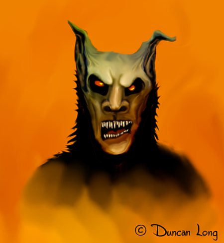
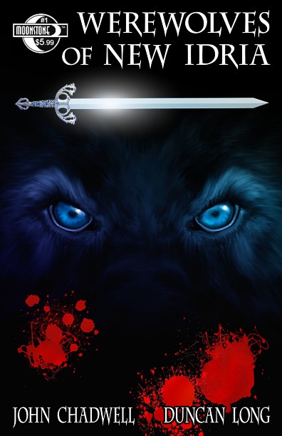
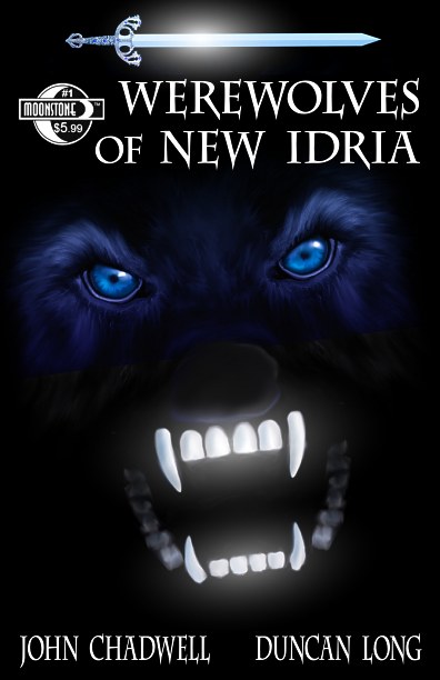
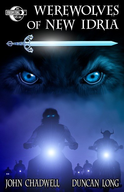
I thought I’d show the progression of the covers created for the upcoming graphic novel Werewolves of New Idria (available from Moonstone Books).
Up front: NORMALLY I don’t go through this many ideas to get to the final book cover illustration. This project proved a challenge and generated bunches of different versions for the cover artwork. While I’ve got eight here, I’m only showing some of the major modifications and proposals. Imagine about ten variations for each of the ones shown and you’ll get an idea of the work involved to finally get to the final version.
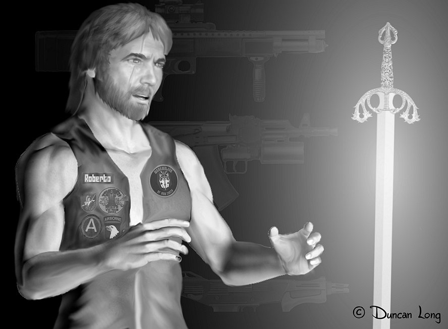
The most ironical part to this story is that the final cover came from a poster I created for the book.
We should have started with the poster.
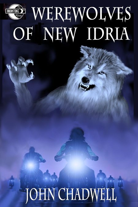
I’ll start with the FINAL version of the Cover for Werewolves of New Idria:

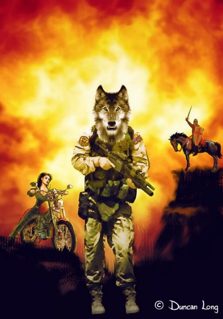
Now we’ll travel back in time to the first version of the cover:

This proved too static and there was some disagreement as to whether the werewolf should be wearing combat boots (there’s a joke here somewhere, I know). And the wolf head seemed too warm and fuzzy. (Note to illustrators: Wolves have a natural grin, so it’s hard to make them look like real wolves while still having an ominous disposition).
The next version:

Still too static. And still the combat boots. But better with a pretty gal. Onward:

Uhhhmmmm… No. I’m not sure I ever even submitted the above cover for the author or publisher to inspect, but include it to show how wrong an illustrator can go when left to his own devices.
But the motorcycles (taken from a concept illustration I did for the book version the graphic novel is based on) did seem to be working so they got boosted a bit for the next version:

Closer. Notice how the wolf shown above is almost smiling again. Oh, no… Next:

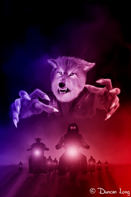
Something from the reach-out-and-grab-you school of illustration. Obviously this isn’t working too well; time to lose this version of the werewolf.

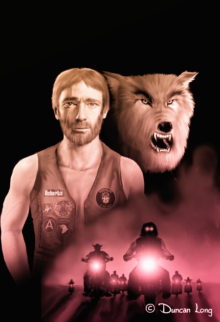
The eyes and sword in the above version were looking good. Finally something that would work – though not everyone was happy with it so I decided to add some fangs….

…and seemed to loose some ground. I retained the eyes and sword and returned to the bikers in the dark which everyone who saw the previous versions seemed to like.

For a time the illustration above was the “final” cover with a few variations in color including green, red, and a combo with a gradient of red to blue. This one would have worked and perhaps is a toss up with the final cover that was generated from the poster. Here it is again:

My question: Which one would you have picked? Input appreciated via the “comments” section below.
=====================
In addition to producing a gazillion variations of illustrations for this graphic novel, Duncan Long often creates book cover illustrations for publishers including HarperCollins, Pocket Books, Solomon Press, ILEX, Fort Ross, PS Publishing, ISFiC Press, and many self-publishing authors. He’s hoping to get started on the artwork for another graphic novel in a few months — possibly with fewer stabs at creating the final graphic novel cover illustration. See more pictures from Werewolves of New Idria at Duncan Long’s Werewolves of New Idria Gallery
=====================
